Optical Illusion is the second of the three quilts I entered for judging at QuiltCon. I actually made this quilt specifically for QuiltCon, so I was very pleased when it got in. I’ve been crushing on simple geometric designs in a limited color palette, so this quilt really allowed me to explore that desire. I definitely think more black and white quilts are in my future.
And yes, it moves when you scroll it! 🙂
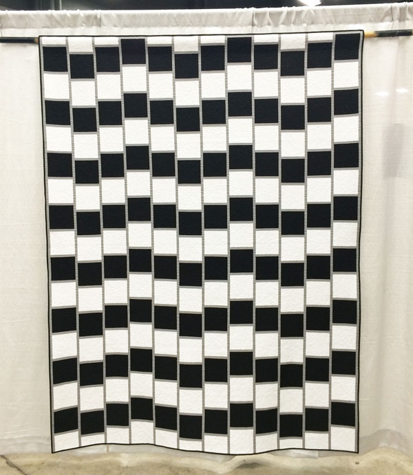 Optical Illusion 67″ x 88″ by Christa Watson.
Most people were surprised at how big it was in person.
Optical Illusion was placed into the piecing category which includes this description, “quilts that are machine pieced and reflect a particularly strong or innovative use of piecing.” I guess you could say this quilt was pieced innovatively, although I was secretly hoping for it to be in the minimalist category. I’m still learning exactly what minimalism means. 🙂
Here are the positive judges’ comments, along with my commentary:
- Quilting motif supports the design. I’m glad – since that’s what I was going for – geometric simplicity that doesn’t overpower the quilt.
- Binding is well proportioned and applied. Double yay since the binding on this quilt is what stressed me out the most!
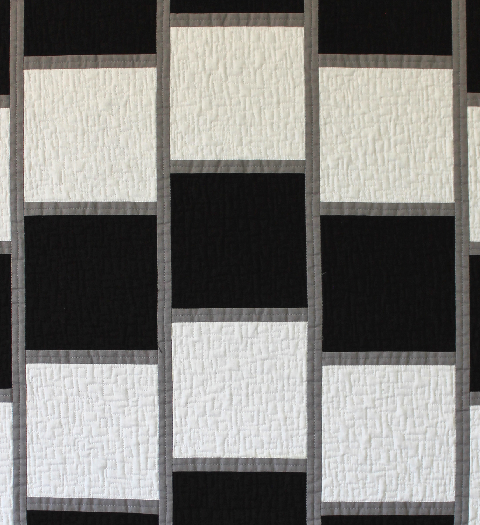 Detail of quilting on optical Illusion – free-motion boxes.
Here are the areas for suggested improvement, along with my thoughts:
Design direction lacks focus. I was afraid of this – the judges viewed the quilt so close up that I’m afraid they missed the point of the quilt. I don’t think they read the artist’s statement either, so to them it probably just looked like a bunch of black and white squares, and they didn’t get to see the effect of the optical illusion.
I had one slight disappointment in that whoever printed off the paperwork for the show got the name wrong. I had entered it as “Optical Illusion” (I went back and double checked all my acceptance emails to make sure it wasn’t my error), but the title was listed as “48”. I can only imagine that was some kind of typo or mail merge glitch. However, much to the credit of the MQG, they did fix it immediately, once I notified them. Unfortunately, it was too late to know whether or not the incorrect title had any impact on the judging. But you know what? Rather than get all upset about it, I’ve learned through experience sometimes these things just happen. Inadvertent mistakes can be made by volunteers who are doing their best, so there’s no need to beat them up about it. 🙂
The best part about sharing this quilt was seeing the reaction it generated. I’m sure I’ll enter it into more shows in the future.
Quilt should be cleaned before entering into competition – lint. I knew I’d get knocked down on this. The quilt wasn’t linty or dirty, but the batting bearded (shed) like crazy through the black fabric on both front and back. When using dark solid fabrics, I need to stick to a black batting or one that doesn’t beard, like 100% cotton. I used Quilter’s Dream Orient which I’ve used before in print quilts with no problems. The batting is a mix of bamboo, silk, tencel and cotton. I’m not sure which fiber caused the problem, but that just means it’s time to experiment and make more quilts!
I share these critiques with you so that we can learn together what makes a successful quilt.
 Standing next to Optical Illusion for scale. Though I’m pretty short so that may not help much.
I have had quite a number of people asking me for a pattern for this quilt. I am in the process of writing one now, so stay tuned!

This was one of my favorites of the quilt show, I love two toned quilts and I loved the illusion of this design.
I immediately thought, “How could they miss the concept with a name like Optical Illusion”, but as I read on I began to understand. Online, especially when you scroll down the page, seeing the illusion is unavoidable; but standing still and up close, it could be feasible. After all, when I looked at the Best of Show, I totally missed the fact that the ENTIRE quilt is an i block (an enlarged version of all the other blocks composing the quilt). It wasn’t until I saw the entire quilt on my computer screen that it dawned on me. I think your attitude is correct; there’s no point in stressing about unintentional mishaps with no mal-intent. Keep working hard and enjoying the process. Don’t agonize about the uncontrollable. It’s never going to be an exact science, and it’s very hard for those seeing artistic work to completely understand without the quilter’s explanation. That’s what is really nice about blogs–getting the inside scoop.
What a shame. I love this quilt, even if scrolling through this post made me a little motion sick.
I wonder what the problem with the batting was. I had a similar issue using orient in a quilt that had a lot of black on it.
I so appreciate you sharing the judges comments. I always find it fascinating to hear what they noticed. I must say, “design direction lacks focus” is incredibly vague to me. I suspect they had a more specific criticism of the design but were trying to make it really polite? When I read that sentence, all I think is “what does that even mean?!” I could see a lack of focus if you had a really scrappy crazy design but you have a very uniform, well planned design. It doesn’t lack focus in any way!
I don’t know if anybody else suggested it – but have you tried a sweater shaver to hopefully get rid of the bearding? MIght be worth a try! 🙂 I love the pattern and the optical illusion is awesome!
Christa, your quilts are stunning. What I admire most about this experience you shared with us, is the wonderful attitude you have toward the mistakes, glitches etc. you delt with. Congratulations on a job very well done!
Carolyn
Absolutely incredible quilt! It amazes me how you get the ideas for these quilts. Truly a work of art! It is so cool how it moves when you look at it up & down. I don’t always like modern quilts but this is too amazing to pass up.
Oh Christa, You are more forgiving than I could be. It is a beautiful, exceptional quilt and I think it is unforgivable it wasn’t critiqued better.
This quilt is so incredible. And yes, I can see how the title “48” might not help people understand the point of the quilt much. 😉
Thanks again for your openness. It is inspiring to newer quilters like me that more established quilters are willing to share like this. I’m sad for you that the judges seemed to miss the point of this design. It’s so striking and to me highly focused. But perhaps the judge is using that work in a different sense than I take it. And the bearding – gah!! What a nightmare. Gorgeous work.
Thanks! I learn so much each time I make a quilt 🙂
Thanks for sharing the judges’ comments on your quilts.
They (the comments) seem a bit brief, but at least they don’t sound as cruel as they did from the first QuiltCon. Do you think you gained/learned anything from them? I think good judges’ comments should guide, not just say “liked this”, “hated that”. I suppose that judging, like quilting, is a learned skill.
Your quilts are powerful & graphic.
I love this quilt and I am so glad you got it entered. Add me to the list of people who would love to see a pattern. Thank you for passing along all your knowledge and “lessons learned”. I will never enter a quilt in a show, but your willingness to share what you know is so much appreciated.
Christa, first, I would like to commend your bravery in sharing the judges’ comments. I am impressed that you are able to get past defensiveness and instead view them as a learning experience for all of us. You are REAL and I love that about you!
Second, I LOVE this quilt and am so looking forward to the pattern.
Third, you rock!
I sure loved seeing this quilt in person and it is too bad if they missed the point of it. I thought that they were to have the quilts held for them at least once in the judging process. Thank you for sharing the comments.
I think you are right – they do have them held up, but they would have need to back up a ways to get the effect. However, I think the main problem was that they were read the incorrect title. They were probably scratching their heads thinking “what does that mean?” But I was still happy to share it!
First, your quilt is awesome, cool and very original! So you deserve to have it chosen for Quiltcon!!!!!! Congrats!!!
Second, thank you for sharing all the critiques’s judges (although I think that they didn’t affect the value of this amazing quilt) ’cause it show to all of us, a little bit of how the judges think!
Thank you for sharing and congratulations on your successes! I like your attitude! Too many people take everything too personally and bear grudges unnecessarily.
Wonderful quilt, a pattern would be nice.
Thank you for sharing your quilts and the judges comments. I admire your courage to enter a show. I like your designs. I don’t think I could live with this particular quilt as it makes me dizzy.
Christa, if you use black batting won’t that show through in the white sections? I guess you have to choose the lesser of two evils?
In any case, I think this quilt is extraordinary. What a waste that they missed the whole point of it. Great job.
That is a good point. So I just need to find the “perfect batting” that doesn’t shrink, beard, or ripple, LOL!!
I just LOVE this quilt!!! I would so love to make one! Do you have a pattern for sale? Congratulations on your “good critiques” . I could never be a quilt judge, I’m too in awe of all that beauty 🙂
I love this quilt! The optical illusion is stunning. Do you plan on making other optical illusion quilts?
I had been wondering if the judges read the information the quilter’s supplied… apparently not? Although Linda’s comment suggests sometimes yes? Either way, I really appreciate you sharing this information, thank you!
I cant believe it bearded! Ack!
I’m a bit stunned to hear the judges didnt read the excerpt before judging, although perhaps they try to judge without having emotional impact bias them?? I adore this quilt, and am so glad for you that it was chosen!!
Ps, Loving your new logo and header! (I know it’s been awhile, but I wan’t sure if I had said so before!)
Usually they don’t read the excerpts and only sometimes will they ask for the name of the quilt. So in my case, it was unfortunate that they didn’t know the correct name of the quilt. 😦
I find it very interesting that you received actual critiques! The comments I received were so bland, and obviously lifted from the description I had written, as to make them completely ineffectual. I’m glad you were able get some take-aways from the comments you received!