Happy Turkey Day!! I’m so thankful to you, dear blog reader for your support you’ve given me over the years. I started this blog on Thanksgiving Day back in 2010 and little did I know that it would lead to what I’m doing today – a full time career in the quilting industry.
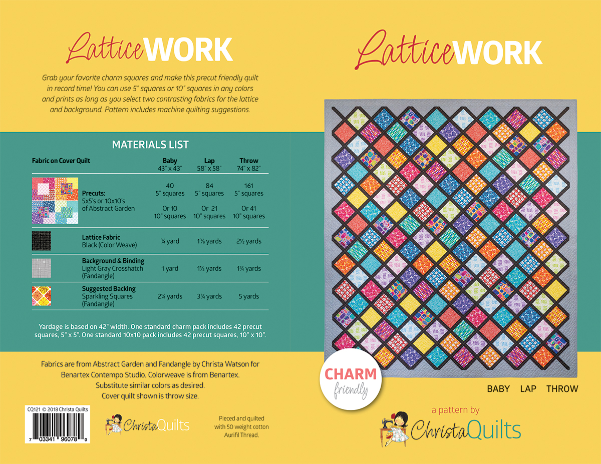
LatticeWork Quilt – Throw Size
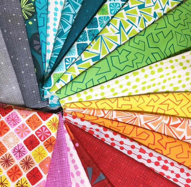
On this day of thanks, I’m so happy to be sharing more fun and inspiring projects with you! Take a look at LatticeWork, the 4th and final quilt pattern I’ve released to go along with my Abstract Garden fabric line (which starts shipping to stores in December).
LatticeWork comes in 3 sizes and is made from Charm Packs (5″) or 10″ squares. You can also make it from a bundle of fat quarters with coordinating light and dark fabric. For the Throw Size, I’ve used 4 charm packs of Abstract Garden, but it would look fabulous in Modern Marks charms or Fandangle charms, too. Or you could mix and match them for even more variety!
As with all of my patterns, I’ve included machine quilting suggestions so you can get ‘er done!! For LatticeWork, I quilted one of my favorite walking-foot designs: an allover wavy grid that requires absolutely NO marking of the quilt!
You basically divide and conquer the quilt into a grid: quilt lines in the center of each lattice strip in both directions. Then fill in with more and more lines until you are happy with the line spacing.
Wavy Grid quilting detail – it’s so easy to do!
If you look closely at the orange “Trellis” print above (the one near the purple, blue and orange spirals) you will see that it roughly mimics the irregular plaid design of the quilting. I love it when I can incorporate my fave quilting motifs into my fabrics!
I chose a tone-on-tone black for the lattice and paired up the bright colorful prints with the light gray Confetti Crosshatch print from my Fandangle collection. The best news is that I just got in more yardage of both of the Fandangle Grays so click here to grab some before it sells out out again!
I’m back home and recovered from Quilt Market – the semi-annual trade show for the quilting industry. It was my third time having a booth to showcase my new patterns and fabric and I thought it would be fun to share my list of top 10 things I learned this time:
1. Wear Cute Things Made from my Fabric (with fun Shoes!)
I had “sew” much fun making 4 fabric aprons to wear for each day of the show. I watched Betz White’s easy Modern Apron class on Craftsy for the pattern and instructions, and I have to say – for this girl who doesn’t sew “3-D” items, they came together very quickly!
Or course I had to pair them with my favorite Fluevog shoes which were as much of a hit as the fabric was! I had people stopping me on the show floor to take pics and I was happy to oblige as that’s part of the game in this industry – get as much social media sharing as possible so that the there’s more eyeballs on my fabric!
2. Pass Out Handouts and Promotional Giveaways
(Click the image to enlarge and select “full screen”)
In this YouTube Video (my first post!) I’ve captured a quick one minute silent tour of my booth so that you can see everything that was made from Abstract Garden. On the top shelf on the far left of the booth, I created a rack full of glossy double sided fliers that included images of each of the fabrics from the line. along with a quick listing of all of my products (patterns, books and thread). I handed these out to everyone who stopped by the booth so they had at-a-glance info on where and how to buy.
While supplies lasted, I also passed out sample fabric swatches of Abstract Garden as well as copies of my current pattern line to shop owners who seemed interested in carrying my fabric and patterns in their shops. These were a huge hit and also gave them something to take home while they wait for all of the goodies to arrive!
3. Get Extra Help
Although I pride myself on making all of my own quilts from start to finish, it was nice to have industry friends make accessories for me out of my fabric to fill out the booth. I have to give a quick shoutout to the following folks who made things for my booth in the video seen above. I’ve linked to each of their sites for more info about them and wonderful designs.
Colourwerx for the adorable Mod Cat Wallhanging and super dupe cute Mod Dog pillows. Aren’t they great??
Easy Peazy Quilts for TWO versions of her adorable Una-Corn activity case: one made from Fandangle and the other from Abstract Garden
Powered by Quilting – for the colorful jelly roll rug. You know you want to make one!!
May Chappell – for adodrable clutches that were a perfect hiding spot for my treats!
By Annie – for the perfect containers and accessories that added the perfect touch to the booth and kept me organized at the same time!
Quilt Market is HUGE and it’s hard for everyone who attends to see all of the booths. That’s why it’s so valuable to get my name and products into as many different booths as possible. I was pleased as punch that Pam and Lynn from The Stitch TV Show were happy to feature Abstract Garden in their latest pattern release in their booth at Market. It’s called A Star is Born and is available for purchase on their website at Shop.TheStitchTVShow.com.
I also had quilts hanging in the Hobbs Batting booth (both at Quilt Market and Quilt Festival) and in the American Patchwork and Quilting booth. (“Out of the Box” quilt made from Fandangle is patterned in the current issue is on the ladder in the upper right below.)
5. Get Plenty of Rest – Before and After the Show!
This goes without saying, but being on your feet talking to folks for 4 days straight can be exhausting. Not to mention that early morning breakfast meetings or after hours networking dinners means I’m “on” from morning until night. Quilt market is probably the most important event I do for my business so it’s important to get my rest ahead of time as much as possible before the show. And that’s why you didn’t hear anything from me last week when I got home. It took several days to recover, unpack, and start making for plans for the next one in 6 months!
6. Don’t Over Schedule
Related to number 5, It’s tempting to want to do EVERYTHING but really, less is more when it comes to market. Although I wanted to say yes to all the things and events, I limited my time to booth prep, business networking, and allowing plenty of time to chat with shops about my fabric. I know that some folks stay on through quilt festival which was the following week, but at this point in time, that’s just too much for me. Maybe in a few years when all of the kiddos are out of the house and I can sleep for a solid week both before AND after the show, LOL!!
7. Stay in my Booth!!
Getting to meet shop onwers in person, such as the gals from Blue Bar Quilts was such a treat! I’m thrilled that they ordered both fabric lines being promoted at the show (Fandangle which is in shops now and Abstract Garden which starts shipping in December).
If you are in the Wisconsin area, be sure to stop by their store and give them some love!
Probably the best lesson I learned from last quilt market was to stay in my booth so that I didn’t miss anyone who wanted to come talk to me. At Spring Market I had scheduled several demos and meetings away from my booth that took me away for a few hours each day. It’s also fun to get out and walk the show floor. However several people contacted me after last spring market saying were sorry they had missed me. Missed opportunities meant missed sales so this time around I stayed put!
If anyone wanted to meet me or chat, I invited them over to my booth so we could conduct business there. Just being present if I didn’t talk to everyone gave the impression I was serious about my products, but also approachable if someone had a question. It made for long days, but the added bonus was that my booth was hopping with people to talk to the entire time!
8. Take Notes on Business Cards
Quilt market is a flurry of activity – chatting with shopwoners and seeing how we can work together for me to provide product support for them through samples, teaching events or other collaborations. I’ve found that the easiest way to follow up after the fact is to collect their business card and add a quick note on the back such as “email them about my trunk show schedule” or “send teaching contract when I return home”.
One word of advice for anyone who passes out their card – please don’t print on black because then it’s hard to see what I wrote, LOL!!
9. Get to Know the Sales Reps
Meet Cindy, one of the amazing Benartex sales reps who scored one of my aprons after the trade show was over. After all, I’m happy to support the reps because they support me!!
This one is HUGELY important! Although social media and the internet make it super easy for quilt shops and customers to easily find me and connect with me directly, quilting is still built on relationships. The relationship I have with my fabric company, and the relationships that the sales reps have with their customers can make or break the success of a fabric line. Benartex is so smart to recongize these relationships and they encourage us getting to know each other by giving the designers an opportunity to present our lines to the sale reps in our own words, the day before the show opens.
Then on the first night of the show at closing, they host a small private company dinner where we can get to know them a bit better on a personal scale. Now that I’ve been doing this for 3 quilt markets in a row, I feel like I’m building a great relationship with both the shops and the sales reps. In other words, they realize as a designer, I’m here to stay rather than being just a flash in the pan, or a one hit wonder.
10. Support my Fellow Benartex Designers
Bill Kerr along with his wife Weeks Ringle make up the dynamic duo of Modern Quilt Studio
One of the highlights of attending quilt market with fellow Benartex/Kanvas/Contempo designers is getting to know them and their work on a more personal level. Jason and I sat at dinner with Bill Kerr while he shared fun stories of his worldwide travel and design inspirations.
Although I didn’t get a chance to snap many photos of the other designers’ booth, Benartex created a virtual tour of all of their booths over on their blog – check out the links below:
Cherry Guidry was my booth-mate at the show and though our styles are completely different, we are both passionate about our love for fabric and fun projects to make from them!
If you are heading out to quilt market, the industry trade show in Houston, Texas, be sure to come find me and say hi! I’ll be hanging out in my booth #2134 in the Benartex Contempo area most of the time, and I’ll be sharing some fun presentations with goodies to give away!
If you plan to attend schoolhouse – educational seminars on Friday before the show, make plans to attend mine at 5:30 on November 2 room 342A. Everyone who comes will get a free sample pack of my new Abstract Garden collection plus one of my patterns.
My presentation is called “Kitting for Profitability” and it’s geared towards quilt shops who want to create kits from my patterns. I’ll be discussing the 4 P’s of profitability: Pattern, Product, Promotion, and Pricing.
The show floor is open Saturday-Monday and Benartex will be presenting four designer showcases on Saturday and Sunday. The 7 designers in attendance will each present a trunk show of our latest and greatest and of course there will be goodies galore!
Quilt market is super fun now that I’m a fabric designer and Benartex really knows how to take care of their designers. They have a design team that gets there the day before, builds all of the booths and then decorates them for us once we arrive with our newly sewn samples. That makes one less thing for me to worry about so I can focus on being present and engaging for any quilt shops who want to stop by and see all the fun new things!
Fluevogs are my favorite shoes of all time – and yes, they are super comfy!!
Speaking of fun things… I gathered up some of my favorite Abstract Garden prints along with my favorite coordinating shoes and whipped up 4 cute aprons to wear – one for each day of the show. To see the big reveal, be sure to follow me on Instagram @christaquilts where I’ll share pictures and videos all weekend long. It will be exhausting – but fun!
If you can’t attend, be sure to tell your favorite local quilt shop to stop by and see me, and if you want to catch all the fun from home, be sure to follow the hashtag #quiltmarket for the hundreds (thousands?) of pics that will be shared this week!
I’ll be back with a wrap-up of the show when I return next week! Happy quilting until then!!
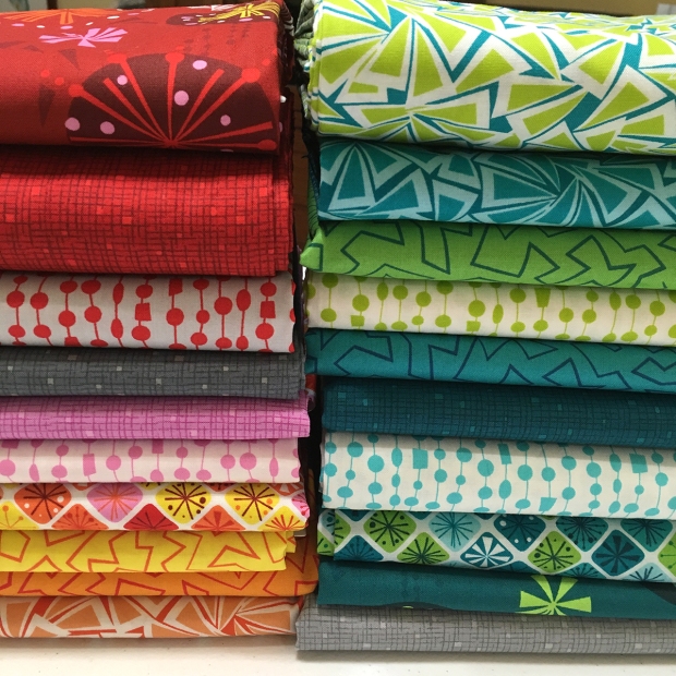
As I head off to quilt market later this week, I’m excited to introduce my third fabric line – Abstract Garden – from Benartex Contempo Studio. It mixes well with my other two lines, Fandangle and Modern Marks, but it features all new prints and some new colors, including purple!! It will ship to stores December/January.
Abstract Garden was inspired by my love for gardens, even though I have a hard time keeping anything alive!! I prefer abstract, geometric designs to realism so you won’t even find an actual floral print in any of the designs, yet they evoke things you might find in a “real” garden: Raised Beds, Trellis, Blooming Roses, Picket Fences, Tracks, and Seeds.
I created this collection of 20 prints divided roughly into color groupings of red/pink, yellow/orange, blue/purple, and teal green. It includes a total of 6 different prints with a few lighter hues to give a bit of sparkle to any quilt or fabric project you’d like to make!
Raised Beds
This large scale print incorporates elements of the other prints in a really cool, graphic layout. This print is perfect for quilt backings, borders, bags, clothing, and and other projects where you really want to show off the fabric. It comes in two colors – orange and purple.
Trellis
This is my version of a “modern plaid” – asymmetrical and a little bit irregular, but full of color and movement. It’s also reminiscent of one of my favorite walking foot quilting designs that I like to do – wavy plaid. Each of the “squares” measures about an inch and it comes in three colors – red, orange and blue.
Blooming Roses
This is definitely my favorite print of the group, inspired by one of my favorite machine quilting designs, swirls! I really wanted to make this print in every color of the rainbow, but I had to stop myself at five colors – fuchsia, orange, green/aqua, blue, and purple.
Picket Fences
This is my other favorite print of the group! I originally came up with this design back when I was creating my first line, Modern Marks. I couldn’t make it work with that line, which is why I’m thrilled that I was able to tweak it and include it now with Abstract Garden. It comes in three colors: fuchsia, mustard, and green/aqua.
Seeds
I love dots! But rather than going with the standard polka, I wanted my dots to have some personality and work with the theme of the collection! Seeds features splotchy spots on a colorful background in three different hues: red, yellow and turquoise.
Tracks
Of course you are going to find tracks in your garden! But what kind of tracks? Are they bunny tracks? Tire tracks? Your imagination is the limit!! I needed a few lighter prints to soften up the line and am pleased to offer it in four colors: pink, light green, light blue and light purple.
Show Your Work
Now I’m excited to see what folks start making with my fabric! It will be hitting stores this December so be sure to ask your local quilt shop to contact Benartex to place an order. Be sure to use the hashtag #abstractgardenfabric on social media so I can see what you create!
Today I thought it would be fun to share a little bit of my fabric design process for Fandangle. The line includes 6 designs in multiple colorways so I’ll take you through the design process of 3 of them. (When my first line, Modern Marks came out, I shared a bit of my process along with some some of the rejects, and that got a lot of interest. Read about that here.)
For Fandangle, I knew that I wanted it to coordinate with Modern Marks, but still stand on its own as a separate collection. In fact, as I was working on the line, I scattered some of the in-process paper swatches onto my Modern Marks Rainbow Taffy quilt, just to make sure they’d look good together:
If you look closely, you’ll notice that the orange, yellow and green tone on tones are not the final versions I ended up with. Read more about those “rejects” below!
Whenever I design a line, I start with a concept and a rough color palette. When inspiration strikes, I can see what I want in my head, but the hard part is technically getting that into the computer to form a proper repeat. Fortunately, I work with a fabulous stylist and graphic designer at Benartex who can help translate my ideas into reality. I thought it would be fun to walk you through the design process of three of the prints so you can see how they evolved.
Evolution of Baubles and Bits
This print was the hardest to finalize and the one that took the most work. I knew I wanted to create a fun, funky medallion that would almost read as a floral. So we started with the basic medallion shape. You’ll notice that colors and designs change quite a bit during the process. First I finalize the shapes, and then the colors. So any in-process and designs and hues are always just placeholders.
First Try:
Second Try:
Third Try:
Final Design:
Isn’t it fun to see how it evolves? Of course there were a lot of intermediate steps in between each image involving more sketches, lots of cutting and pasting, and the painstaking decisions to add or remove colors that didn’t work. Did you notice that I cut the purple? It just didn’t work this time around (although we were able to work in some nice pink and lilac). But don’t worry, purple will work its way into my fabrics in the future – I promise!!
Multiply these design and color changes by each print and color in the line and you can see what an involved process fabric design can be!
Triangle Trinkets Design Process
This print was a lot quicker to finalize. It began with a simple line-drawing sketch of my arrowheads quilting design in several different arrangements.
Original Concept:
Then we put the designs into the computer and tried different color groupings and design layouts to see what worked. The teal colorway was one of my favorites, but I thought the stripe arrangement below was too directional.
Good Color, Bad Layout:
Final Design:
Once the design was finalized, we recolored them in a dozen different colors that coordinated with the rest of the prints. It was hard to narrow it down to the final three colors I included in the line, but sadly, I knew I couldn’t include them all!
Paper Cuts – the Tone on Tone Blender
This print was one I felt strongly about from the beginning. I knew exactly what I wanted but it took awhile to get there. Again, I started with a simple pen and ink sketch on paper, inspired by another one of my favorite free motion designs – jagged stipple.
Design Sketch:
The design team at Benartex wasn’t so sure it would translate well as a design, so we tried a couple other things first that I ultimately rejected. First of all, we revisited the boxes print from Modern Marks with a different take on the design.
Boxes Blender:
Nice, but nope, that wasn’t it. It turned out very nice but was too close in concept to the boxes design from Modern Marks.
Loops and Strings:
We tried something that looked like loops and strings, again based on one of my free-motion quilting designs. This print would have worked well, but it wasn’t what I wanted.
Jagged Design – First Try:
Finally, they were willing to let me try the jagged, edgy design that I really wanted with this line. The first iteration was a little too dense for my taste, so we spaced it out to give the design a little more breathing room.
Final Tone on Tone Design:
It was worth all of the time and effort we put into this print! After the design and scale were finalized, the hardest part was naming it. “Jagged Stipple” didn’t really go with the other design names inspired by the idea of ornamentation and embellishment.
So I finally renamed it “Paper Cuts” because that sounded cutesy and crafty. The irregular jagged lines reminded me of small cuttings of paper. I almost named the print “scherenschnitte” which literally means “scissor cuts” but I knew people would have a hard time trying to pronounce that word it, let alone spell it, LOL!!
Of course, once the prints were finalized as digital images, it took me nearly as long to come up with quilt patterns to showcase the fabrics effectively. Designing quilt patterns is a very similar process for me as fabric design: I start with an initial sketch, and tweak it until it feels right. All of this work was finalized before I even received fabrics to work with. It’s a long process for sure, but I enjoy every minute of it!
Fandangle Finalized
I hope you enjoyed seeing this peek behind the curtain of how one designer’s process evolves. I know it’s different for each and every fabric designer, but so far this process has worked very well for me. I went through a similar process described above for all six prints in the line, but it was worth it to create a collection I love!
In fact, as I write this, I’m developing additional concepts, sketches, colorways, and ideas for future fabric lines. I’m starting to get the hang of how things works which each new collection I create, and it’s been such an incredible journey. As long as you all continue to love them as much as I do, I’ll have more to share in the coming months – so stay tuned!
The latest issue of Modern by the Yard was just published by Benartex. It’s a free quarterly online magazine published to help promote their fabric collections and it always features lots of amazing designs.
My friend Vicki from Orchid Owl Quilts designed and made this gorgeous quilt, Teal Appeal from Fandangle, which is featured on the cover. Isn’t it gorgeous?
The pattern includes a complete materials list and step-by-step full color illustrations. I think it’s so clever that Vicki chose the teal confetti crosshatch print as the background. I’ve really been enjoying seeing what other designers have been making from my fabrics. It’s always fun to see how folks combine the prints and really make them sparkle!
Free-Motion Inspiration
In the issue, there’s also an interview with me and fellow fabric designer Amanda Murphy about how our machine quilting designs often influence our fabric lines, so be sure to read about that, too!
There’s also a really fun block-study in the ezine called “Modern with a Twist.” Three designers are each challenged with putting a modern spin on a traditional block and this issue’s block is the drunkard’s path.
Chris Dodsley came up with this really cool variation that showcases some of the cool-colored Fandangle prints. She even went the extra step and created a fun layout which she talks about more in depth on her blog -click here to see more.
Block Study – Drunkard’s Path
I hope you check out Modern by the Yard from Benartex. I love that they offer a source of inspiration to make fun things from their fabrics, and can’t wait for the next issue!
Please know that there are many, many more stores that carry my fabric – these are just the shops that I personally know about. Also, since the line has now been out for about a year, some shops may be sold out – so check with them for current availability.
If you see my fabric at any shop not listed below, please leave a note in the comments and I’ll be glad to update the list!
If the shop sells online, their name below will be a clickable link.
Copy and paste each shop name into google for additional contact info and/or website.
It’s so fun to think it was just a year ago that I released my first fabric line and my second one is in stores now. It’s been wonderful to work with Benartex (Contempo Studio) and they’ve given me wide latitude to design what I want – fabrics that I would actually put in my quilts!
I recently got the notice that Modern Marks is on its last print run which means that once Benartex sells out of their current stock, that’s it. So I went ahead and grabbed a bit of everything left in stock to share with you all in 2 yard increments for just $18 each (plus shipping.)
I also grabbed enough for my personal stash so that I’ll be able to use it in future quilts, too!
Modern Marks Fabrics Available for Purchase
As of today, here’s a list of prints that are still available, first come first served.
I’m happy to ship internationally and can fit up to 8 yards in a priority mail flat rate envelope. (Just leave me a note on your order to refund any excess shipping charge if applicable.)
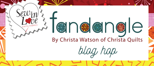
Exciting news! I just got word that Fandangle fabric stars shipping to stores this week, so those the pre-ordered fat quarter bundles and kits should from me should be getting them soon!! In other fun news, this week also kicks off the fun and inspiring Fandangle blog hop over on Benartex’ blog: Sew in Love with Fabric.
Today starts with an introduction of the fabric line over on the Benartex blog along with an interview I gave explaining some of my thoughts and inspiration behind the collection. Tuesday through Friday, nine talented designer friends will be sharing the projects they made from my fabric. Saturday will wrap up with a virtual trunk show of my patterns featuring Fandangle, again over on the Benartex blog.
There will be prizes and tons of beautiful projects!
Each of the stops will include a winner who will get a prize pack of 8 assorted Fandangle fat quarters (US shipping only due to high shipping costs.) So be sure to scroll to the end of this post for the complete schedule and bookmark each stop for your chance to win!
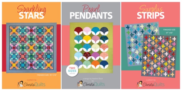
And to make it even more exciting – I’m throwing in a bonus prize bundle, too. I’ll choose 3 winners who will each win a bundle of my three newest patterns: Sparkling Stars, Pearl Pendants, and Surplus Strips. Of course, these patterns will look great in any fabrics you choose!
To enter leave me a comment letting me know if you prefer PDF patterns, or print patterns – or both!!
US winner swill get their choice of PDF or print version. International winners will receive the PDF version. I’ll choose 3 random winners on Saturday at the end of the hop and announce their names here on the blog on Monday.
I’m so excited to see what everyone makes from my fabric! Be sure and use the hashtag #fandanglefabric on socila media so I can see what you’re making, too!
Modern Marks was my first fabric line that I designed for the Contempo division of Benartex Fabrics. They released in September of 2017, and because Benartex reprints fabrics as long as they are selling, most of them are still available. Although I’m now promoting my second fabric line, Fandangle, (which ships to stores this month), I realized that I need to archive all of the Modern Marks prints in one place so that I can link back to them as needed.
Modern marks was inspired by many of the marks I like to make – whether by hand or machine. Several of them are based on machine quilting designs and they all incorporate graphic geometry which I love so much! I wanted them to work well when cut up into quilts and add a spark of color to any project.
Modern Marks
The main print comes in four colors: Red, Orange, Lime, and Turquoise
The namesake print is mashup of many of the coordinates, and even includes a few motifs which didn’t make the final cut of the collection. I’m definitely revisiting some of the shapes in future fabric lines as my goal is for all of my fabrics to work seamlessly between collections.
Half Ovals
Half Ovals comes in four colors: Dark Fuchsia, Orange, Light Turquoise and Teal
I knew I wanted to include a “dot” print in this line but wanted it to be more interesting than the standard polka dot. I also wanted to make sure that with this coordinate, it would cut up nicely no matter which way you rotated the print.
Herringbone
Herringbone comes in four colors: Red, Lime, Jade, and Navy
This print is one of the blenders in the line that’s based on one of my machine quilting designs – a simple zig-zag. The beauty of fabric design is that the lines don’t have to be continuous like my machine quilting is!
Boxes
Boxes comes in three colors: Light Blue, Cream/Lime, and Light Orange
Boxes is based on one of my favorite modern machine quilting motifs of the same name. The quilting design is a continuous/allover design, but I wanted the print to not be so obvious that it was a quilting design, so the squares are less dense than the quilting design with just a few of them overlapping. These fabrics also read a little lighter so that they can provide contrast to the darker, bolder prints.
Crossmarks
Crossmarks comes in five colors: Pink, Gold, Green, Turquoise and Jade.
This is the simplest print of the bunch but very effective. It serves as the blender, basic, or tone-one-tone of the group.
Quirky Triangles
Quirky Triangles comes in three colors: Pink/Orange, Green/Blue, and Navy/Blue
I knew I wanted to include a triangle print but something a little more unexpected than the usual tossed triangles. Adding a pop of color emphasizes the asymmetry and irregularity of the print which I really like.
Crosshatch
Crosshatch comes in three colors: Tangerine, Light Lime, and Royal
Crosshatch is another basic/blender print. Adding the random pops of filled in squares gives it a little more quirkiness and originality to your basic crosshatch/plaid design.
The full Modern Marks line includes the 26 prints I designed above, plus 5 coordinating Color Weave basics in Cobalt Blue, Fuchsia, Citrus, Kelly Green, and Electric Blue.
I hope you’ve enjoyed this trip down memory lane for my first collection. Click here to see current list of shops that carry my fabric and feel free to email me if you know of a store that carries it that’s not on the list. I’ll be glad to add them!