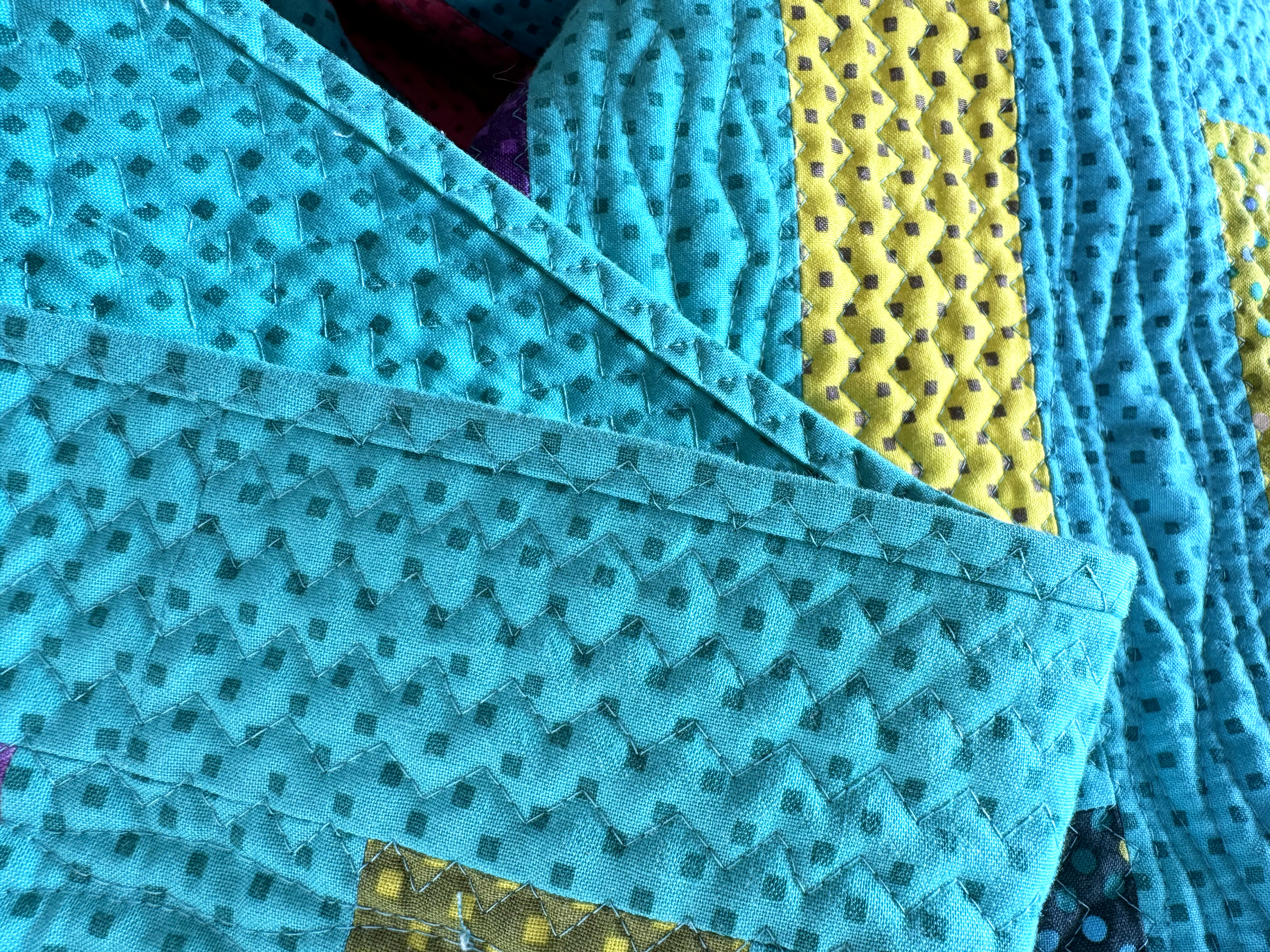
This week we are practicing more decorative stitches with our walking foot. Any traditional “straight line” design be modified for this technique. Watch and learn below:
Quilt This Design on a Real Quilt!
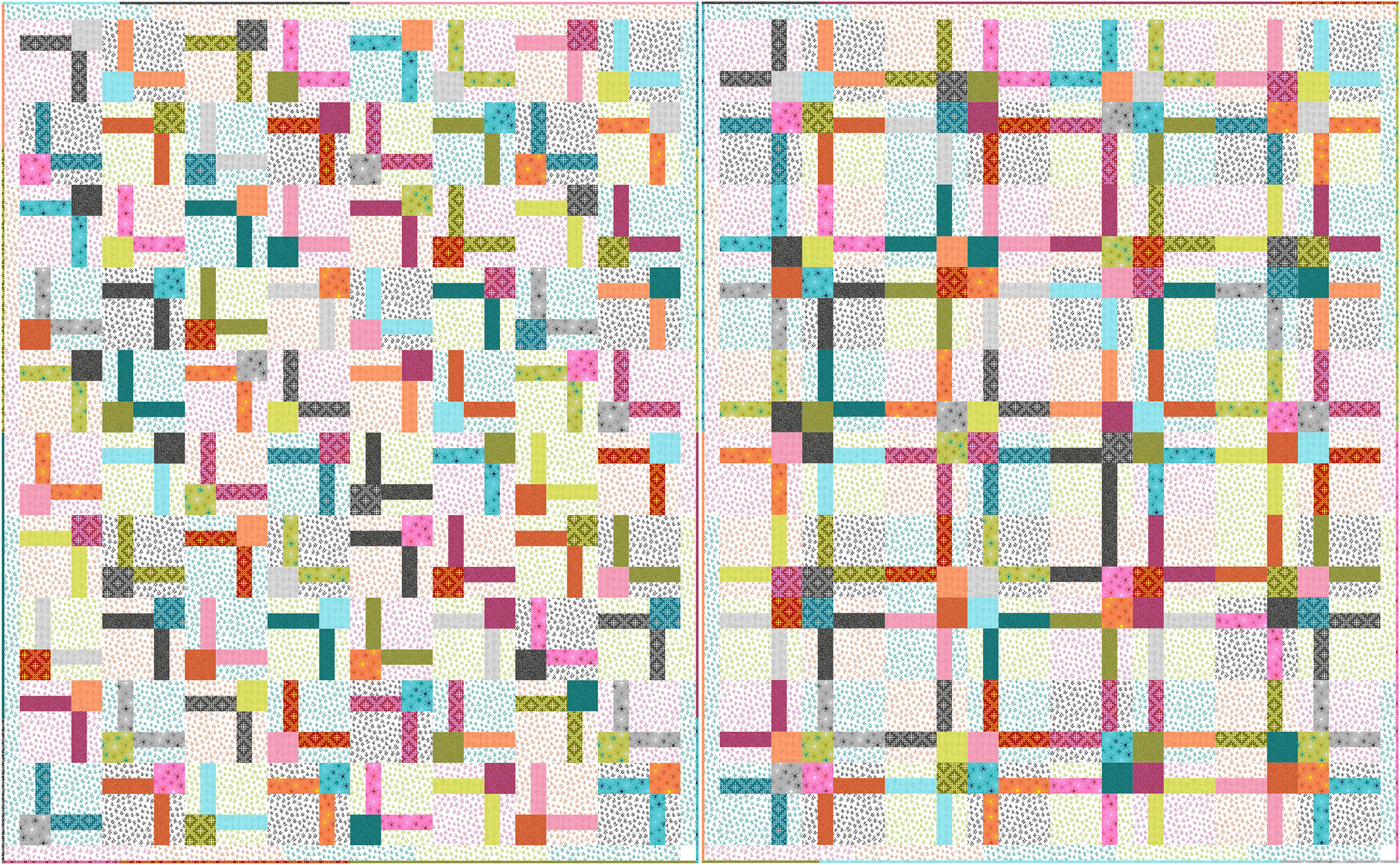
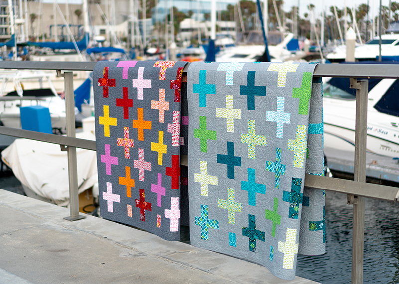
Practice quilting decorative stitches on Ticker Tape! I have several colorways of this kit available (while supplies last). It’s made from one jelly roll of Dazzle Dots with a colorful background.
I even used decorative stitches on the binding, too! It’s a fast way to finish and the binding stitches become part of the overall quilting design. I love paring decorative stitches with other walking foot designs like wavy lines.
Bonus Video – Watch Me Quilt 2 Versions of Ticker Tape
I put together a video showing how I quilted two different colorways of Ticker Tape. I will usually make the same quilt more than once, just to try out different machine quilting ideas.
Did you know that any walking foot design can be quilted with decorative stitches? It’s a great way to add incredible texture to your quilts! Check out my latest free video tutorial below and give it a try!
After practicing on smaller samples, it’s time to try these designs on real quilts! Below are two bonus videos to watch for free. First, try out those decorative stitches I’ve shown above on my Bling quilt made from Stitchy fabrics:
While supplies last, you can grab the kit to make Bling from either my Stitchy fabrics as shown in the first and second videos above, or Dazzle Dots, shown in the bonus video below.
Here’s another bonus video, showing how I quilted Bling using other walking foot quilting designs I’ve shared in previous tutorials. And don’t forget to checkout my playlist showing how I quilted these designs on real, full sized quilts!
Did you know that one of the easiest ways to change up your free-motion quilting is to stitch the design with wavy lines? That’s what I’m showing in my latest video. Watch and learn below:
If you are looking for fun quilt patterns to practice your quilting skills, check out my printed patterns. They are all on sale now for way less than the regular price.
Let me know how your free-motion practice is coming along. I still have many more videos to share! I’ve you want to see them all, be sure to subscribe to my YouTube channel. It’s totally free to watch! Then catch up on my 99 Machine Quilting Designs play list while you are there!
In this week’s episode of 99 Machine Quilting Designs, practice free motion quilting more “shapes on a stick” like Balloon Shapes and Shish Kebabs. Click below to watch and learn:
I made this quilt before I started making video tutorials, but it’s a great one to practice these designs! The Block Chain quilt pattern includes a quilting plan showing you how and it’s perfect for your favorite charm packs!
Right now, my Gridwork charm packs shown in the quilt above are on sale for way below the retail price. I’ve also reduced the price of many of my earlier fabric lines, and they are only available while supplies last!
As you practice your machine quilting designs on samples, or real quilts, be sure to share what you’ve made over in my Christa Quilts Group on Facebook. Fellow members and I would love to cheer you on!!
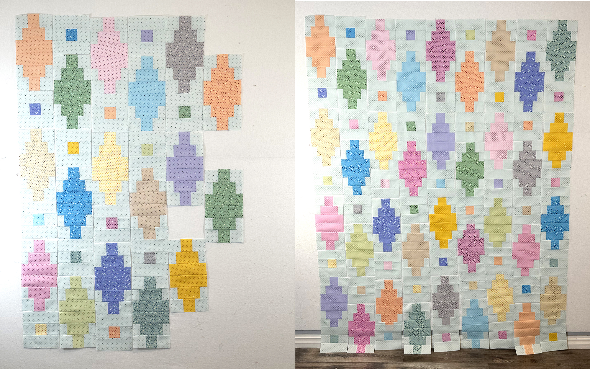
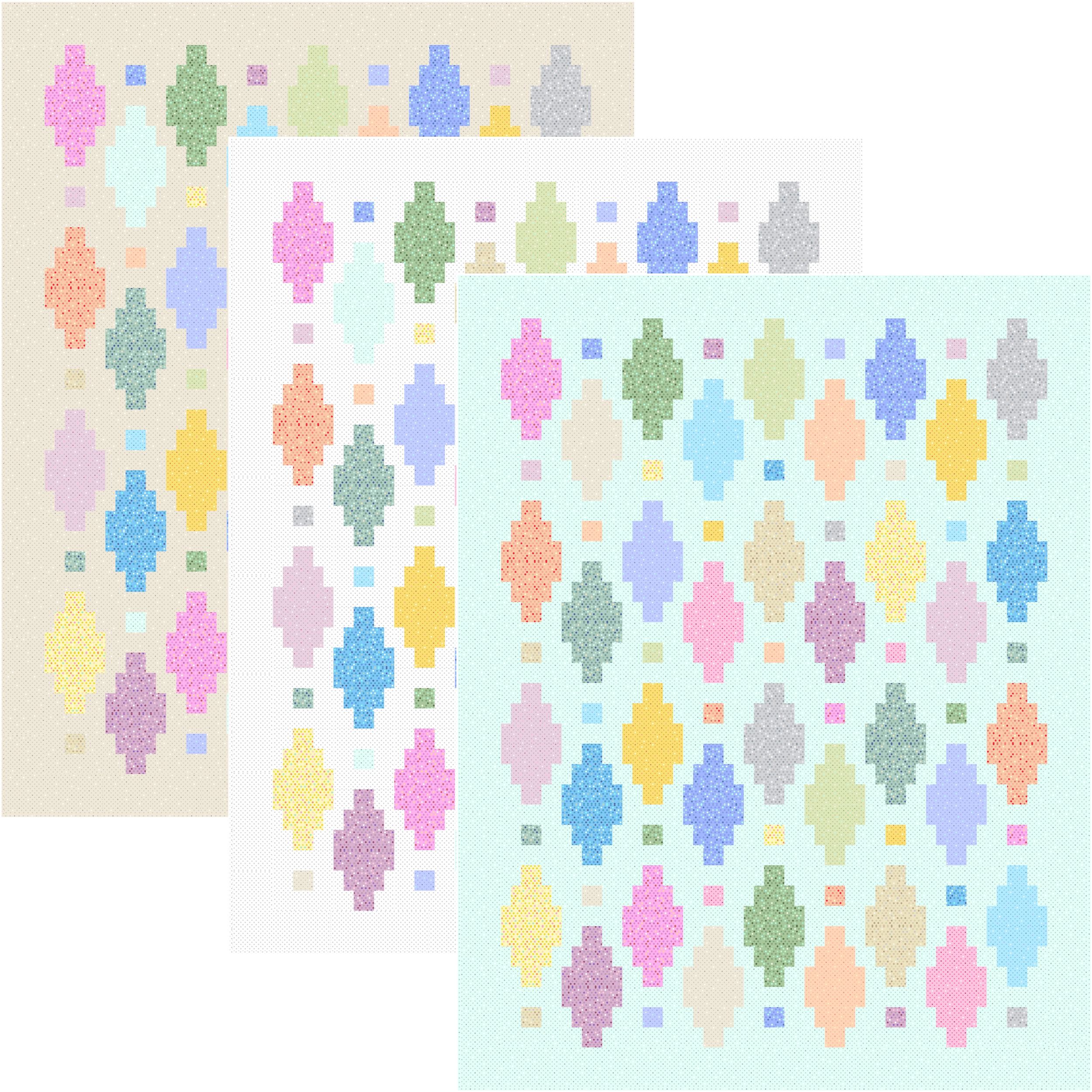
How are your Beaded Lanterns quilt blocks coming along? It’s time to sew them together to create the quilt top! If you are just now finding the quilt along, be sure to grab the Beaded Lanterns free quilt pattern to join the fun!
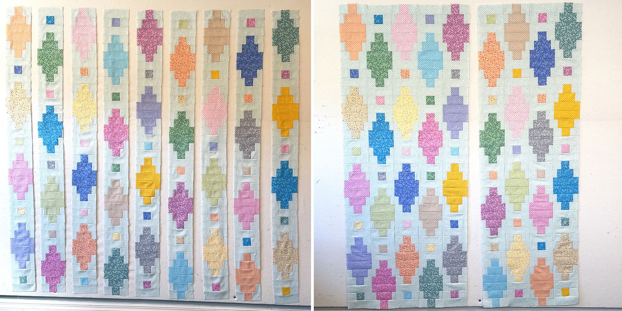
To start things off, I like to lay out my blocks on a design wall. Then I’ll spend time arranging them into a pleasing order. I usually take a picture with my camera phone to refer to while sewing.
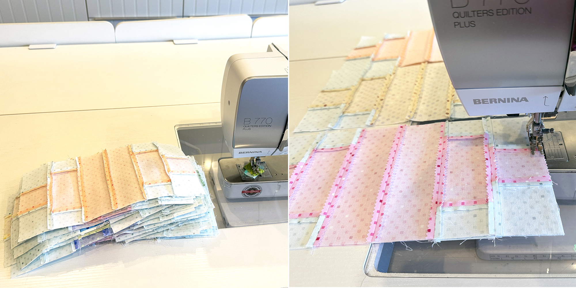
Once that’s done, I’ll make a stack of blocks to sew in order and then chain piece, or assembly line sew them all at once. I always start sewing with a leader/ender piece of scrap fabric to catch my threads. This prevents them from knotting up when I start and stop.
It makes a beautiful mess and I love the feeling of accomplishment!
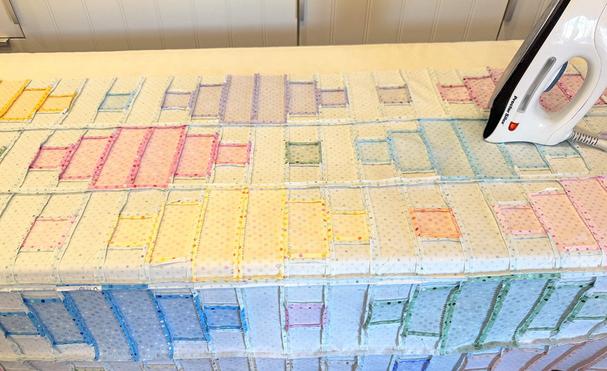
I’ll sew all of the blocks together into rows and then continue using my design wall to lay it out as I join the rows together. I press after every round of sewing to keep things nice and flat.
As you can sew I prefer to press all my seams open. This ensures flat blocks, flat rows, and a very flat quilt top which will make machine quilting so much easier! I sew with a short stitch length (2.0) so that nothing comes apart while handling.
I pin generously as I sew to keep things from shifting. Because my seams are pressed open, I’m not pinning right into the intersection. Instead I will pin on either side of the seams I want to match up and I get really clean joins and matching points this way.
Finally, I add the borders and give the quilt top a final press! Notice the bit of patchwork on the design wall below. I sewed together some leftovers into strip units and I’ll start using those on the back.
Coming up next: I’ll need to piece the quilt backing, baste the layers and quilt the quilt, so stay tuned for more! Click the links below to catch up on any of the previous steps:
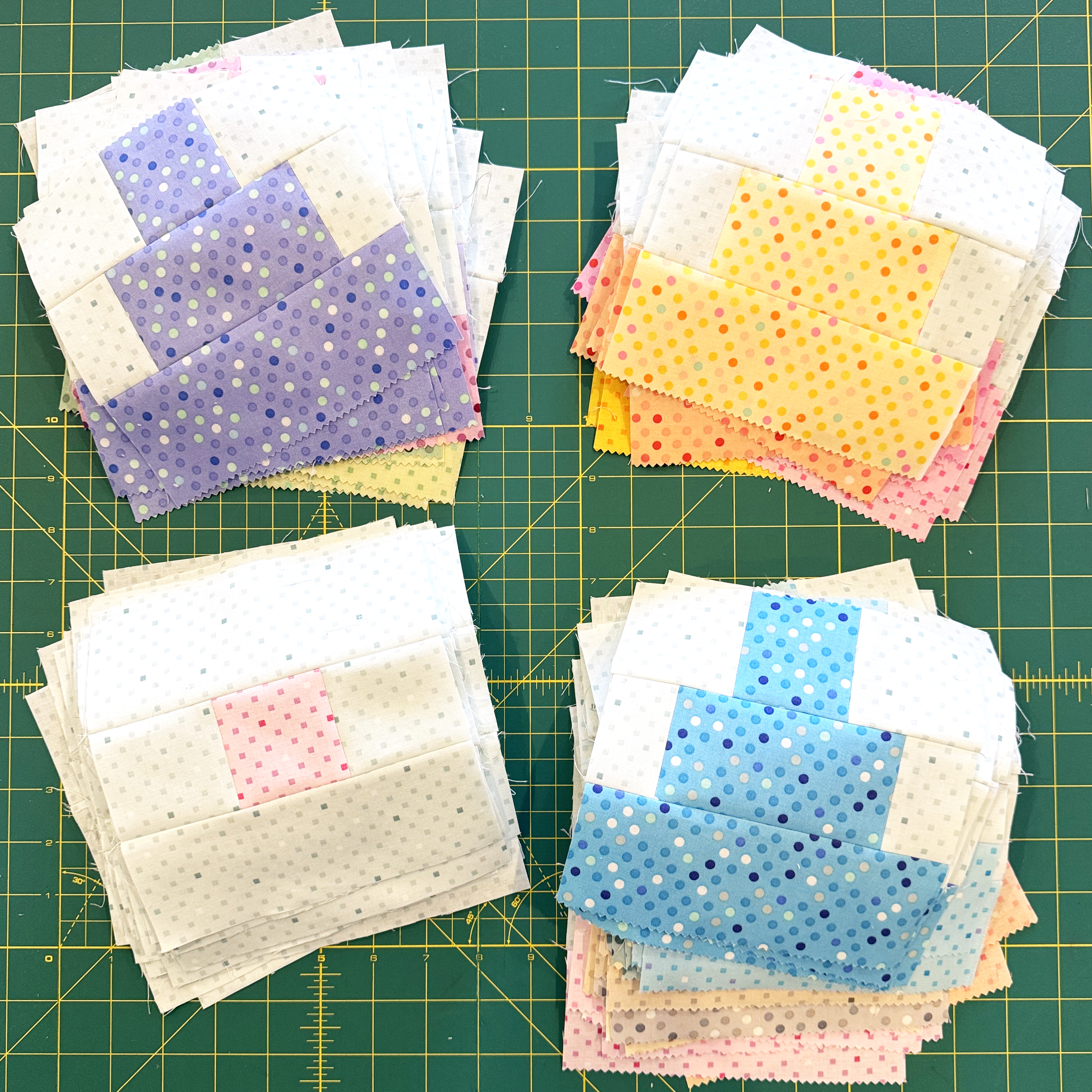
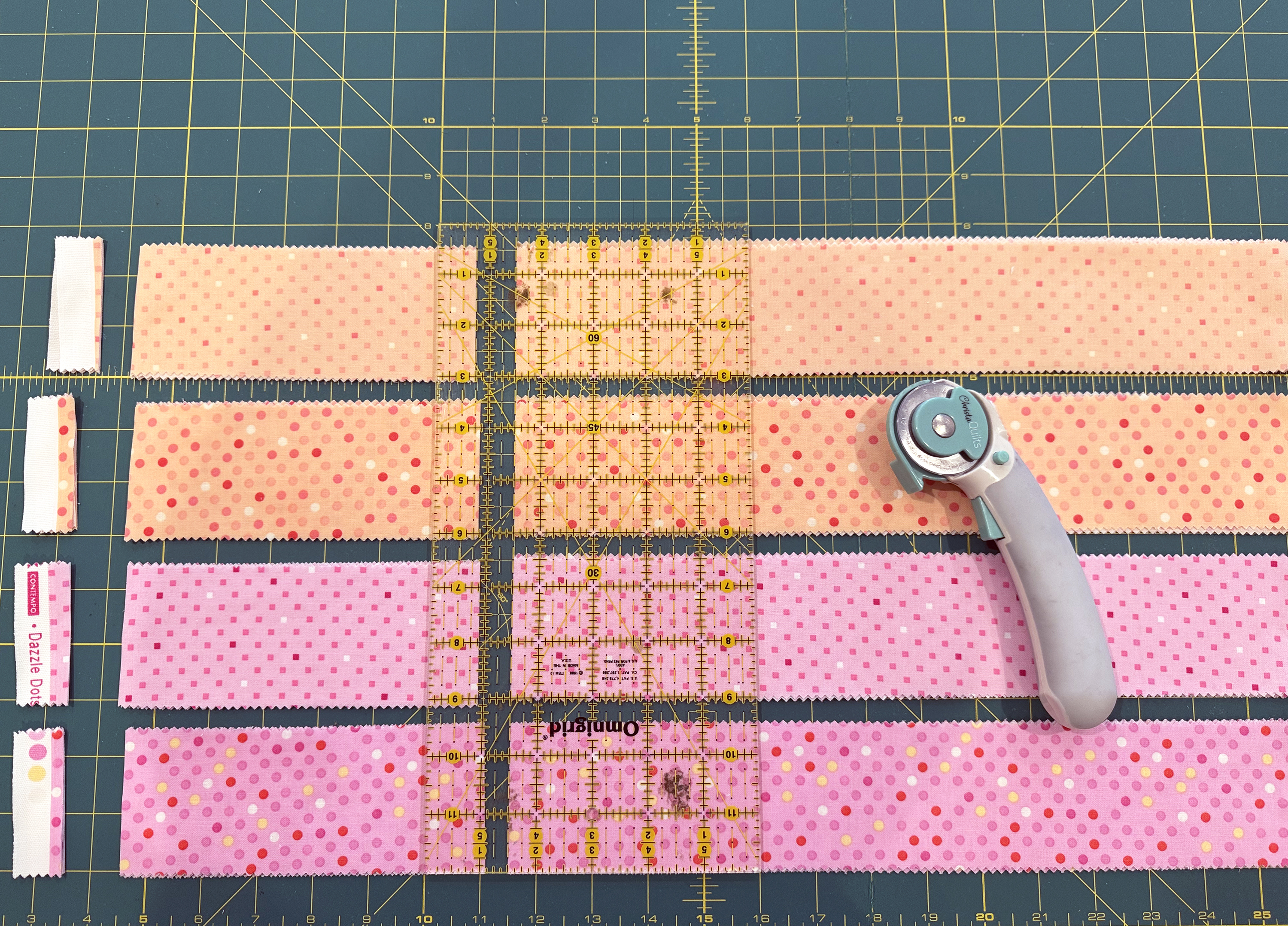
Read through the free quilt pattern for instructions on sewing everything together. To keep the blocks nice and straight I sewed with the light background fabric on top each time. I also sewed with a shorter stitch length (2.0) to strengthen the seams and then pressed them open for incredibly flat blocks.
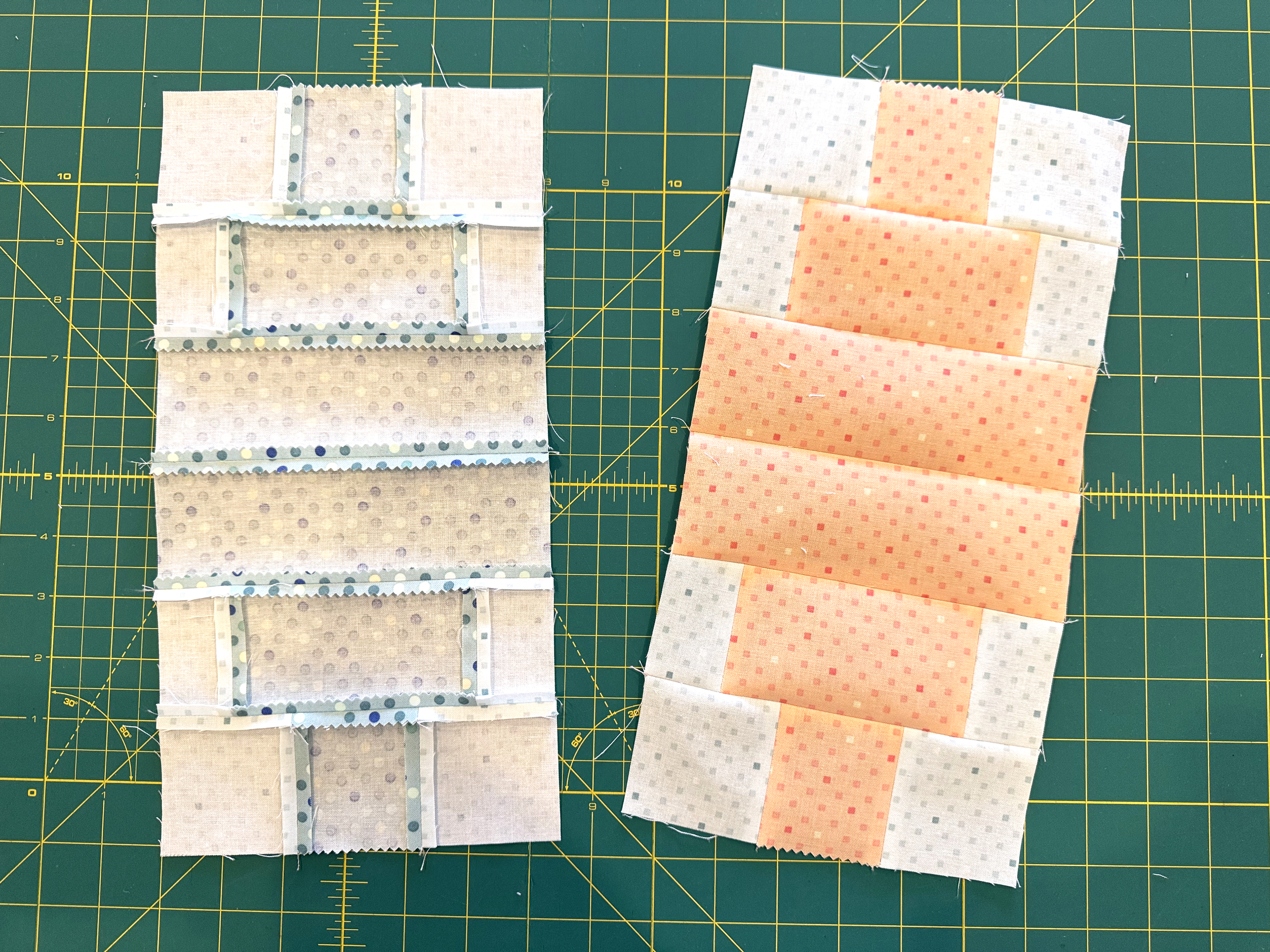
I like to chain sew or assembly line stitch which means slipping each pair of units to sew under the machine and sewing continuously without breaking thread in between. Here’s my first run through after I added the lighter background to the sides of each lantern unit:
I sew as many units together as possible, then cut them all apart, press the units, then continue chain piecing until the entire block is sewn. It creates quite a beautiful mess by the time I’m done but it’s a quick and efficient way to sew!
This block is very simple because it’s two of the same halves sewn together. I used the same fabric for each Lantern unit. But you could absolutely go super scrappy if you wanted to! The trick is to make sure you are sewing with accurate 1/4″ seams so that each unit ends up the same size.
I press each seam as I go and then press the final block front and back when I’m finished. The reason I do this is so that the blocks and quilt top will lie flat for domestic machine quilting. I’m always thinking about how the piecing will affect the quilting and vice versa!
I love having a yummy pile of freshly sewn bocks! Aren’t they pretty?
Don’t forget to make the square blocks in addition to the lantern blocks! If you don’t already have a copy of the free quilt pattern, you can grab it below, along with the optional kit in 3 colorways:
Sew all of the blocks so they are ready to make the quilt top. Share pics of your progress and feel free to ask for any help you need over in my Christa Quilts Group on Facebook!
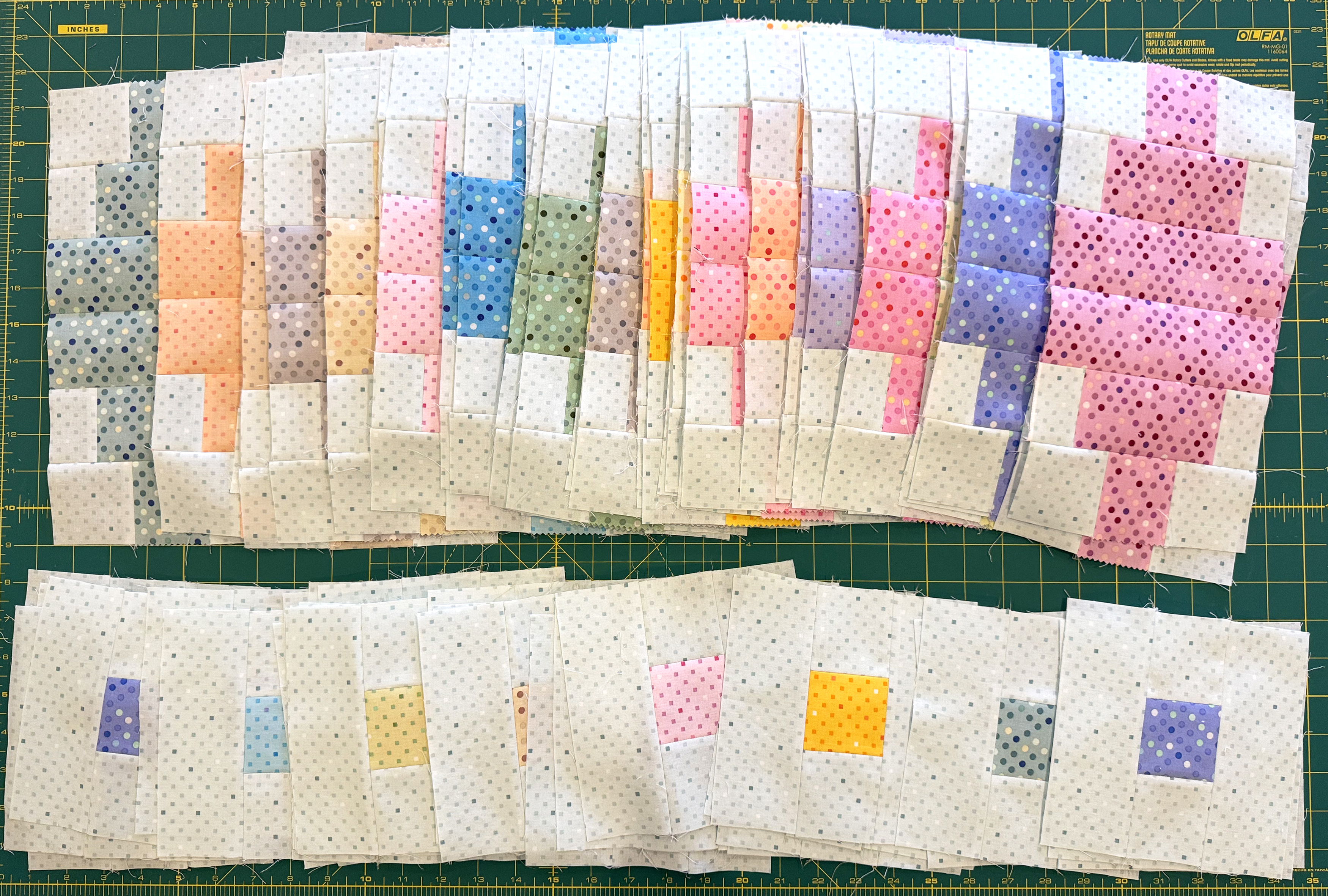
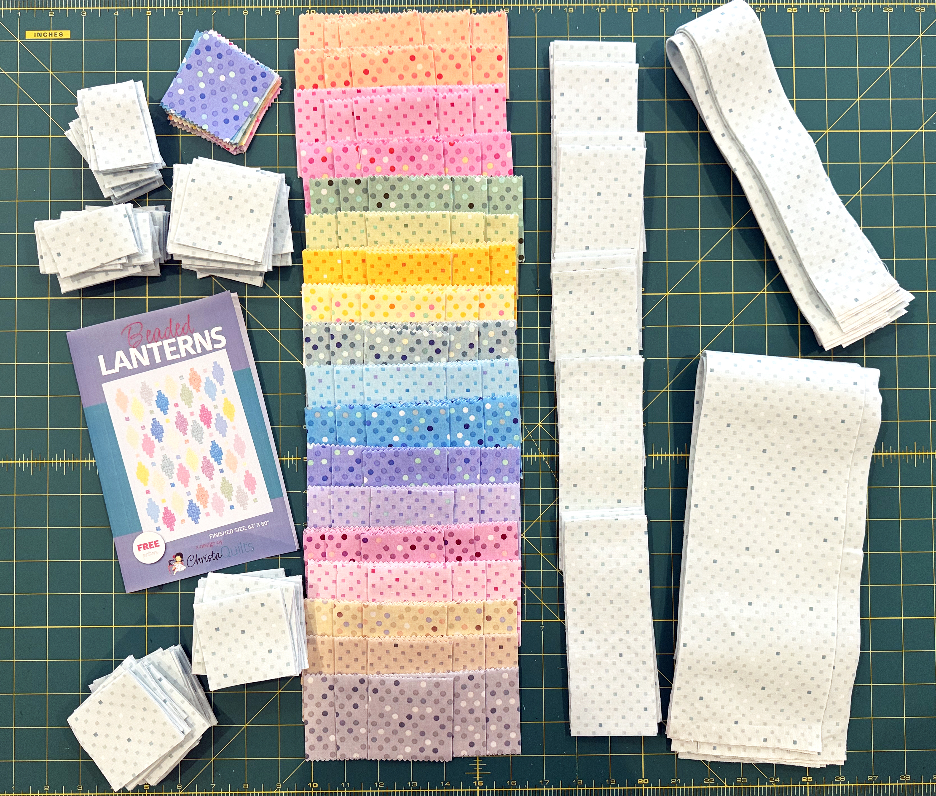
This week it’s time to cut into your yummy fabrics as we begin to make Beaded Lanterns. If you haven’t done so yet, be sure to download my free Beaded Lanterns Quilt pattern to follow along. Now, let’s get started!
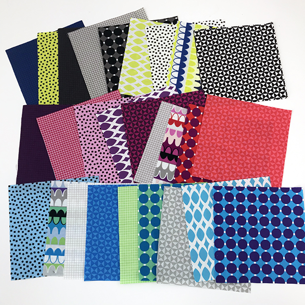
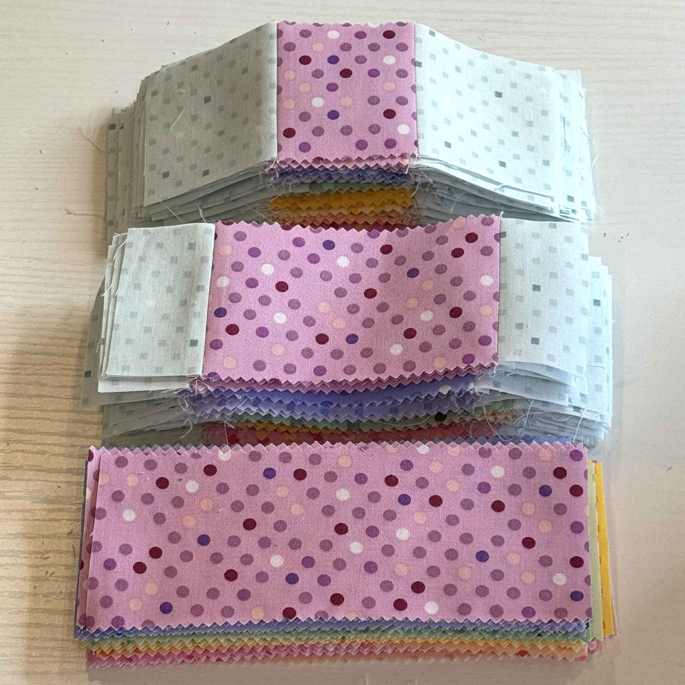
You’ll need a total of 36 precut strips from a standard sized strip roll. Using my Dazzle Dots 2 roll shown above, I took out 2 strips of the ice blue color because it was the same as the background and I didn’t want a “hole” in my quilt. I also took out the 2 white strips since it had the least amount of contrast. That left me with a total of 18 colors, 2 strips of each. Perfect!
Follow the pattern instructions on page 2 to cut out your individual units for each block, plus cutting up the 4 yards of background fabric (which includes the binding). To speed up the cutting, I layered 2 strips of each color (4 layers of fabric), and cut through several stacks of strips at one time.
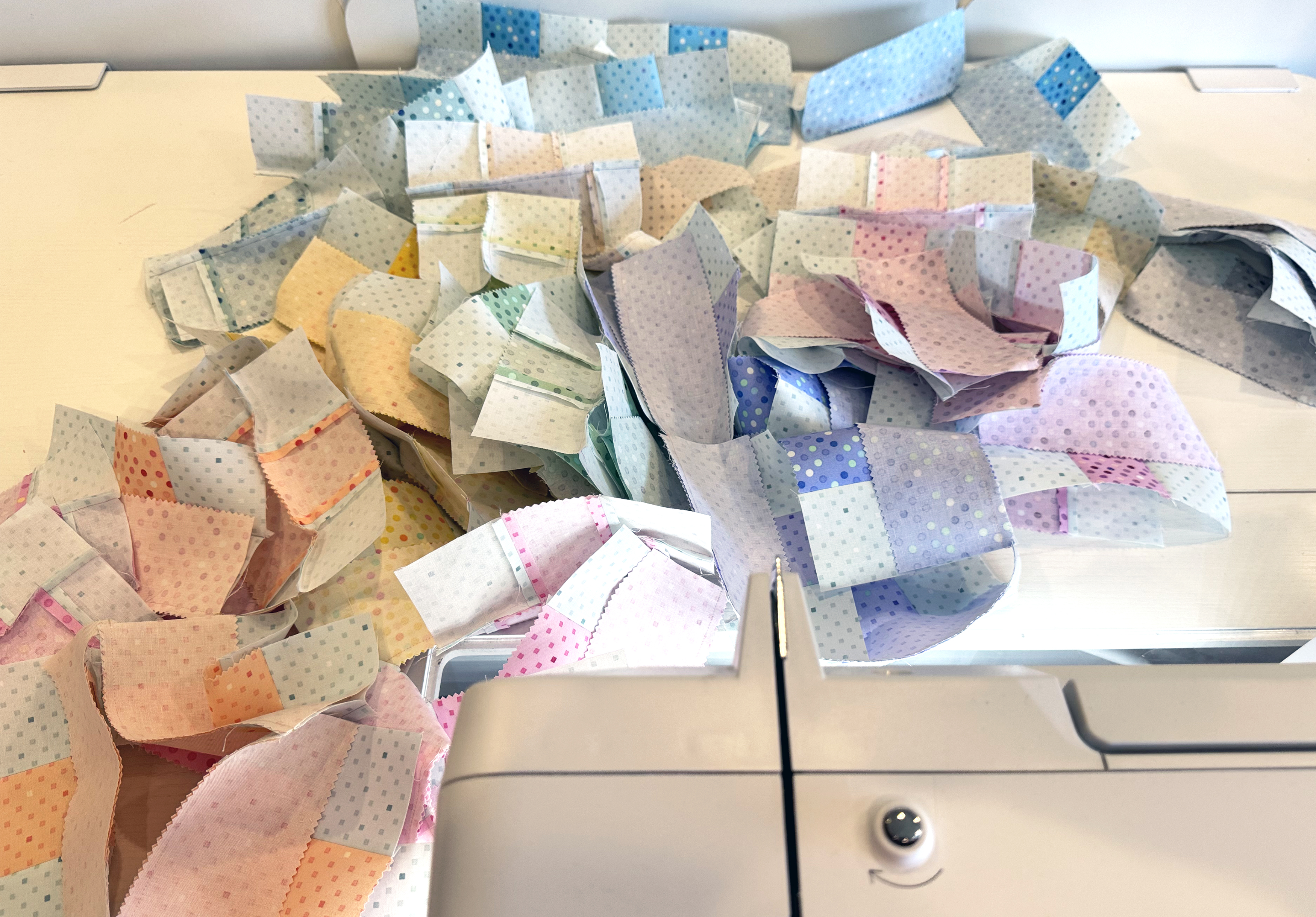
I prefer to cut out all of my units to the correct size first, before sewing. After many years of trial and error, I’ve found that my units are much more accurate this way.
I plan to set aside the leftovers after cutting, and then piece them into the backing. This is totally optional, but it’s a fun way to personalize your quilt!
Ta-Da! All of my pieces are cut and ready to sew into blocks for next week!
Now it’s your turn to share. You can share your work in progress on social media using #beadedlanternsqal. Or you can post pics and ask questions over in my Christa Quilts Facebook group.
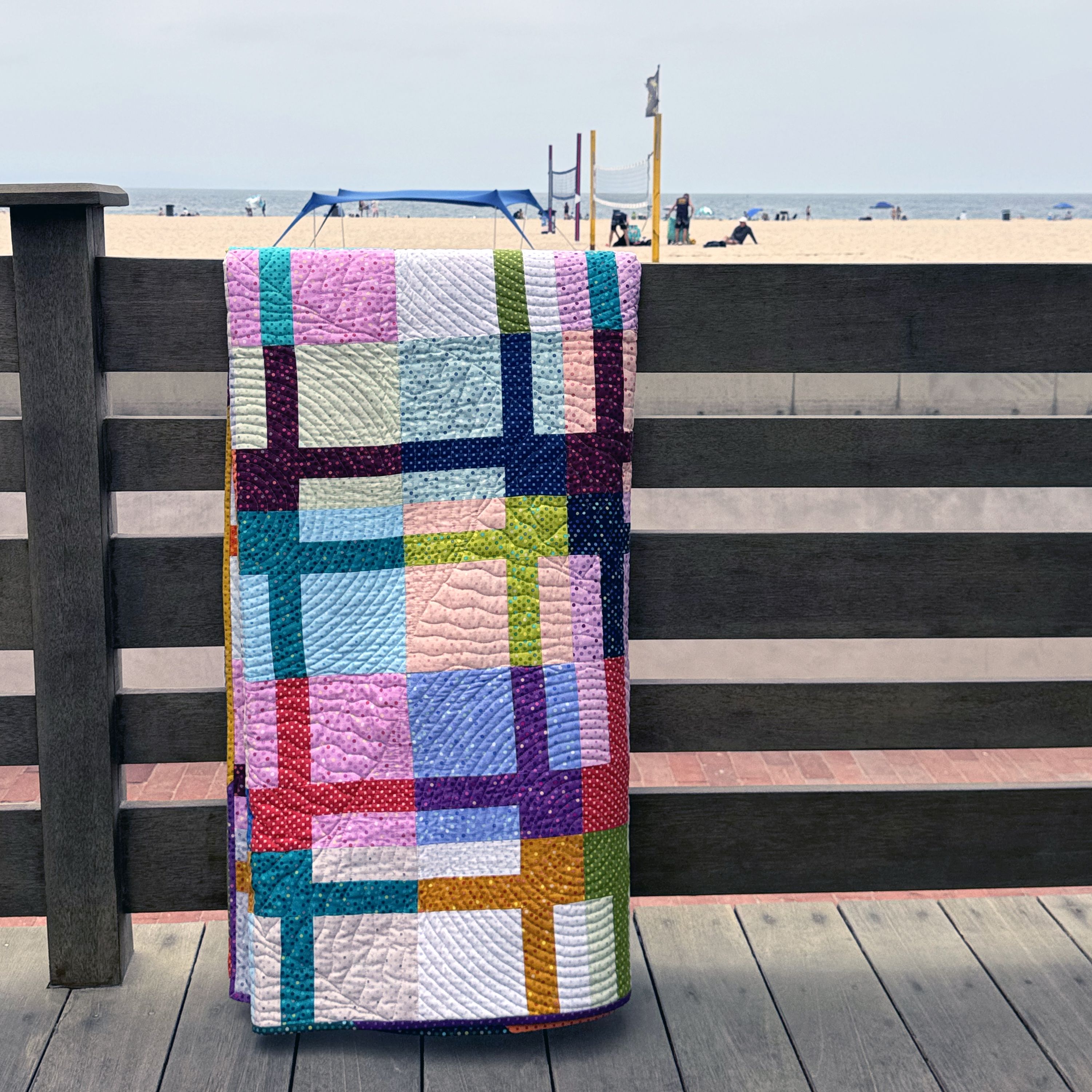
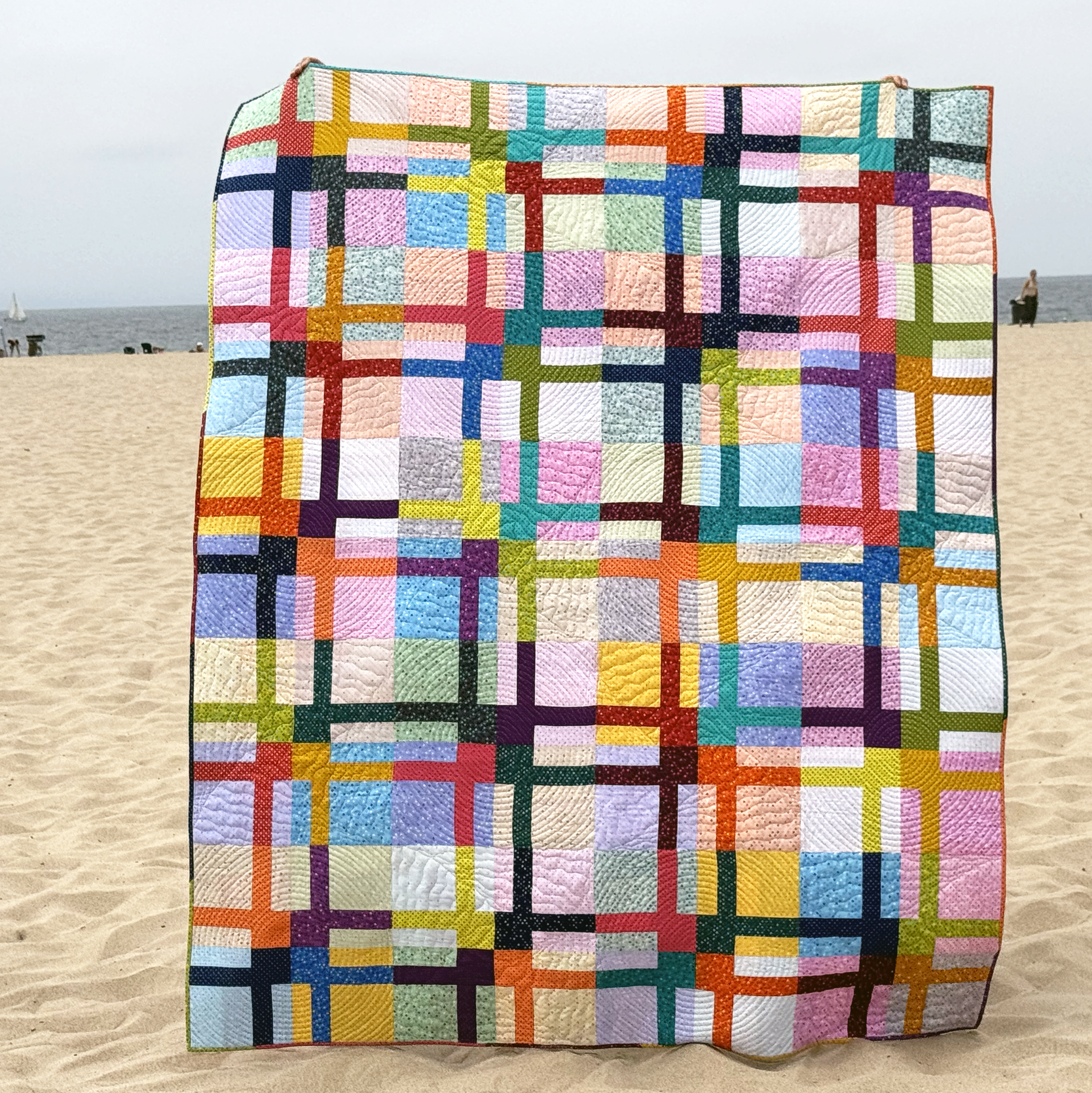
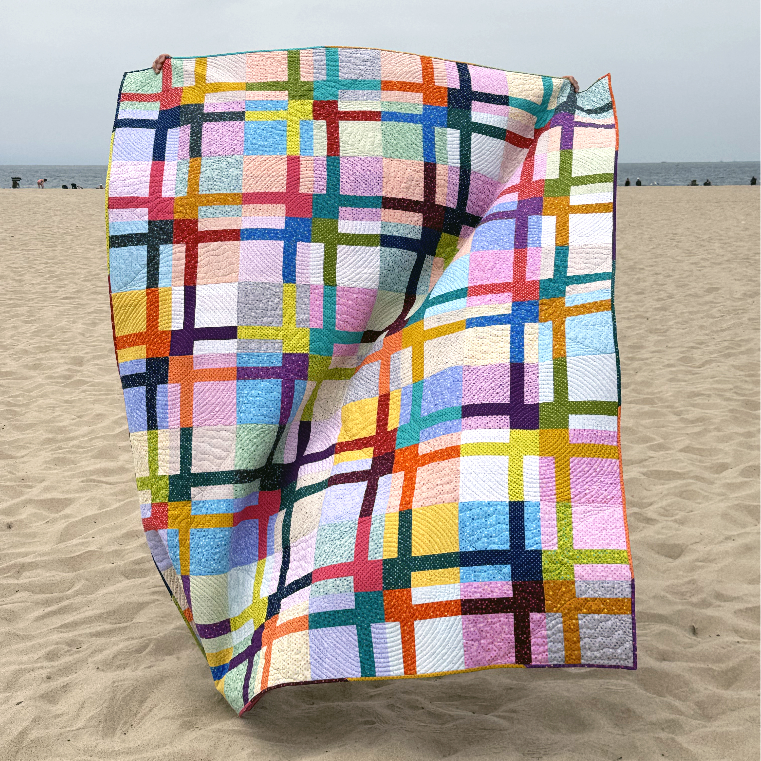
I’m excited to share my step-by-step process for quilting my latest iteration of Bling. This is one of my favorite patterns I’ve made over the years. Whenever I get a new idea for a fun colorscheme or quilting plan, I can’t help remaking some of my most popular patterns! Click below to watch and let me know what you think!
You can choose a similar color story and layout, or you can switch things up and make it your own! The last few times I’ve made this quilt, I chose scrappy backgrounds, but you can also use one fabric for the background and it looks just as good. Hmmm, maybe you’ll want to make more than one like I did??
I always like to kit up a quilt when I make it because I know others will like it too. However, these are only available for a limited time, as long as the fabrics are in print. Enjoy some beauty shots of this quilt that I took while on a recent beach vacation. It was a nice cloudy day, and seeing these pics brings back great memories!
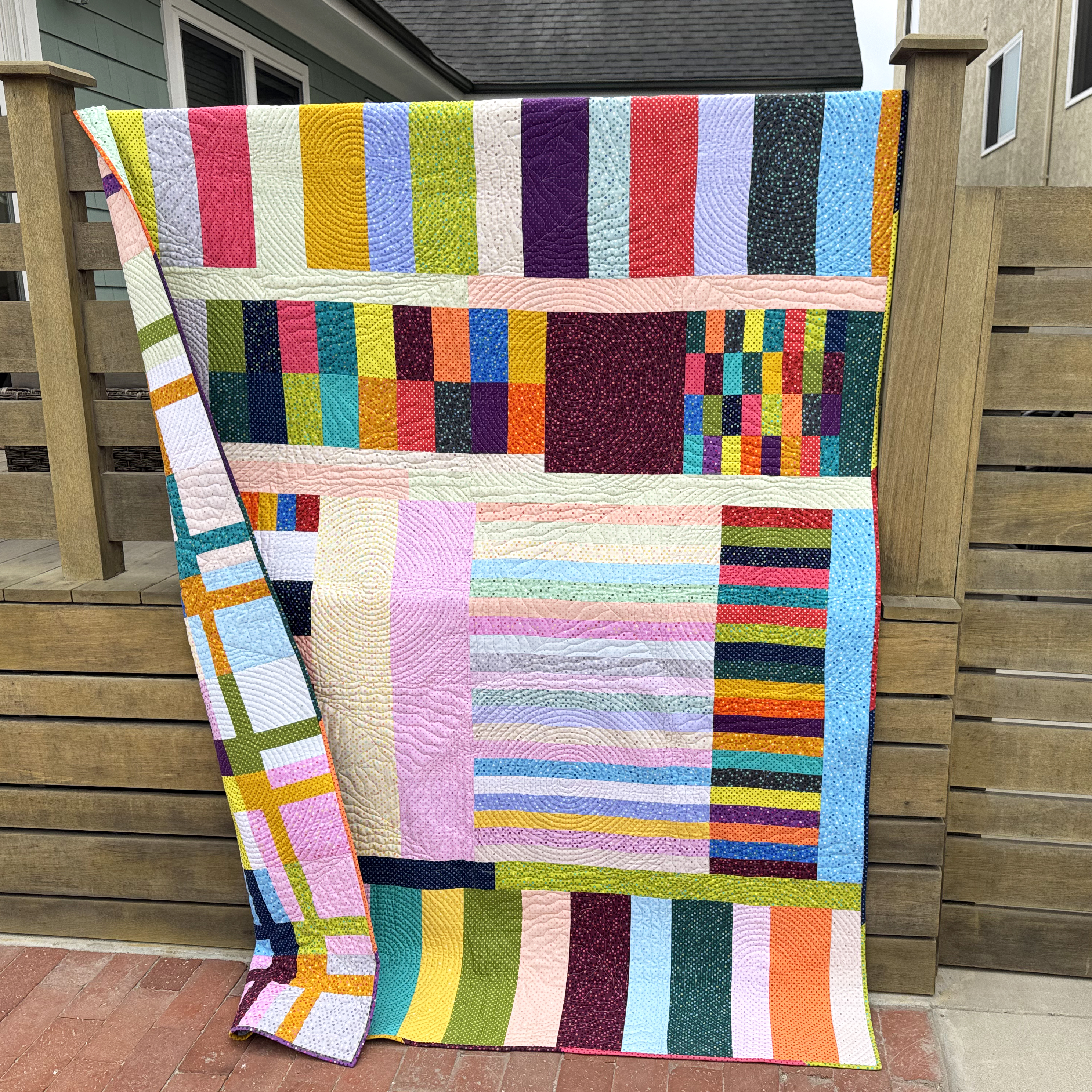
I had just as much fun making the pieced backing and using up a bunch of leftover Dazzle Dots!
This week for 99 Machine Quilting Designs we are learning to quilt Triangle Texture, a design that’s great for modern OR traditional quilts! Watch below and let me know what you think!
Get the Surplus Strips Quilt Pattern or Kit I recently combined 2 motifs – boxes and triangles on the gray version of my Surplus Strips quilt! You can now grab the kit to make this quilt with the gray or white background, or grab the pattern and choose your own colors. It’s fun to make and fun to quilt!
If you’d like to choose your own adventure, grab the Surplus Strips quilt pattern and then rummage through your stash for the perfect colors to make it your own. It’s the perfect design for using up leftover (surplus) precut strips!!
Below are 2 versions I made a few years ago and it looks great no matter what!
In my quest to explore the concept of geometric abstraction, I felt compelled to take a perfectly interesting quilt top and cut holes in it, then inset some circles.
It’s been very liberating to play with color, line & shape, without the need for my design to represent anything concrete. It’s a risky move for sure, but I just couldn’t move forward until I explored this idea.
Below are a few in progress pics while I was inserting the circles. It’s not a tutorial, but it was more of a journal exercise to write down my thoughts while making this top because it was bold and risky move for moe to even attempt to do something like this, LOL!!
First I started by making a sample circle. This obviously was not going to go in the quilt and I just grabbed some scraps I had lying around to test the technique (ahem… you may see more of these fabrics shown in the circle a bit later this year… just saying!!). I pinned it to the sewn top to see if the scale looked right.
The basic idea is to cut your focus circle 1/2″ larger than your finished size. Then cut a circle into the background that’s 1/2″ smaller than your finished size.
I wanted 12″ finished circles so I drew out 12 1/2″ and 11 1/2″ circles using EQ8 and printed them out on paper, then taped them together. I know there are templates and rulers for this, but since this is all one big experiment I just used the supplies I had on hand.
The hole in the peach background was cut 11 1/2″. The lilac circle was cut 12 1/2″.
By creasing both units you can match up the 4 quadrants and then sew with the background fabric on top. The hardest part is pinning the circle to the background. I used a million pins! There are tons of tutorials on youtube, google, pinterest etc. showing how to insert a circle into a block, using lots of different methods like using freezer paper, glue, etc, but I just went old school with pins.
It’s also super important to heavily press the back and front until it lies flat. With the successful test block complete, I was ready to dive in and start adding circles to my quilt.
I created a bunch of low volume improv units – way more than I needed, but I set aside any leftovers knowing I could probably use them up in some way on the back.
These are actually the wrong side of a bunch of low volume prints from my various collections. I really like the softer effect this gives to the fabric.
I traced out the circle shape onto the pieced background fabric, then very very carefully cut a circle with a super small rotary cutter. I made 3 circles like this with subtle shading. One was all light grays and whites (below), one had the light grays and just a little color (not pictured); the third was all light colors (above).
I pinned the circles roughly in place where I wanted them on the top; but then I needed to trace the smaller 11 1/2″ circle size using a paper template (NOT the 12 1/2″ cut unit), so that I could account for the seam allowances. Now the scary part – cutting holes in the quilt top!
This was a bit scary, but I wanted to take a risk and really explore this idea. The whole time I kept reminding myself it’s just fabric – I can get more!!! I only cut and sewed one hole at a time just in case anything went awry.
Oh no!! There’s a hole in my quilt top, LOL!! By the way there are no tutorials I know of showing how to insert a circle into a whole top, so I just sort of winged it and hoped for the best! I treated the whole top as the background or concave unit and folded it so that the circle was folded in half both ways, first horizontally and then vertically.
I used pins to mark the midpoints of the circle in 4 places. I’ll do the same for the inset circle so that I can match up the pins and they act as my registration marks for proper placement.
Can you see my crease lines? I’ll match up the background pins to circle pins.
Then it was just a matter of subdividing each quadrant evenly and adding more pins to distribute the bulk. I actually looked into the idea of using a freezer paper method as the circle template and sewing on the paper, but it looked way too complicated.
Even though this method used a ton of pins, it made more sense to my brain. Basically I’m sewing wrong sides together and matching up a concave (background) curve with a convex (inset circle) curve. The actual sewing just uses a straight stitch, sewing in a line, but very slowly.
Dealing with the bulk doesn’t bother me because I’m so used to moving a large quilt when I’m domestic machine quilting. It gave me similar happy vibes like that. 🙂
I wasn’t sure about this after I put in one circle, although I was pleased that the technique worked. But by the time I added the 2nd circle I knew it was going to be ok. So if at first you aren’t sure – just keep going!! More than anything I wanted to try out a technique that’s been on my bucket list for years (perhaps decades).
When adding the inset circles I didn’t overthink it. I let the orientation of the circles be random and I’m really pleased with how it turned out.
Thinking ahead to basting and quilting, I’m planning to use a Hobbs Silk batting to quilt it. I like the drape and texture this adds to the quilt. I took a picture of the finished top with the batting I plan to use so I don’t forget!
I have big plans to use up all the leftovers on the back, so stay tuned for the next step! The nice thing about sewing without a deadline is that I can make this quilt on my own time frame. Let me know what you think about my experiment so far. I’m loving inset circles and will definitely do them more in the future!