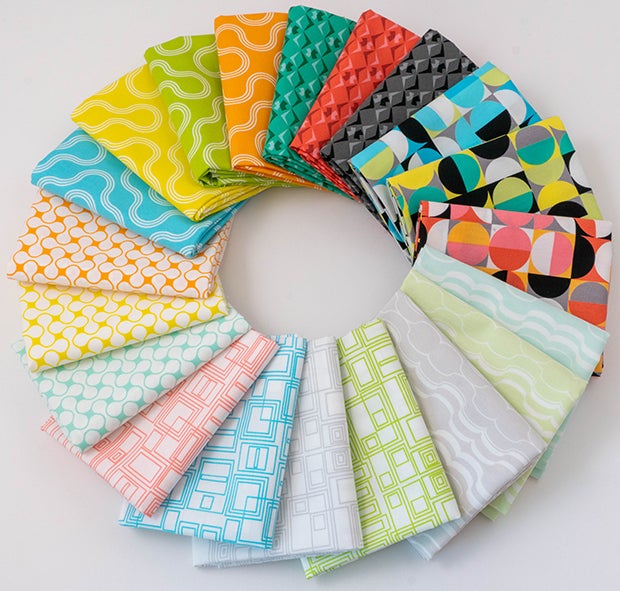
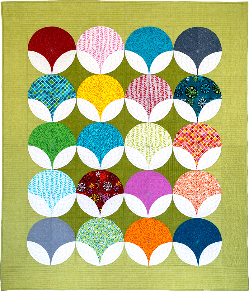
I’m always excited when I can host a quilt along featuring easy to choose fabrics. For my Bling quilt, all you need is 20 fat quarters and 4 yards of contrasting background fabric. Today I’m excited to share with you lots of different color options in order to prepare for our next quilt along which begins on Monday, July 20!
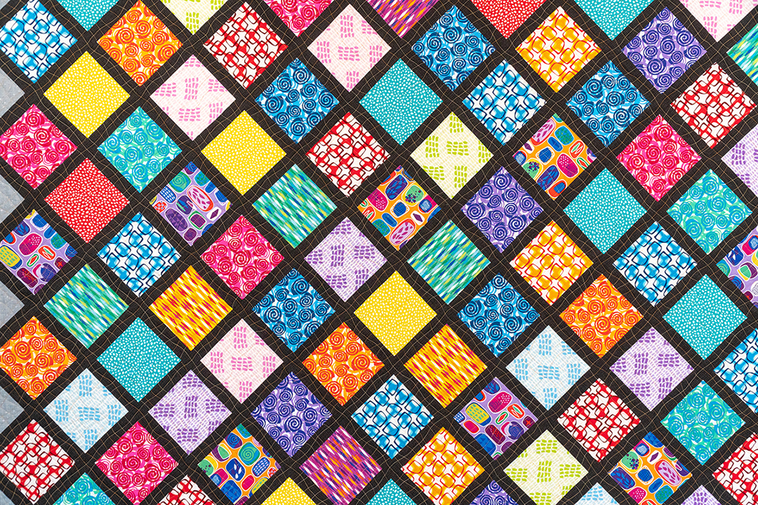
Original Bling
My first version of Bling made from Fandanglewon a ribbon at a local quilt show!
The key to a successful color combo seen in all the quilts I’m sharing today lies in the variation between the colorful prints in the blocks and the contrasting background fabrics. Be sure to take note of which colorings you like and choose similar fabrics, or grab a kit or fabric bundle to make any of the options shown here.
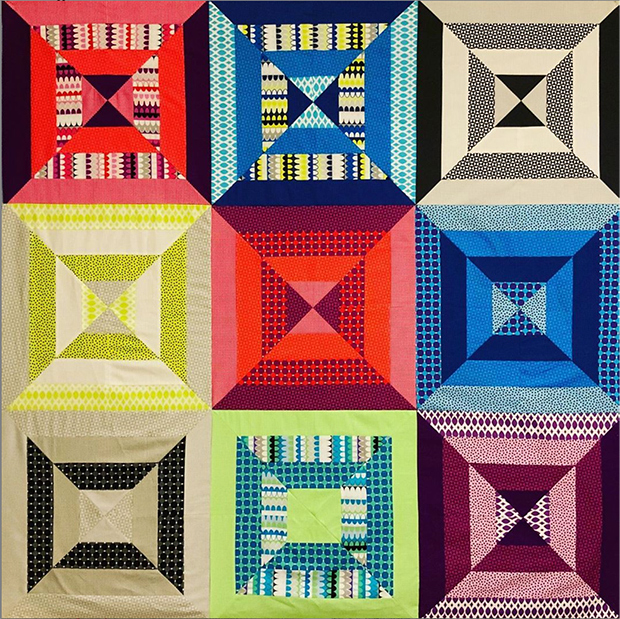
Geo Pop Bling
When my Geo Pop fabric line came out, I knew I wanted to offer Bling quilt kits to show how well these fabrics would pop wether you paired them up with bright white or dark black.
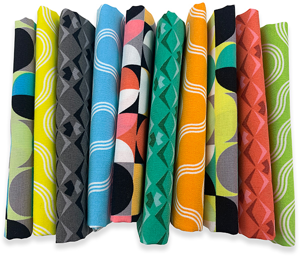
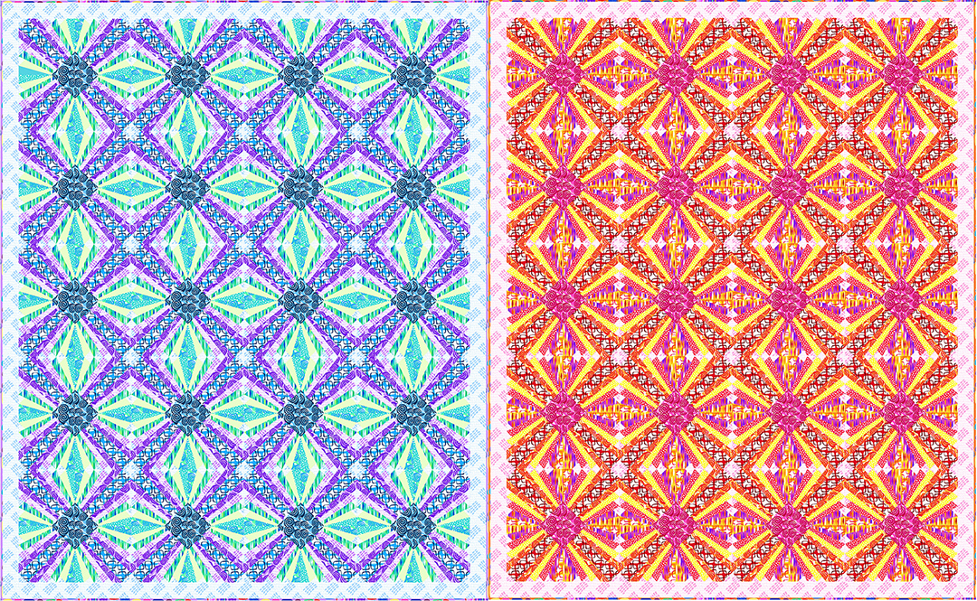
Whenever I release a new line of fabric, it’s always fun to recolor my patterns digitally to give lots more color options. Here are some other colorways I would love to make whenever I get the chance:
And of course I couldn’t wait to recolor bling in my newest fabric line, Good Vibes. This one was a fun challenge since the collection features an equal amount of lights and darks. But thank goodness for EQ8 so that changing colors only took a few clicks!!
In the color option above, I’ve paired a Good Vibes fat quarter bundle with 4 yards of Hourglass Gray from Gridwork. In this example, the gray background works better than black or white because of the variation of light and dark prints in the Good Vibes collection. I also love it when I can use the leftovers to make a scrappy binding!
You’ll have about a yard leftover if you choose the scrappy option, but you can always throw that on the back of your quilt, or save your scraps for another project.
Above is a sample I made for my in-person quilting classes. Notice that I used a blending thread so that you don’t see the imperfections.
Below is the sample I quilted for you on video this week so you can see how the process works. I quilted with black thread on white fabric which shows ALLL the imperfections, LOL!!
For my Optical Illusion quilt, I used a black/white thread from my Aurifil Variegated thread collection. I love using 50 weight cotton thread for both piecing and quilting, because I’m able to use any leftover bobbins when piecing my next quilt!
Click the image below to watch my spiral quilting video tutorial on my YouTube channel. It’s just over 9 minutes long and will demo how to quilt the basic spiral.
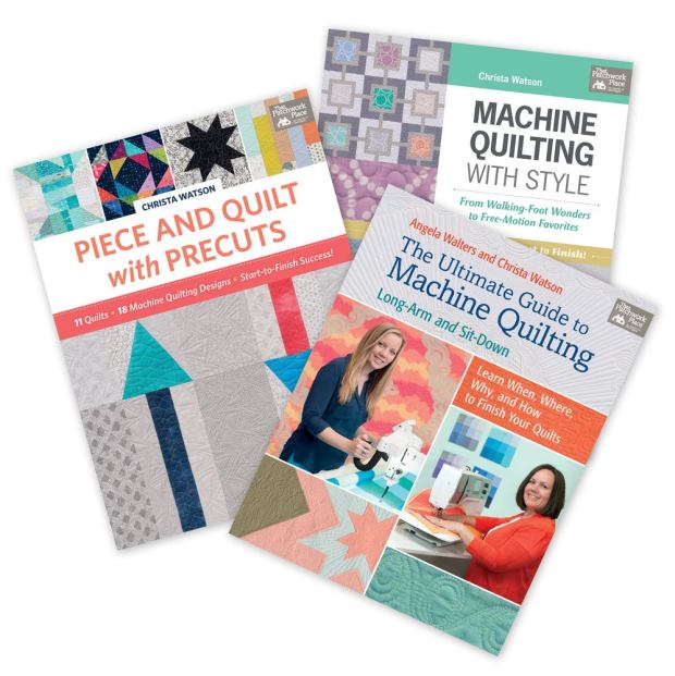
If you’d like to learn how to quilt additional spirals, be sure to grab a copy of my machine quilting books.
In my first book, Machine Quilting with Style, I show how to do the basic spiral, plus a wonky spiral variation. Then I expand on that with overlapping spirals in The Ultimate Guide to Machine Quilting. Finally, I teach how to quilt a continuous square spiral in my third book, Piece and Quilt with Precuts.
All 3 of my books are currently on sale for just now on sale for just $19.95 each until they sell out!
So grab 1 (or all 3) today! And who knows – you may find a completely different design you want to quilt on your version of Optical Illusion.
Remember to share your version of Optical Illusion in my ChristaQuilts Group on facebook. I love seeing everyone’s progress and the variations with all the different fabric colors are amazing!!
This is my sixth fabric line for Benartex Contempo Studio and I’m thrilled with it! There’s nothing more exciting than seeing your name on the selvage!!
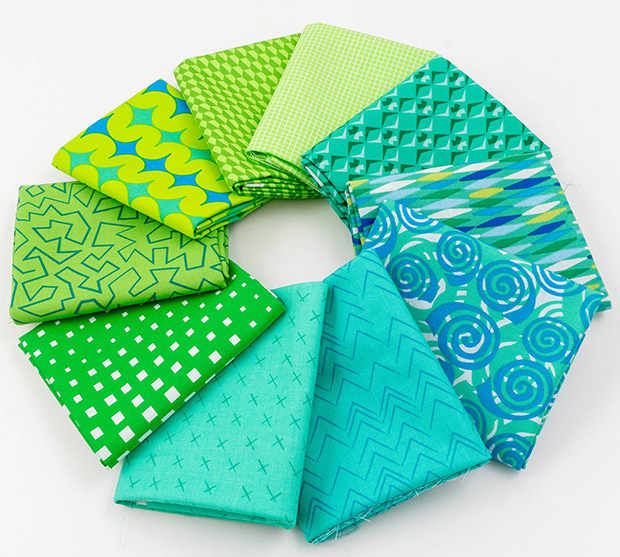
Good Vibes: saturated prints on the left, low volume prints on the right.
Good Vibes consists of 10 colorful, saturated prints and 10 low-volume prints, all with a geometric theme. The fresh citrus colors of orange, lemon, lime, and turquoise are going to look great in so many kinds of projects!
And of course there are a few neutrals thrown in to make the line super useful as well as happy and beautiful!
This group is all about nostalgia for me. As a child of the 80s, it reminds me of good vibes and happy times with my family and friends.
I spent my summers running through sprinklers, exploring my crafty side, watching TV with friends, and tinkering with computers—all while practicing my bubblegum-popping skills.
Would you like to hear the story behind each print? I hope this will jog happy memories for you, too!
This print reminds me of gumballs, jawbreakers and all sorts of “juicy” fruits! The colors make my mouth water for those sweet tastes that were a part of the past.
My most prized possession was an authentic gumball machine of my own that I could fill with whatever I wanted!
The scale of this print adds movement and interest, and I know you’ll find creative ways to use it in your quilts and bags and more.
This low-volume geometric print comes in four delicious colors, and it’s all about computers. When I was growing up, we were the first people on our block to get an Apple II-E computer. We thought that machine was amazing!
I loved tinkering with computers and video games back then, and even now, the computer is a workhorse for my business.
TIP: If the right side of a fabric is too intense for your project, flip it over and use the back side for a lovely muted effect.
What is childhood without some slippin’ and slidin’? My siblings and I kept cool in the Las Vegas heat for hours on that classic plastic strip in our front yard.
These four summery colors in a medium scale look great against the smaller prints!
This small geometric print brings out memories of my crafty side! In the 80s I added bling to my jeans and jackets and made a big mess with all those baubles and bits, but look where it has led today.
Another of the fun low-volume prints! Look closely and maybe you’ll see the interlocking roller skates in this design. I spent many Friday nights at the roller rink with friends, and I still get nostalgic when I hear those old songs. We were the original dance party!
Just like the Slippin’ Slide colors, there’s great movement in this print, and it will add zip wherever you put it!
Thanks for strolling down memory lane with me! I hope it made you smile, too!
All the Good Vibes prints are available as yardage and in bundles of half yards and full yards. I want to you to be able to get exactly what you desire!
Gotta love the low volume and saturated prints—don’t they look great when they’re arranged so prettily?!
And it’s fun to see them in different combinations. Playing with fabric and seeing how it looks with different “neighbors” helps your color sense grow and mature!
Remember that you can use the lighter prints right side up or turn them over for a more subdued look. Any way you pair them, they are sure to dazzle!
I did a video to introduce Good Vibes to the world! See it here.
Since you can use the front OR back side, maybe the low-volume bundle would be a perfect addition to your fabric conservancy!
Since these arrived, I’ve been enjoying a rainbow of citrus hues!! My family often finds me with the fabric, happily stroking and dreaming and remembering all the happy times and the Good Vibes!
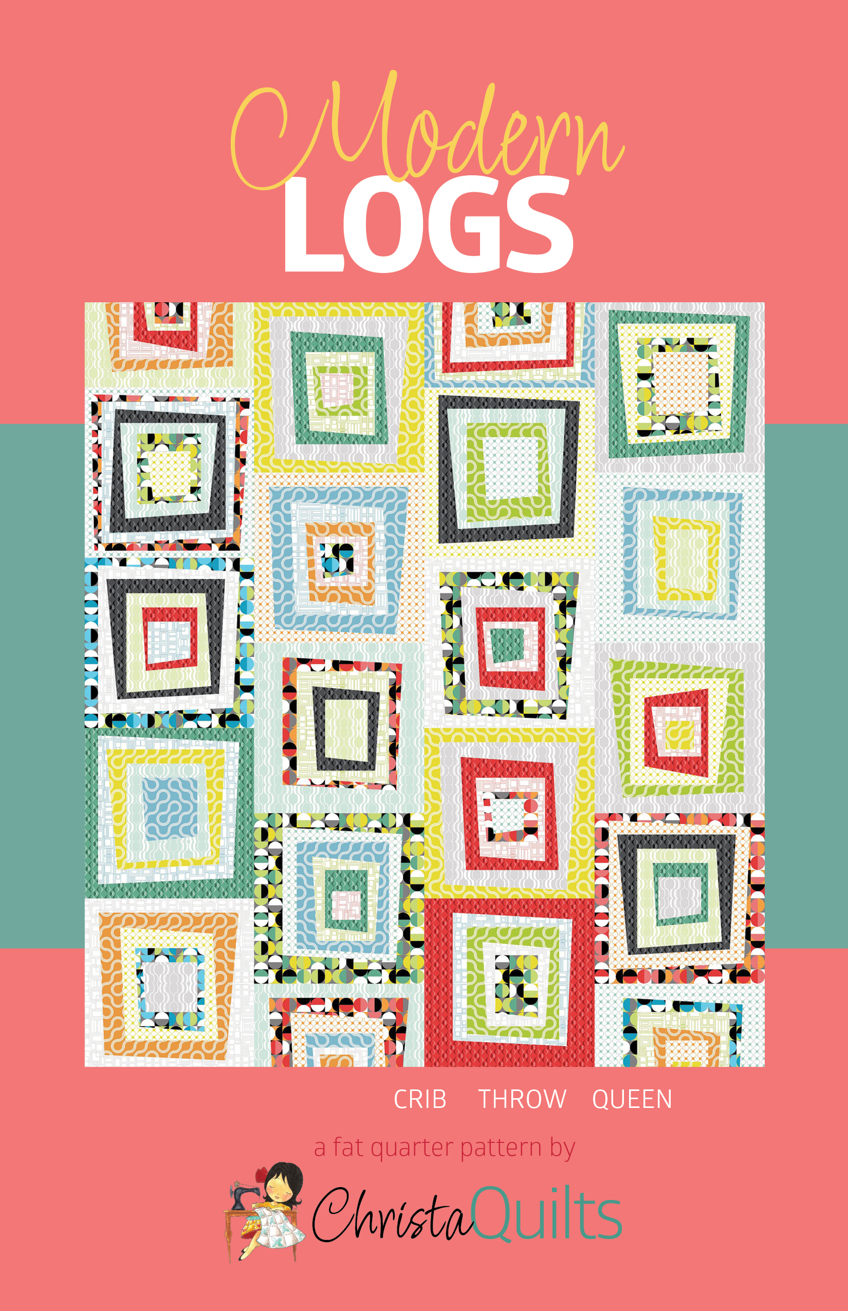
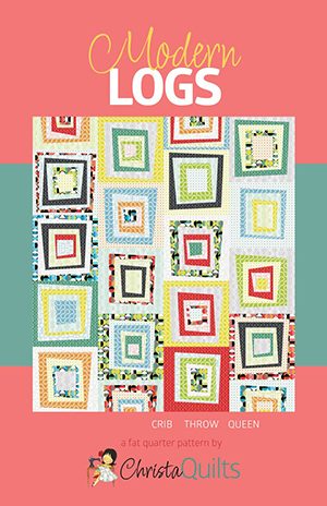
I am so excited about my two newest patterns, Charming Chevrons and Modern Logs. I’ll be doing quilt alongs for both later this year, and I can’t wait!!
The lap and throw sizes of Charming Chevrons are made from 5″ charm packs. (The thinking is done—so you just relax and sew!) This design has a lot of movement for great visual interest.
Twin-size Charming Chevrons in Good Vibes fabric by Christa Watson for Benartex Contempo Studio
The larger sizes of Charming Chevrons (twin and king) are made from 10″ precut squares, also called Layer Cakes or Ten by Tens.
Watch for Good Vibes 5×5 and 10×10 packs coming in July!
Right now, I’m taking pre-orders for the paper patterns of Charming Chevrons and Modern Logs, and I have a special offer for you. Please read on!
The cover quilts were made with my new Good Vibes line for Benartex Contempo Studio. I’m really pleased by the interplay of the modern low-volumes and the saturated bright prints. It’s just the look I was after! More thoughts on Good Vibes coming soon.
All of my patterns include step-by-step instructions and machine quilting suggestions so you’re never stumped when it’s time to finish. We have it covered!
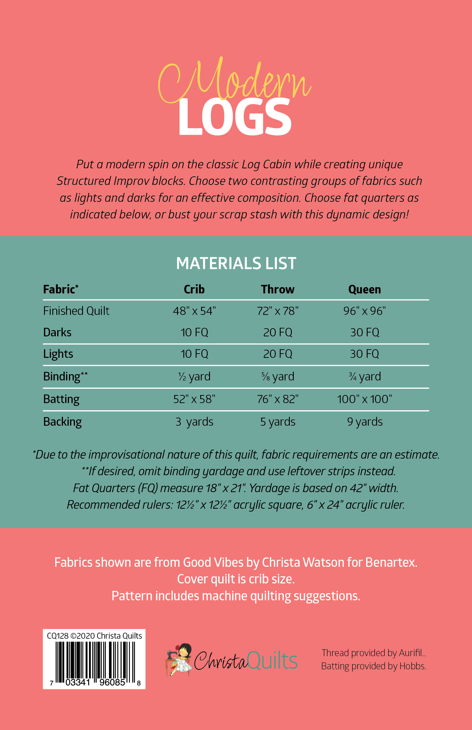
Choose from four handy sizes in Charming Chevrons: Lap, Throw, Twin or King! See the pattern’s back cover below for the dimensions.
Maybe you have some charm packs around just waiting for the right project. Or have you been looking for the perfect quilt to use a special layer cake? Look no further than Charming Chevrons!
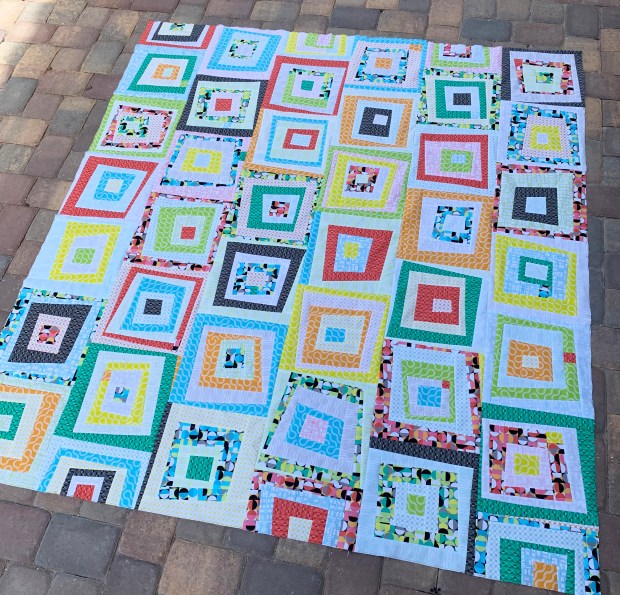
Maybe Modern Logs will suit your fancy! It’s made from 1, 2 or 3 fat quarter bundles, depending on the size you want to make. The pattern gives instructions for making crib, throw and queen sizes, but the improvisational technique means you can adjust the size of your quilt by making more or fewer blocks. That’s a great design bonus!
Maybe you’d want to get some Good Vibes and then supplement from your stash for a unique project that’s totally you! You can go with a coordinated look or be super scrappy. I think you’ll really have fun with the improv nature of these blocks!
I’m putting the finishing touches on both of these quilts now and I can’t wait to share them with you!
Seeing your excitement when you like my fabric or fall in love with a quilt design is a real boost for me. And I always meet some wonderful people during a quilt along, so I’m really looking forward to that, too!
I’ll host Quilt Alongs for both designs later this year.
I’m offering a special preorder bargain through the end of June for paper patterns of Charming Chevrons and Modern Logs. Buy two, get one free! Here’s how it works:
.
Use code PATTERN to get a free paper pattern of your choice when you preorder both Modern Logs and Charming Chevrons paper patterns. Add three patterns to your cart, enter the code in the coupon box and then remember to hit the + to make sure the discount is applied. Offer expires end of day June 30, 2020.
In one of my early Ask Me Anything episodes in the Christa Quilts Group on Facebook, lots of folks were interested in my fabric design process. So I’ve put together some images and files to share a peek into how the process works for me, and my experience in designing fabrics for Benartex.
About five years ago, I decided to get serious about designing fabric. As part of that goal, in 2016 I went to an industry event sponsored by Sara Lawson @sewsweetness and Brenda Ratliff @pinkcastlefabrics. It was called Sew Pro and it was only held that one time.
It was geared to helping people understand the different ways you could get involved behind the scenes of the industry. After that event, I decided to give myself five years to figure it all out, find a fabric company, pitch my ideas, learn the technical aspects and so on.
Two days later, the most unusual thing happened. (Really and truly, this almost never happens.) Benartex called and said they wanted to produce some modern-type fabrics under their Contempo label, and would I be interested in designing for them.
“Um…YES!”
But in the same breath I said, “I don’t really know how to do that.”
Now before I tell you the rest of the story, I should explain that I had already established myself as a Martingale author and a Bernina ambassador. I’d spent years developing a network in the industry, so while it was completely out of the blue for them to call me, it also wasn’t completely out of the blue for them to call me.
Bernina actually owns Benartex as well as a distributor called Brewer Sewing, so my connections in other parts of the industry helped me break in to the fabric design arena.
Now Back to the rest of the Story:
As it turns out, there are at least three different ways to design fabric.
100% of the work is done by the designer
Designer collaborates with a team at the fabric company
Design work done by a team at the fabric company, designer’s name is attached to the fabric
My work with Benartex falls under #2 above: It’s a design collaboration.
When I told them I didn’t know how to design fabric, their response was, “No problem!” They assured me they had people skilled in the technical aspects and that we could work together.
So I jumped in, and Good Vibes (out in July) is my sixth collection for Benartex! (Cannot wait to show you all the fun things we’ve made with it!)
The Design Process
Before anything else can happen, I come up with ideas for prints and make rough sketches with notes. (Side note: Ideas are everywhere! One print in Gridwork was inspired by a bath mat in a hotel.)
The first thing we did with Modern Marks was to establish a “look.” (And by the way, that look is something I have continued through all of my lines.) When the first samples (below) came back to me, I thought they were beautiful, but they were not the look I was after. They were blendy and batiky and I wanted a flat, geometric, modern feel.
The first paper swatches that came back from Benartex
I got more descriptive about what I wanted, and we worked our way closer. This is how it happens.
A more evolved concept for Modern Marks on paper—we were getting closer!
We go back and forth as I share my ideas and vision, and they continually refine it and bring it closer and closer to what’s in my mind.
They create the repeats and together we work on getting the colors just right. The stylist and the graphic designers have the technical expertise and they help me bring my ideas to life!
Then comes The hard part…
Quirky Triangles made the cut, but Donuts did not.
Eventually we have prints and colors I’m happy with and then comes a really difficult part: narrowing it down. My collections are usually from 20 to 25 prints, which means I always have to weed out a few.
Heartbeat was cut from Modern Marks, but Herringbone stayed in.
It is so much fun when the final swatches are done! I usually only see the line on paper until I get the actual fabric months later. But this is the culmination of much hard work, many twists and turns and a few tricky decisions! It’s all worth it when you see the collection together!
Final swatches for Modern Marks
The Good News
Fortunately, just because an idea doesn’t work for one collection doesn’t mean it won’t ever work. I tuck all of the rejects away, literally (in a drawer) and figuratively (in my head) because they make great starting points down the road. More on that a little later.
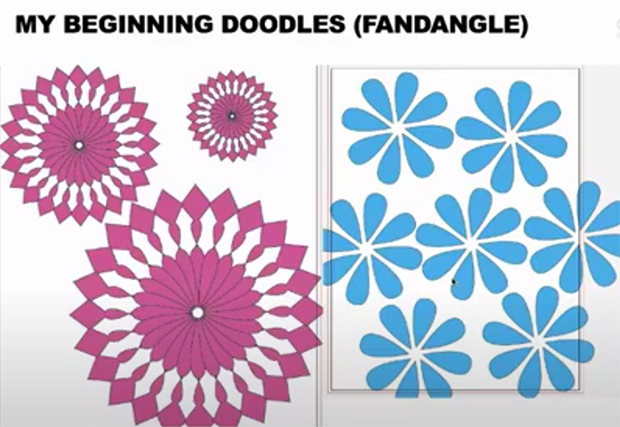
My first computer drawings for Fandangle were reminiscent of Spirograph as a kid.
For Fandangle, I had the childhood concept of Spirograph in my mind and wanted to do a little more of the computer work myself. Above are the early images I created in Illustrator.
The design starts to evolve for the main Fandangle print.
Just above are some of the paper swatches that came back to me as we collaborated.
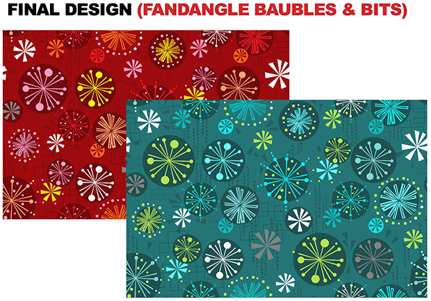
The final design of the main or “hero” print for Fandangle
And these are the final look for the main print in Fandangle. There are many steps that happen between these images, but you’re getting the idea of how it works.
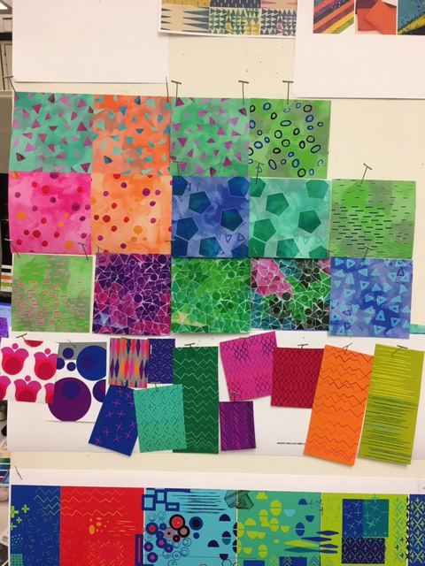
Let’s circle back to the idea of rejects being useful down the road. On the right in the photo above is my upcoming line called Good Vibes. On the left are some low-volumes I wanted for Modern Marks that didn’t work out.
The main idea for Good Vibes was soft and loud: low-volume prints and bold, saturated prints together. The low volume idea was something I had to scrap from Modern Marks, but I held on to it and half a dozen collections later, it’s going to be one of my very favorites! Good Vibes will ship to stores in July; ask for it at your local quilt shop!
Mockup of the promotional folder for Modern Marks
One of the last things that happens is the creation of the promotional materials. The Benartex people send me a mockup (above) and later the final folder, which is used to show the fabric to potential buyers during quilt market, and by sales reps visiting quilt shops around the country.
It’s still amazing to me that from my simple drawings such a beautiful thing can appear! If you’ve read this far, I want to offer you a deal.
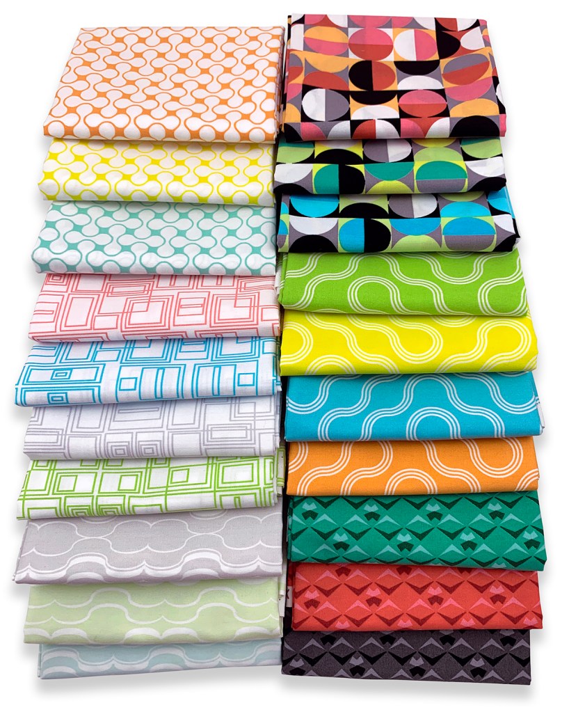
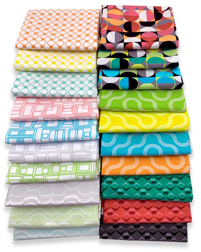
I’ve been working hard over the last few weeks, creating 11 gorgeous color bundles spanning all of my fabric lines for Benartex. A few weeks ago I got a request from some followers in my Facebook Group to create these custom color bundles, and I’m pleased to say they are now finally ready!
This custom color bundle includes 12 fat quarters in pretty reds and pinks with a touch of other colors for added sparkle. Each fat quarter measures approximately 18″ x 21″.
This custom color bundle includes 20 fat quarters in light, medium and dark neutrals. These blacks, whites, and grays include fabulous patterns and interesting textures that will draw your viewers’ eyes deeper into any project you create!
Aren’t these all just so delicious??? One of the main reasons I love being a fabric designer is so that I can create colors, patterns and textures for my own personal stash! I’m so happy that I’ve been able to fill out a rainbow of color with my fabrics and I can’t wait to show you what’s yet to come!
One of the best things about designing fabric is seeing how people use it. It’s absolutely inspiring for me when I notice your work using my fabric out in the world. It makes my day! Here are some recent examples.
Geo Pop Beaded Lanterns
Beaded Lanterns by Leesa Burr-Bates; pattern by Christa Watson.
Leesa Burr-Bates shared her Beaded Lanterns quilt top in the Christa Quilts Group on Facebook. If you’re not yet a member of the Group, you’re invited to join us!
Leesa used my Geo Pop fabrics from Benartex. I think she did a great job, and I can’t wait to see this one quilted up!
Bonnie Eicher pieced Blooming Wallflowers from a kit, and it turned out really well! Then she used a simple drawing app on her tablet to try out ideas for quilting.
If you’re a friend of felines, check out these Mod Cats made from a variety of my fabrics. Mod Cat was designed by Linda and Carl Sullivan of Colourwerx in Palm Desert, CA. If you’d like to make one-color cats, my brand new bundles would make it easy:
New York Lattice by @sewjess, from a kit in Geo Pop from @timefliesquiltandsew
Jess @sewjess posted her New York Lattice quilt top recently.
The fabrics are from my Geo Pop line. Jess made the shop sample for @timefliesquiltandsew. I appreciate it when a shop puts my fabrics into a kit, thank you very much!
Quick Zip Cases in Geo Pop fabrics, pattern byAnnie.com
These Quick Zip Cases are so handy for storing all kinds of items. And aren’t they cute in Geo Pop fabrics? The contrasting zippers are a nice added pop. The pattern for Quick Zip Cases is from byAnnie.com, and it’s just five dollars!
When you use my fabrics from any collection, please post it to your social media with the @christaquilts tag and #christaquilts, or send photos my way using christa@christaquilts.com. I’d love to see what you’re making!
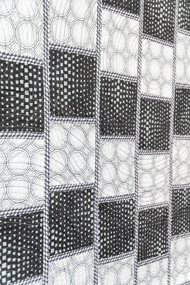
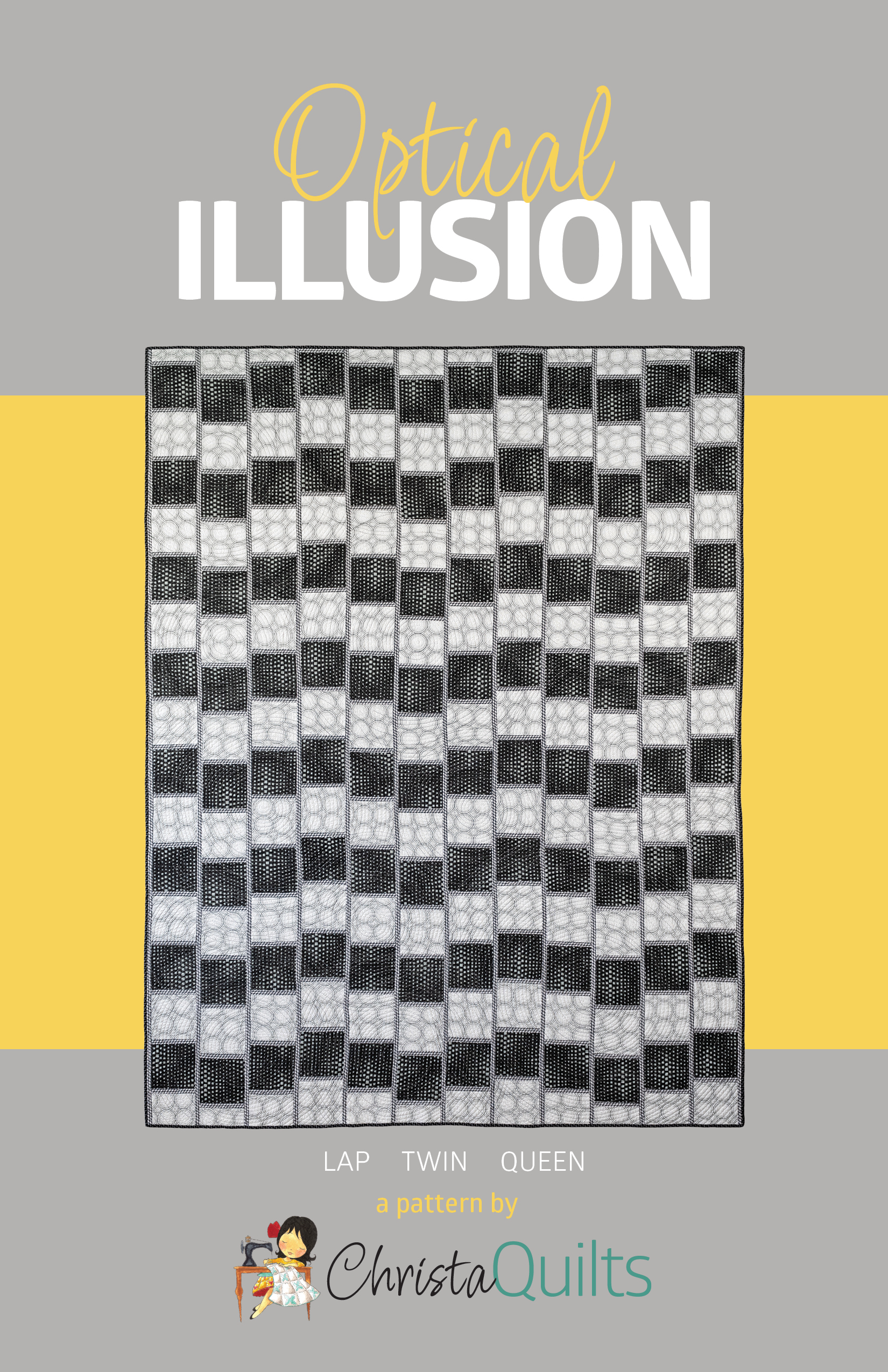
Are you having fun making your Optical Illusion quilt? This week it’s time to sew our cut units into the blocks. Follow along in the quilt pattern on pages 3-4 and pay close attention to what goes where. It’s simple to sew but the key is to follow the diagrams precisely for proper fabric placement.
In a nutshell, the interplay between the dark/light squares and the medium skinny strips is what causes the illusion to appear. Because you are working with long skinny strips, your pieces can stretch if you aren’t careful. In the previous post I mentioned starching your fabric before cutting as this will help.
Piecing Tips
To prevent the rows from bowing or warping out of shape, I like to sew all of my units with the medium, skinny rectangles on top at all times. This will automatically switch the sewing direction for you each time you assemble a unit, which helps keep things nice and square.
I also sew with a shorter stitch length (2.0mm instead of 2.5; about 13 stitches per inch) and press my seams open. This will ensure crisp, flat blocks that are easier to work with so that things line up properly. I always start and end a session of sewing with a “leader or ender” – scraps of fabric that catch my starting and ending threads. Then I don’t lose my thread and chain piecing is a breeze!
Example of Subunits in Progress
Stack up similar units that will all be sewn at one time so you can assembly line sew, or chain piece as you go. Pay particular attention to the number of units specified in the Optical Illusion quilt pattern on pages 3-4 and make sure everything is in the right place. Once all of your pieced units are complete, you are ready to assemble them into rows and complete the quilt top next week!
Most of my kits include the pattern plus all of the fabric needed for the quilt top and binding. All of the kits on clearance have been reduced by 25% off the original price with no coupon required!
Next up, Lattice Work features charm packs from my Abstract Garden fabric line with light and dark neutrals to make those bright colors pop! This kit includes fabric for the top and binding in the throw size at 74″ x 82″.
The beginner-friendly design is quick to piece and fun to make. The bright, colorful fabrics make it interesting enough for anyone to enjoy!
Cool things off with my Pieced Primrose quilt kit on sale. As of this writing, I have one of these left in the wall size kit for 25% off the original price – no coupon required!
If you’d like a larger version, the throw-size Pieced Primrose in warm or cool colors is also on clearance. It’s 4 times as big as the wall size and with the clearance sale, you’ll save over $50 on this kit – what a deal!
I hosted a quilt along awhile back to make this quilt and you can still access all of that free content here on my blog. I even included YouTube videos of my basting, quilting and binding process which you can apply to any quilt you make!
Not a care in the world when the fabrics are neatly packed into a convenient kit, ready for you to have all the fun!
Pattern Clearance
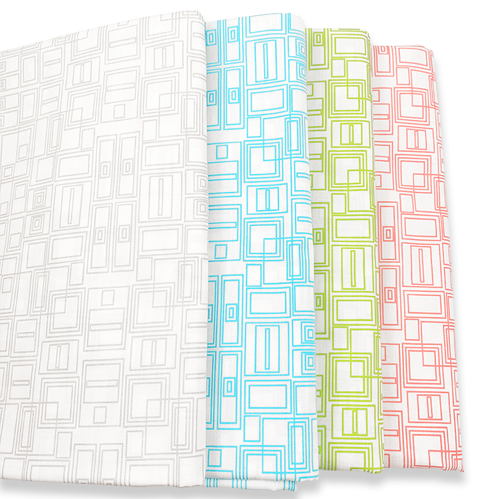
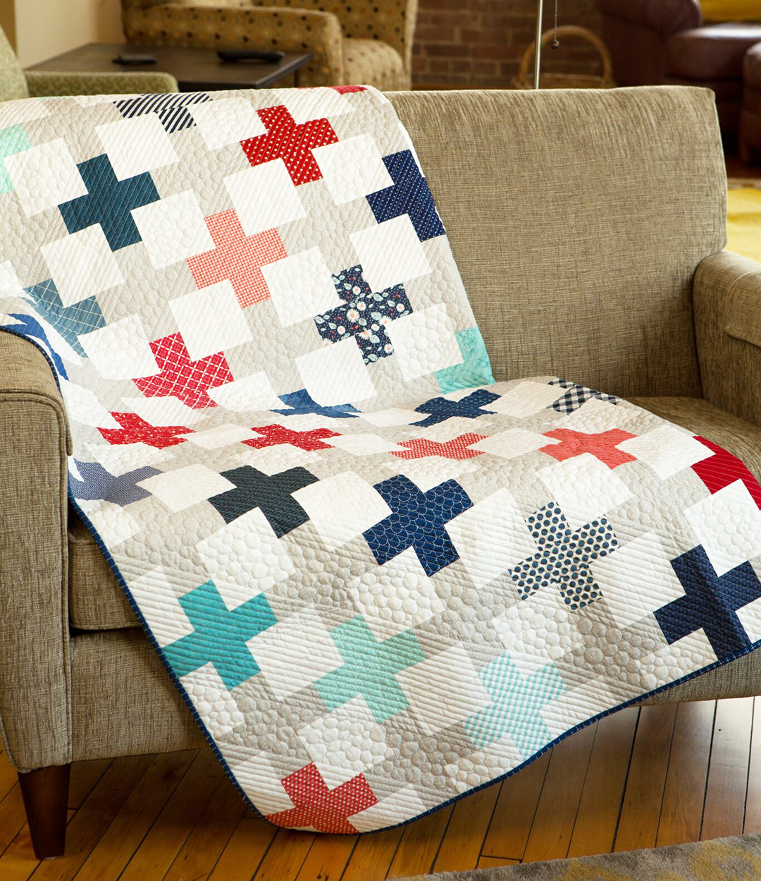
Positive Direction paper pattern is on clearance.
A number of paper patterns are on clearance including Positive Direction. The soft neutrals let the plus signs take center stage in this modern quilt design.
I have fond memories of creating my very first fabric line, but now it’s time to clear out the old to make way for the new. I know you’ll love Modern Marks at just $8.95 a yard while it lasts. Much of it is sold out already, but you can still grab yardage of the remaining prints to stock your stash or add a pop of color to the back of your quilt.
Cutting out the fabrics to make Optical Illusion is pretty straightforward. Just follow the cutting instructions on page 2 of the Optical Illusion Quilt Pattern. You can reference my previous post on choosing fabric color combos that will work. For my version I used highly contrasting black and white for the squares with gray for the long skinny strips.
Before cutting, I highly recommend starching your fabric. This will keep the smaller skinny strips from stretching out of shape and will give body to your pieces as you handle them. I like to use inexpensive starch from the grocery store. I spray one side of my fabric and iron from the opposite side. Then repeat for the other side. It works like a charm!
Cutting the Squares
When cutting the squares, the easiest way is to first cut strips from your fabric, then subcut those strips into the square sizes as indicated in the pattern. If you are using a directional fabric like I did, you can choose to have the print always running in the same direction, or let it be more random. The choice is completely up to you depending on the look you want.Still need the Optical Illusion pattern? Get a printed version or get the instantly downloadable pdf. Refer to the quilt pattern for the number of squares to cut for your size.
When it comes to cutting the rest of the units that are a slightly different size (for the starting and ending rows), be sure to label them to keep the sizes organized. I’m constantly referring to my pattern for unit size and placement so I keep everything in the right spot!
Cutting the Skinny Strips
When you are cutting out long skinny strips, you’ll either need to piece together shorter lengths of fabric to get a long enough piece or you can rotate your fabric and cut them parallel to the selvage so that there aren’t any seams. This is the method I recommend in the quilt pattern.
Cut long strips parallel to the selvage.
You can fold your fabric into about four layers by shaking it out so it hangs straight, then folding it in half, and half again parallel to the selvage. If your folded length of fabric is longer than the width of your cutting mat, I recommend getting another cutting mat and another ruler so that you can line things up along the entire edge.
Once everything is cut, you are ready to start sewing your pieces together next week! Feel free to take your time, or work ahead. The choice is up to you and you are the boss of your quilt!