Click here to read about Part 1 – My design process for Diamond in the Rough.

Diamond in the Rough hanging at QuiltCon 2017. I’m with Linda Permann, my editor at Craftsy. I credit her with helping me put a name to the process I use to figure out how to quilt each quilt. It’s called “The Quilter’s Path.” Click here to register for my class of the same name.
Now I’m excited to tell you about how I quilted Diamond in the Rough, since that’s my favorite part of making any quilt! First of all, I printed off a copy of the EQ7 design on a regular 8 1/2″ x 11″ piece of paper. (You can do the same thing by taking a picture of your quilt top and printing it onto paper – black and white is perfectly fine!!)

This is the actual sketch I submitted to QuiltCon Magazine when it was accepted.
I always, always make a quilting plan before I quilt so that I can figure out the quilting path I’ll take to get it done. It’s like a puzzle – figuring out what designs I want to put where and how to maneuver around the quilt with the fewest stops and starts. I’m not too worried about scale here. I’m more interested in seeing how the texture of the quilting will look and where I may need to switch thread colors.
Of course, I have to sketch with black ink to see my design, so my quilting plan is pretty rough and quite stark when you look at it. However, from experience I know that I prefer to use a blending thread so that all you see is the overall texture, rather than the individual stitches.

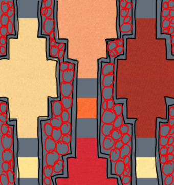
Overall, I’m really happy with how the quilting turned out. I’m just a little bummed that you can’t see the quilting in the black areas. I quilted a textural pebble design in the black triangles. Although I love the contrast of black and white, each time I quilt on black, I remind myself that it doesn’t show up as well as I would like. So I may need to use less black fabric in the future!!
I’m really happy with how the “Switchbacks” and “String of Pearls” quilting turned out in the white areas of the quilt. I teach how to quilt both of those designs in my book Machine Quilting with Style. It was super fun to combine them together in this quilt!

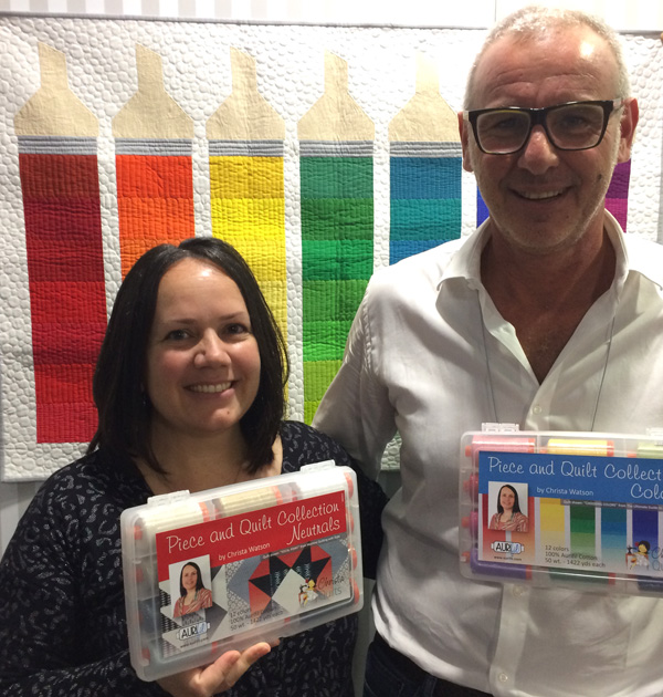
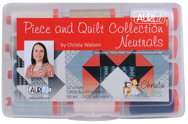
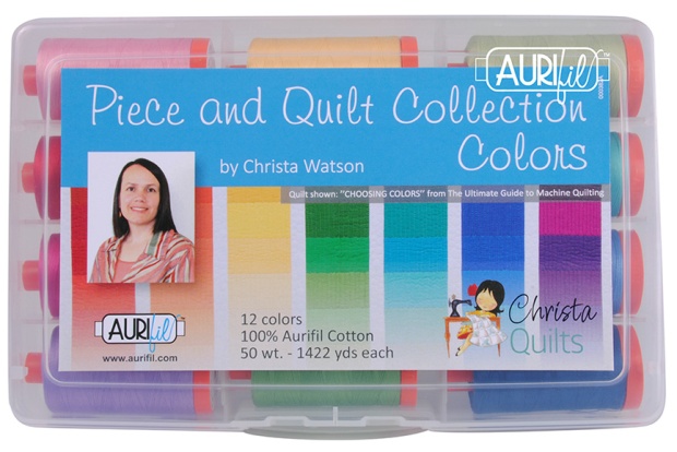
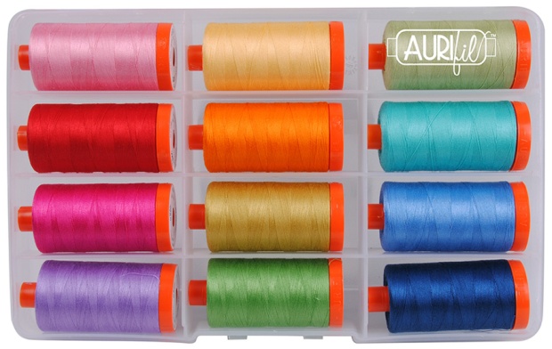
I used very dark gray, red, and white 50 weight cotton thread from my Aurifil Piece and Quilt collection for the machine quilting which I did all on my BERNINA. You can sort of see the pebble quilting on the top row of black diamonds in the image above.
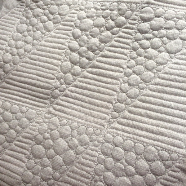
Here’s a view from the back of the quilt where you can see the pebbles better. I normally use the same color thread in the top and bobbin so that any tension imperfections are not noticeable. However, since I didn’t want the dark gray thread showing up too strongly on the light back, I used an invisible thread in the bobbin when I quilted the pebbles. Here’s a tip: wind your bobbin slowly and only fill it half full!

First I stitch in the ditch with the BERNINA dual feed before adding free-motion quilting.
Here’s the quilt in progress underneath my machine. I use a very technical process I call “scrunching and smooshing” to wrestle the bulk of the quilt. It’s really no more complicated that twisting and shoving enough of it out of the way so I can see what I’m doing. Here’s another tip: when working with a large quilt on a small machine, just remember you are only quilting about 5-6 inches of the quilt at any time, so it’s normal to stop and shift a LOT!!
Right now you can get a digital copy of my Diamond in the Rough quilt pattern in QuiltCon magazine. It includes the instructions for the piecing only, but when the rights revert back to me next year, I’ll release it on my own, most likely in multiple sizes with quilting suggestions.
I was pleased with the comments I received from the QuiltCon judges about the quilt:
- Strong offset focal point.
- Varied quilting motifs were well chosen and fit areas well.
- Strong geometric shapes create graphic visual appeal.
I’ve had at least one quilt in each QuiltCon and have yet to win a ribbon, but it’s still fun to get them accepted. In fact, the main reason I submitted this design for the magazine was that it was a guaranteed entry into the show. Since the other 5 I entered didn’t get in, I was really happy that this one did.

Making this quilt reminds me what I love most about the modern aesthetic: strong geometric forms, minimalist designs, and plenty of negative space for fun machine quilting. Although I love ALL quilts, making those on the modern end of the design spectrum truly make my heart happy!
Save
Save
Save
Save
Save
Save
Save
Save
Save
Save


 I’m excited to be one of the judges along with Carolyn Friedlander and Jennifer Sampou.