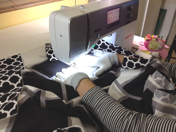
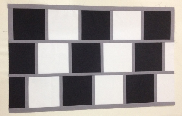
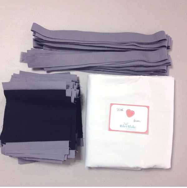
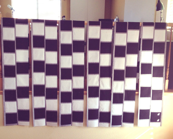
Optical Illusion is the second of the three quilts I entered for judging at QuiltCon. I actually made this quilt specifically for QuiltCon, so I was very pleased when it got in. I’ve been crushing on simple geometric designs in a limited color palette, so this quilt really allowed me to explore that desire. I definitely think more black and white quilts are in my future.
And yes, it moves when you scroll it! 🙂
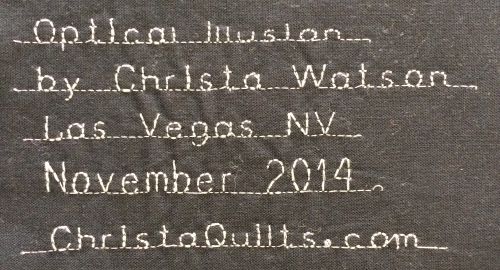
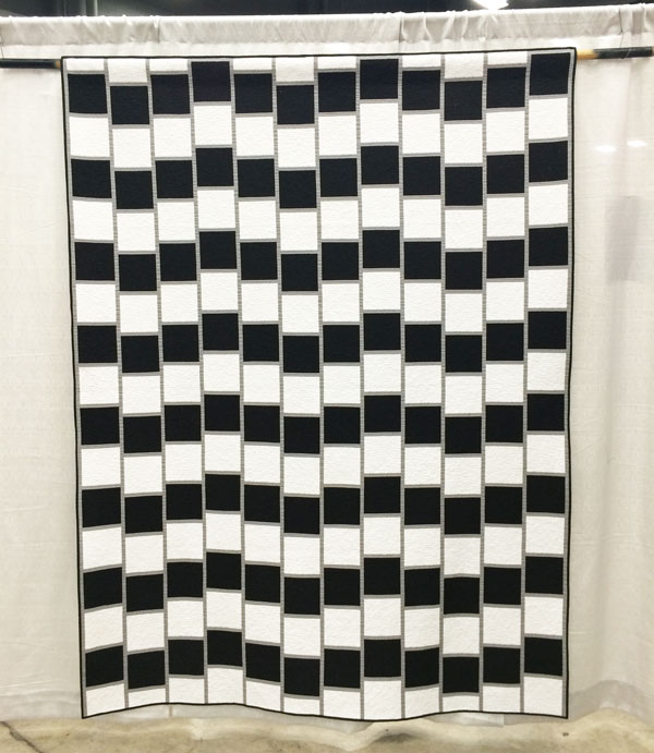 Optical Illusion 67″ x 88″ by Christa Watson.
Most people were surprised at how big it was in person.
Optical Illusion was placed into the piecing category which includes this description, “quilts that are machine pieced and reflect a particularly strong or innovative use of piecing.” I guess you could say this quilt was pieced innovatively, although I was secretly hoping for it to be in the minimalist category. I’m still learning exactly what minimalism means. 🙂
Here are the positive judges’ comments, along with my commentary:
- Quilting motif supports the design. I’m glad – since that’s what I was going for – geometric simplicity that doesn’t overpower the quilt.
- Binding is well proportioned and applied. Double yay since the binding on this quilt is what stressed me out the most!
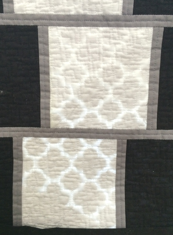
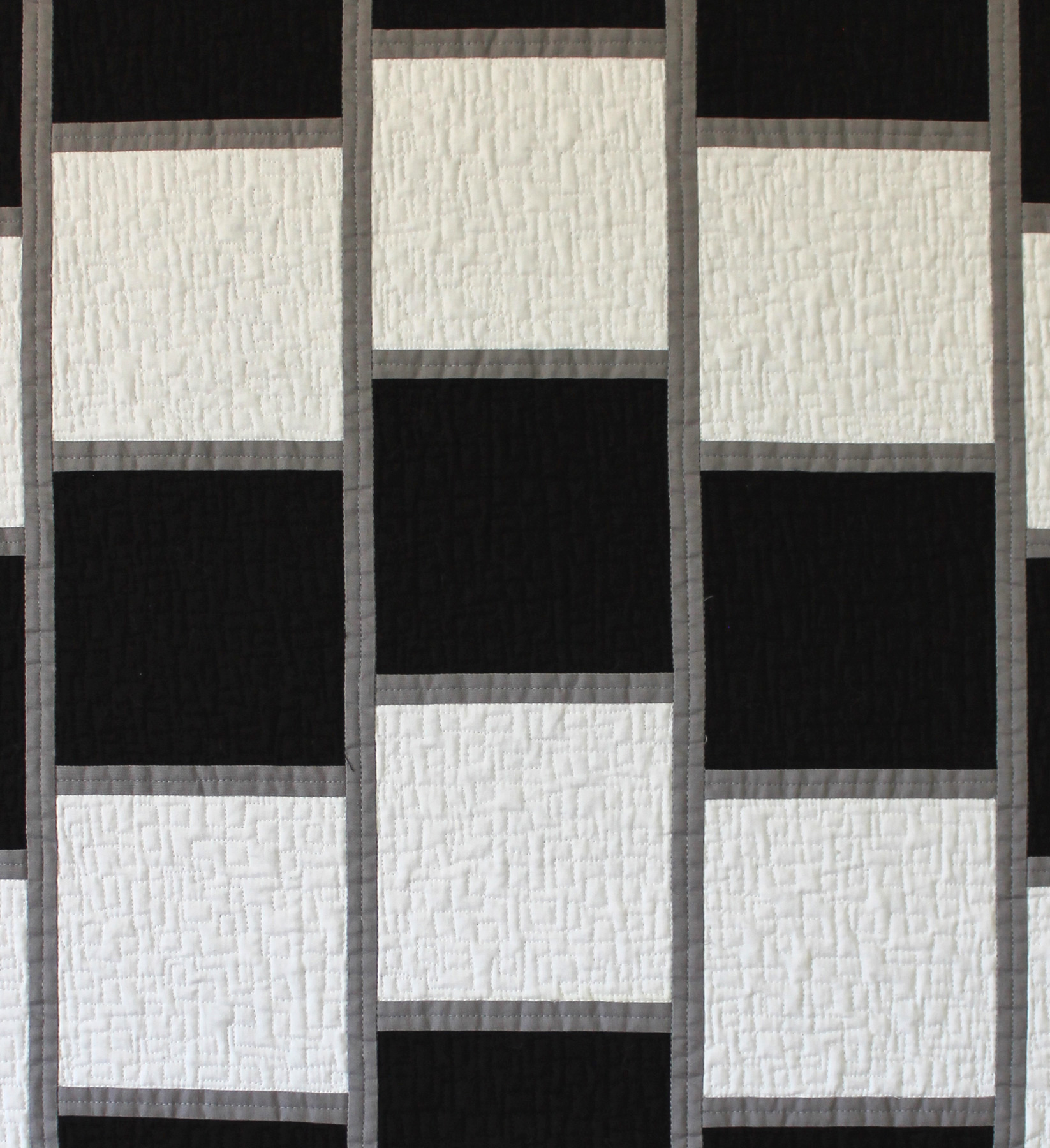 Detail of quilting on optical Illusion – free-motion boxes.
Here are the areas for suggested improvement, along with my thoughts:
Design direction lacks focus. I was afraid of this – the judges viewed the quilt so close up that I’m afraid they missed the point of the quilt. I don’t think they read the artist’s statement either, so to them it probably just looked like a bunch of black and white squares, and they didn’t get to see the effect of the optical illusion.
I had one slight disappointment in that whoever printed off the paperwork for the show got the name wrong. I had entered it as “Optical Illusion” (I went back and double checked all my acceptance emails to make sure it wasn’t my error), but the title was listed as “48”. I can only imagine that was some kind of typo or mail merge glitch. However, much to the credit of the MQG, they did fix it immediately, once I notified them. Unfortunately, it was too late to know whether or not the incorrect title had any impact on the judging. But you know what? Rather than get all upset about it, I’ve learned through experience sometimes these things just happen. Inadvertent mistakes can be made by volunteers who are doing their best, so there’s no need to beat them up about it. 🙂
The best part about sharing this quilt was seeing the reaction it generated. I’m sure I’ll enter it into more shows in the future.
Quilt should be cleaned before entering into competition – lint. I knew I’d get knocked down on this. The quilt wasn’t linty or dirty, but the batting bearded (shed) like crazy through the black fabric on both front and back. When using dark solid fabrics, I need to stick to a black batting or one that doesn’t beard, like 100% cotton. I used Quilter’s Dream Orient which I’ve used before in print quilts with no problems. The batting is a mix of bamboo, silk, tencel and cotton. I’m not sure which fiber caused the problem, but that just means it’s time to experiment and make more quilts!
I share these critiques with you so that we can learn together what makes a successful quilt.
 Standing next to Optical Illusion for scale. Though I’m pretty short so that may not help much.
I have had quite a number of people asking me for a pattern for this quilt. I am in the process of writing one now, so stay tuned!