Over the last couple of weeks I had a chance to work some more on my Riley Blake Challenge hosted by the Modern Quilt Guild.
Post #1 for this quilt was about block design. This week I finished sewing my blocks and I’m pleased with how the quilt is starting to shape up. I may just make that February 17th deadline yet!

Riley Blake Fabric Pull – it took me 3 tries to get the right shade of grey I wanted!
I had originally chosen a grey background for my improv blocks and it took me several tries before finding the right shade (I can be a little finicky like that).

Original Design Sketch
However, once I made up a sample block it wasn’t really speaking to me. Then on a whim I decided to go with a much darker background – the Riley Blake Charcoal solid included in the original challenge bundle.

Auditioning a darker shade of grey – Charcoal solid by Riley Blake
I pulled in several more Riley Blake Basics in coordinating colors, then cut out a bunch of different length strips and sewed them together in an improv way (so fun – even if it does waste a bit of fabric). Using a large square ruler, I trimmed the blocks to size. I was going for the effect of a foundation string pieced block – without the pesky foundation part!

Improv Strips Sewn Together
Now I’m starting to like how the blocks are coming together.

Riley Blake Challenge Blocks
I timed myself while working and it took a total of 21 hours to starch, press, cut and sew a total of 36 – twelve inch blocks (not including prewashing all the fabrics first!) That seems like a long time for me, but I sewed them together just a few blocks at a time to make sure I knew what I was doing.
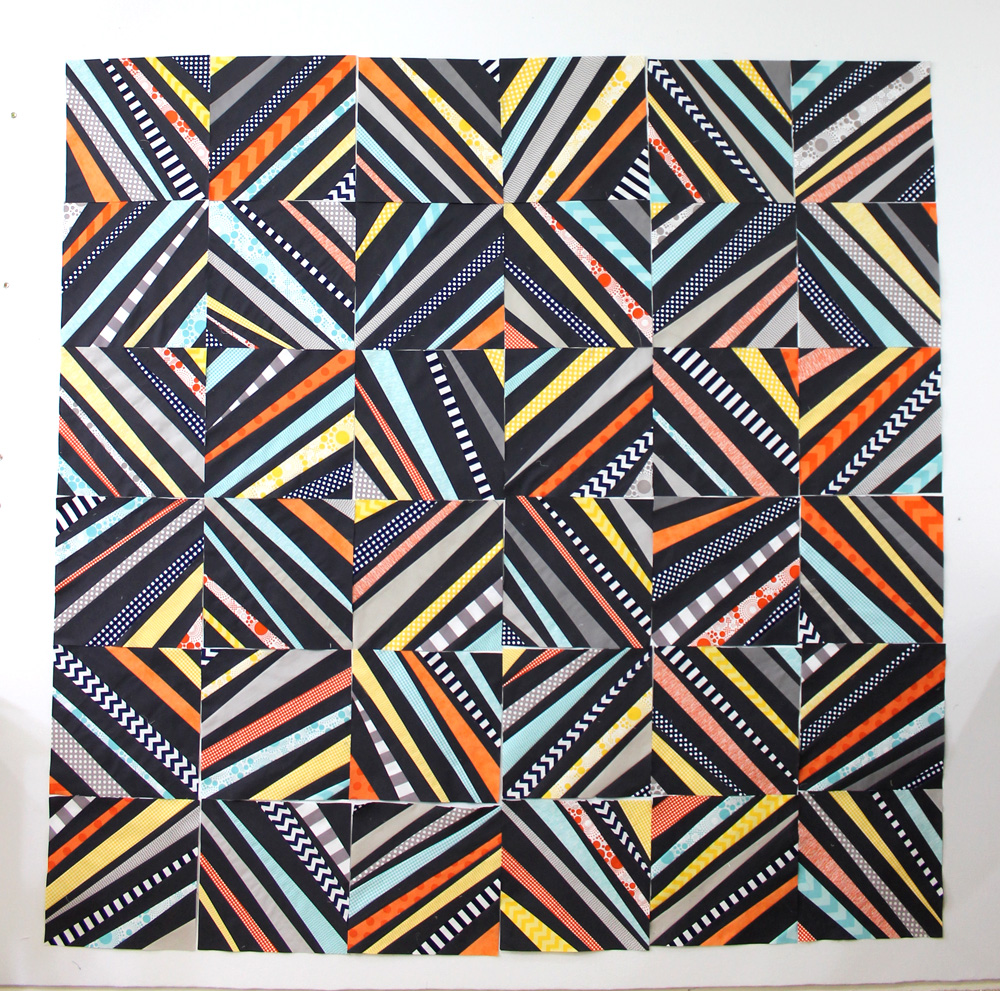
Riley Blake Challenge – Improv String Blocks
This is my first attempt at an improv design and it was very liberating. As I finished each block, it was fun to see the wonky, graphic design emerge. I may rearrange them to balance out the colors and I’m toying around with adding a border of dark charcoal around the edges to make the whole thing appear to float. We’ll see.
I can’t wait to sew the blocks together and then start on the super fun part – the quilting!!

I absolutely love this! Maybe a low volume version with the lighter gray? But the dark looks so wonderful on this one!! Great improv!
Thanks Sarah – there are so many possibilities!
This has to be my favorite design I have seen for the Challenge! That darker fabric really makes a difference in the whole appearance! 🙂
I LOVE IT!!!!! Have done a couple strip quilts and totally love the look of them.
Great design! I would do an asymmetrical white border and consider extending some of the strips as if they were falling into place.
the darker background is a great contrast to those wonderful fabrics. Looking great.
Gotta love improv for creative freedom! Your colour choices are lovely and the block looks great! Makes me want to run to the studio and do some improv too!
I love the look with the darker grey background! Great job as always. Yes, putting the dark border on to make it look like it’s floating would be a great idea! Also I think using a white background with bright colors would be awesome as a spring look! Looking forward to seeing the finished product!
It looks like some kind of optical illusion. Looks awesome all blocks put together. Great job.
Christa that is turning out so nice. I really like the charcoal background it really makes the other fabric pop. love it!
i always wondered why you would need or want a “foundation” for this type of string quilt block???mmmm so glad to see that it can be done without that part. BTW: l see the zig zag or ripples as secondary design… was that intentional ? It is very sublime. I love the block and playing with it is going to be fun.
Bedazzling! The dark background is perfect!
I really like this design! Even though you say it wastes fabric, I can see it using up a lot of scraps as well. As usual, I love your color scheme!
Love this! And the zig-zag print looks particularly fun in this design!
Going a little improv can be very freeing when you’re not inclined to work that way. You’ve done a great job. I really like how the chevron print adds extra zing to the overall effect.
Wow. I love it! I think you made the right choice switching to the darker background. I’ve been timing myself a lot lately too. It’s amazing how the time seems to go by so quickly when I’m making a quilt, but then when I add it all up I can’t believe it took me so long!
Love it so far! Actually I usually love anything with Charcoal fabric, but the Riley Blake fabrics look great, and I love the design/pattern you’re using!
This is so cool Christa!!!
That turned out great! I like the idea of foundation piecing without the pesky paper part.
I just couldn’t imagine having to rip out all that paper, LOL!!
Love love love! I might have to make one for me!
I’m loving this! Can’t wait to see more!
Love Love Love it!! This would make a great bee block too!
That dark charcoal is perfect!
Love it. Great improv. It is so much fun to do improv piecing.
Fabulous design! Looking forward to seeing how you choose to quilt it!
This looks awesome and doable for me. 🙂 was it hard to get the fabric to lay flat since you didn’t do a foundation?
No – I just pressed the seams open as I went. I also starched the fabrics before I started so that helped, too!
Your colours really pop. I like the size of your strips. Well done. Looking forward to seeing the quilting. I would like to try a string quilt without foundation.
LOVE IT!!! I so agree, the darker was so needed to sharpen the design. The med. gray has its place but not paired with such powerful colors!!! Your border idea may be the perfect finish!!!! Hugs………………
Thanks! That’s a great way to describe it – that it “sharpens” the design. I couldn’t put my finger on why I like it so I’m glad you said that!
No ‘prob’!!! I’m here for ya!!!!!! LOL!
WOW!!!! Very striking. I love it. Hugs
I’m such a sucker for string blocks and yours is fabulous .
Oh I just love it. The wonkiness is just fantastic.
Oh wow! Very striking – bold and fun! Love the contrast of the dark solid with the geometric prints with their bits of white shining through. The wonkyness makes it, and your post makes me think I could do this!
Great! Glad to be of help – you can so totally do this!
I’m with everyone here. AS for your color balance. I think you’re almost there. Just move some of the squares on the right lower to the left to distribute the orange and you’ve got it. I might do a double border. A wide interior that’s the plan gray and then a smaller outer border that uses all the colors again somehow. I know the inner border is usually smaller than the outer, but it might be interesting to try it the other way since this is freeform already.
I love your quilt. I have wanted to try a more modern design for a quilt and now I think I can do it.
Gorgeous! So striking. I’d go without borders (personally) just because I love it as is. Maybe with the lighter grey for binding…?
this is fabulous! Glad you went with the charcoal-it is perfect!
this looks great!
Just love how this looks! The wonkiness ( if that’s a word) just makes it fun to look at! I think my scrap bag is calling me to try this!
You’re doing great I love how it is turning out. And as easy as it is for you to do the quilting you will have it done in no time. Eager to see what quilting design you come up with though. Also I like the idea of making the blocks float. I’ve seen that done on individual blocks but I don’t think on the whole quilt. Excited for you.
Looks fantastic – love the dark
I’m totally in love with this. I love the very graphic nature and the asymmetry. Thanks for inspiring! (I think my first comment got lost, but if it pops up, forgive me the duplicate.)
I’m totally in love with this. I love the very graphic nature plus the asymmetry (can’t bear to call in wonky – that word has been way over-used in recent times). Thanks for inspiring us.
Oh yes… That charcoal background really makes the design! Great call, Christa. And wonderful progress. Look forward to seeing what you decide next!
OMG, I love this!!! It’s amazing!
Oh what an exciting quilt! I’m planning a grey, orange and light blue quilt for my king size bed. I’m seriously considering adding in navy and/or a darker grey after seeing yours!
I really, REALLY like this! It is outstanding with the charcoal background. How are you going to quilt this one?
Thanks Vicki! The plan is to maybe quilt straight (or not so straight) lines in the printed areas and fill in the negative space with some interesting texture – like elongated pebbles. We’ll see how it actually turns out, LOL!!
Great ideas as usual! Glad I came by!
Wow! Fabulous.
yup! It’s a good one!
Thanks so much! It’s quickly becoming my favorite!
I’m officially in love with this quilt! It is so fun, and very modern
Love your design. The darker background was definitely the right decision.