Hey guys, you may have noticed my new blog design. It’s all thanks to a lot of hard work from Design by Lindsie. I asked her to join me for an in-depth behind the scenes look at what it took to make these changes. This is a rather long and detailed blog post, but full of great info I wanted to share. So take it away Lindsie….
Hi! This is Lindsie Bergevin, Christa’s graphic designer. I wanted to stop by today and share with you an inside peek of the creative process we went through to create Christa’s branding, visual materials and website update. I also hope to share a few tips for those of you who want to go through a similar process.
It starts with a brand, not a logo
We all know how important a logo is to your business — it is the essence of your business in the simplest form. Everything your business represents is communicated in the logo. But too often we business owners get hung up on this and forget that there’s something more important.
When Christa contacted me to help her with the visual aspects of their business, the conversation started with discussion about her logo. She had a wonderful illustration she wanted to keep using in her new business identity, and incorporate it into her logo. But before I started in on that, we first talked about her branding.
What is branding? It’s not a logo. Or a color palette. Or even a website.
It is a message. And it’s one that you communicate to your customers whether you realize it or not.
Before I even start designing anything for my clients, I have found it essential to discuss the message they want to communicate. Having a clear idea of what your business is all about, who the audience is, and how you are going to approach them, are essential when you are creating the branding for your business.
To start the conversation with Christa, I asked her a few questions:
- Tell me about yourself and your business
- Who is your audience?
- Who is your competition?
- What colors inspire you?
- What are some words that describe the message you want to communicate, words that describe the visual identity of your business?
- What elements do you want incorporated into your visual identity? What do you not want?
What message do you want to communicate to your customers? What message are you communicating right now? Are they the same?
Branding is about creating a customer experience. When you apply branding, you are developing a perception about your business. Design is part of this process, but branding also includes elements such as naming, marketing strategy, advertising, public relations, market research, customer feedback and more. All of this helps you make decisions to run your business.
The fundamental idea behind having a brand is that everything a company does, everything it owns and everything it produces should reflect the values and aims of the business as a whole.
The visual identity then, is the application of your brand onto visual materials that your customers will see. It’s how you communicate your message.
That’s why I ask all of those questions. The answers to those questions, in particular the list of words that describe the business, drive every design decision I make in the creation and execution of the visual identity. I want each aspect I design to communicate the message of the branding.
For Christa, the list of words that she came up with to describe her business were:
- Modern without screaming “Modern!”
- Warm
- Clean
- Straight
- Approachable
- Trustworthy (Be a coach/Best friend)
- Honest and upfront
- Where to go to learn all about quilting
- A modern quilting cheerleader
This provided a great starting point for us as we started in on the logo development.
Creating the logo and visual identity pieces

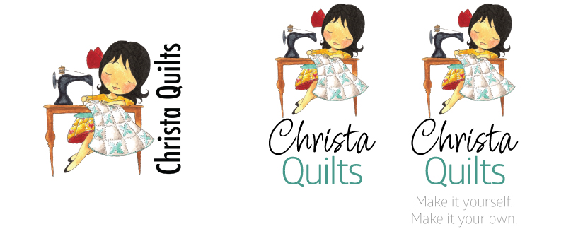
Before (left) and after of Christa’s logo.
When you work with a graphic designer to create your visual identity, it should be a back and forth process where you, as the client, are presented with an array of options that you pick from, then are narrowed down and refined by the designer, and then you pick again. These rounds of options are important to explore the design possibilities and give you say in how the logo is developed and what variations are created in the final suite of logos.

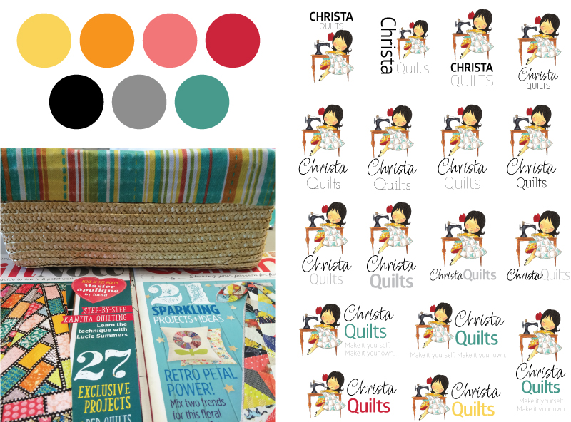
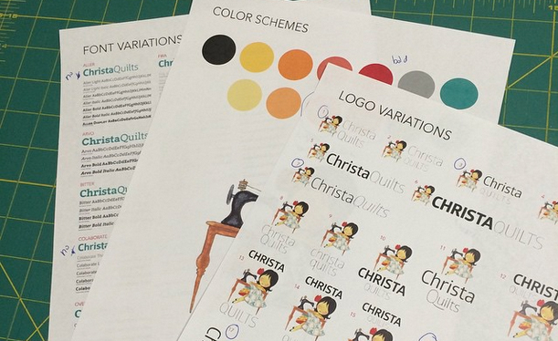
A selection of the logo comps we explored during the development phase. First row explores a B&W logo in various placement options, 2nd: font choices, 3rd: font weights, 4th and 5th rows: color variations. Above left is her color palette based on a photo she took of a few items that inspired the colors she wanted to use.
Christa and I went through six rounds of logo development, and while she probably didn’t expect going into the process that it would be that involved, I think the end product is a testament to her dedication and willingness to explore the options and really hone in on the versions she wanted. She’s happy with her logo and it embodies her — a win win!

The final variations of the logo include 4 sizes, all in color, b&w and reverse options. This provides Christa with flexibility to use the logo in virtually any application.
I start off designing the logo and visual identity basics like fonts and color palette, and then apply that to the various collateral my clients need. Not everything has to be created, and each client has different needs.
Visual identity pieces usually include:
- Logo
- Stationary – letterhead, business card, envelopes, etc.
- Marketing collateral – flyers, brochures, books, websites, etc.
- Products and packaging
- Apparel
- Signage
- Messages & actions
- Anything that visually represents the business

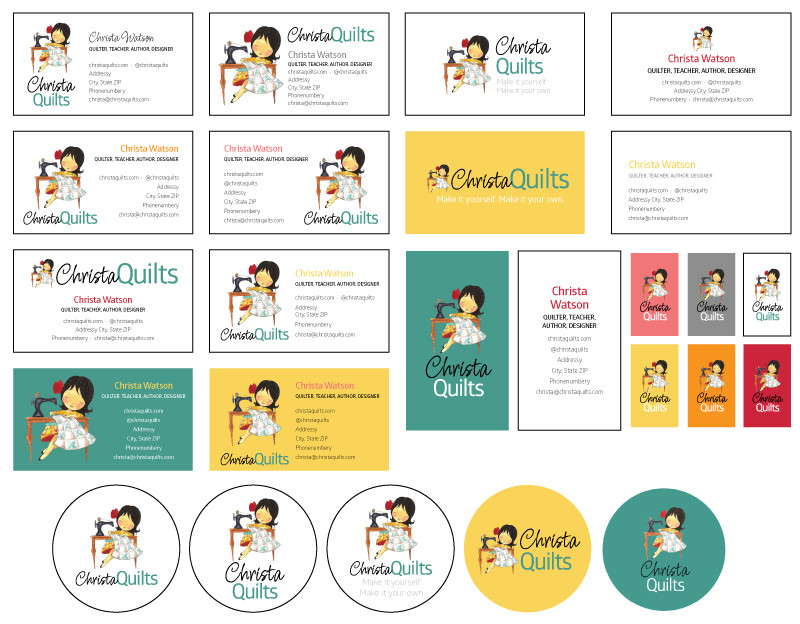
A look at the comps I created for Christa’s business cards and QuiltCon button. She chose the vertical double-sided card option with matching button.
Start with what you need to get rolling, then work with your designer to develop items as needed. Your designer should also provide you with high-quality, vector files of each of your logo versions so that you can apply your identity to pieces (with and without a designer) down the road if need be.
Website updates
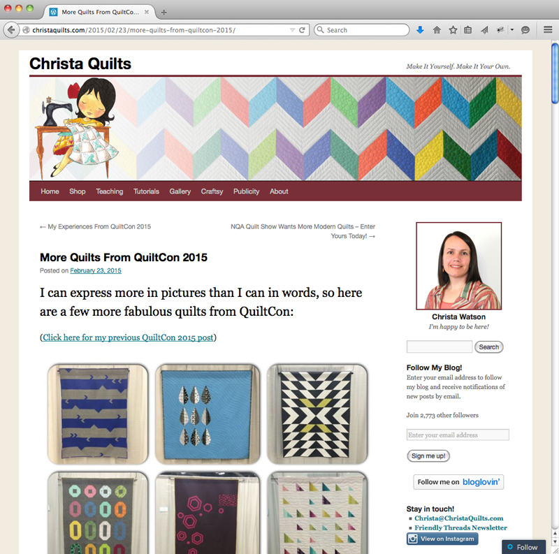
When I started with Christa, she already had a successful business going, with a busy shop, active social media followers and this awesome blog. Big changes weren’t in order, just a visual update. We are in the process of updating logos throughout social media and other locations online. Her newsletter got a new banner and next up is a redesign of her quilt patterns.

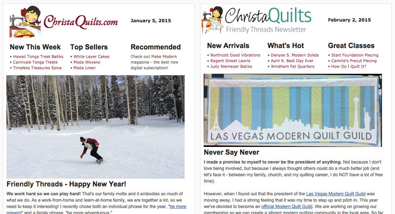
Friendly Threads Newsletter before and after application of the branding.
For this website, though, it needed a visual refreshening. Christa is using WordPress.com for her site, and the software has a variety of themes that allow varying degrees of customization. Prior to the redesign, the site was using a basic WordPress theme that didn’t have much personality. (It didn’t communicate her branding and message very well.)

Before: The old site’s theme used generic fonts that didn’t pair well together, an understated title in the banner and dated colors in the menubar.
That was my task — to find a better theme that supported her message, and then customize it as well as I could. I found success in the Selah theme, and used WordPress’ Premium Design Customization options to further tweak the colors, fonts and CSS styling of various parts.

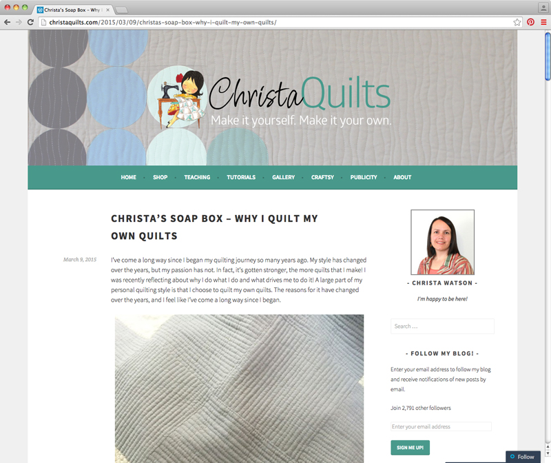
After: The new site feels cohesive in its use of typography, colors, large photos and more white space.
The new site has a wider main area, allowing for bigger photos, and a wider sidebar, too. We cleaned up the items on the sidebar, getting rid of outdated buttons and adding a widget of her quilt designs that refreshes on each visit to the page.
A new banner also was key to making the site feel fresh and new.

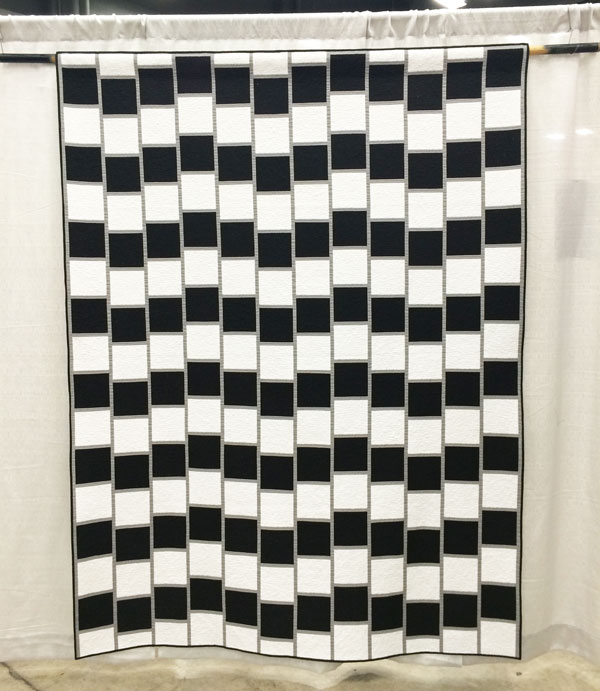
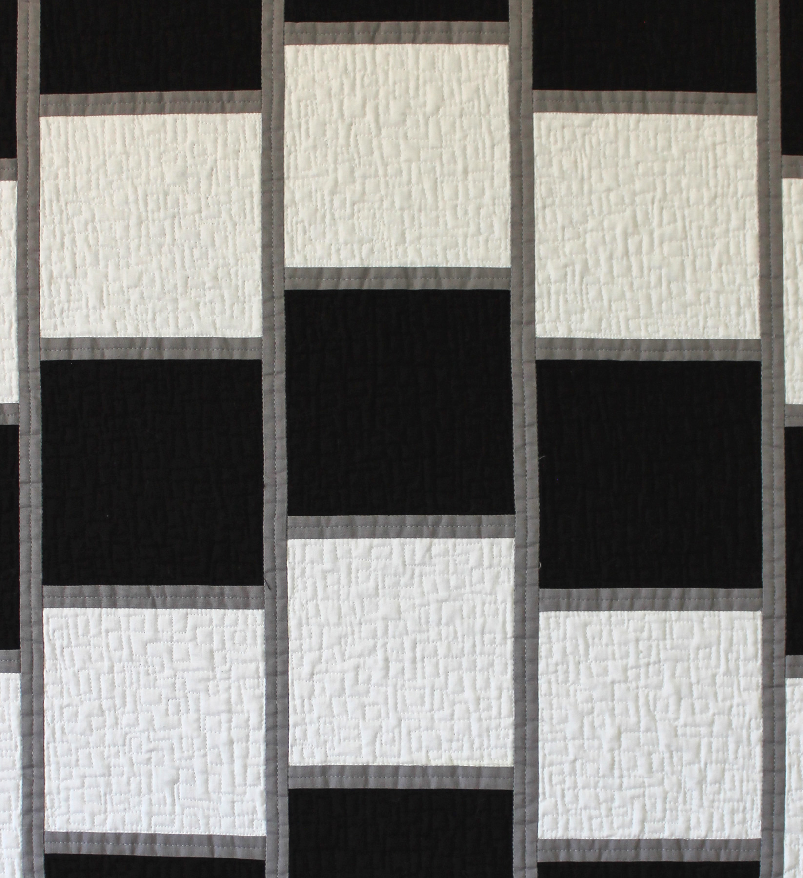
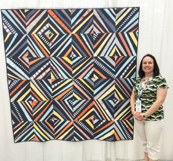
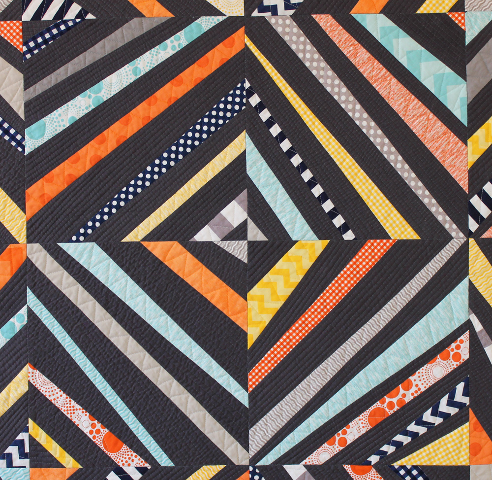
A few of the banner options Christa considered before deciding on the current banner that highlights her quilt Abacus.
A few tips
For those of you just starting a business, or those who want to retool their current one, congrats! Hopefully you have realized what message you want to communicate and are ready to get to work. Do you have a logo? How about a website? Here are a few tips for improving your site:
- Add a custom banner that showcases your logo and communicates your branding. It’s the first thing your readers will see, so make it count.
- Use the theme options and customization options to your advantage. You will be surprised what you can accomplish with the right CSS and plugins.
- Test your site on multiple browsers and devices. Each show sites differently and you may not be aware something is broken until you pull up your site in different places.
- A successful site can be built with either WordPress.com or self-hosted WordPress.org setups. It all comes down to theme selection and customization. You can find a way to make your site what you want. You may just need to find someone to help you get there.
If all of this seems overwhelming, please don’t stress out and feel that you have to know everything to make your business successful. Find someone to help that knows what you don’t know. I promise it will be worth your time. Each of my clients came to that realization before finding me. They each realized that their time was worth more doing what they did best (creating their products and running their businesses) than it was getting frustrated trying to figure out how to do things they didn’t know as well.
So a little plug for my fellow graphic designers and web developers out there: Hire a professional. They can help you achieve your goals and you’ll both be happier doing what you each do best.

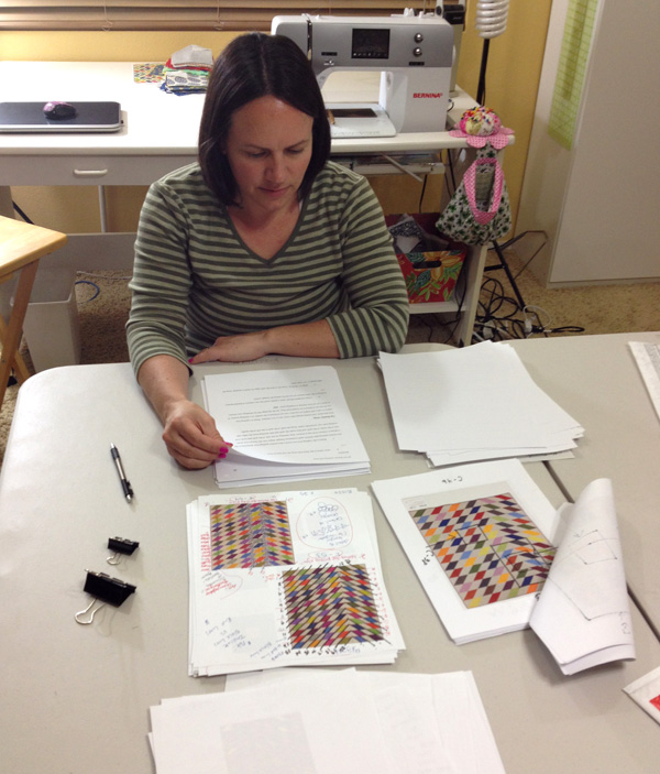
 Thanks to Michelle Freedman (aka designcamppdx on Instagram) for the pic!