QuiltCon 2015 Judging Results #3 – Abacus

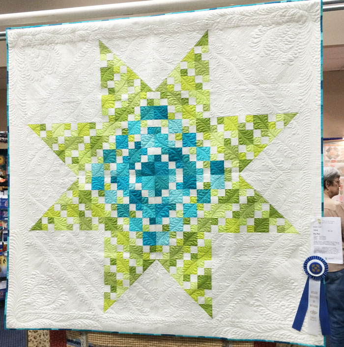
Ahh, Abacus. I finally made a quilt incorporating negative space! I also explored my love of machine applique which I just don’t do enough of. 🙂

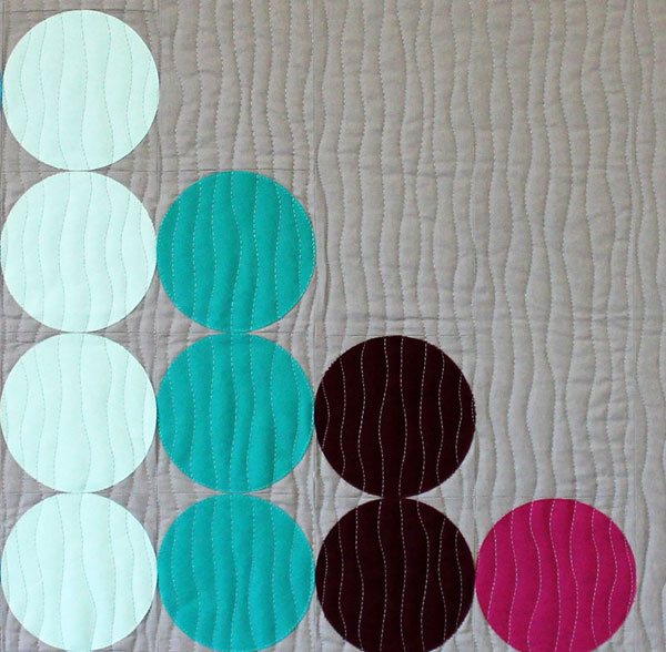
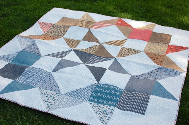
abacus_quiltconAbacus, 32″ x 32″  by Christa Watson. It was judged as a “small quilt” although it could have easily fit into the applique or negative space categories, too. A bigger version may be in order!

Abacus is probably one of the quickest modern quilts I’ve ever designed and made. The colors and layout came together quickly and the quilting was simple to design and easy to execute. Entering it into QuiltCon was an afterthought, but I’m glad I did because it was fun to see it hanging in the show. I was also very pleased that it hangs nice and straight.

Here are the judges’ comments for Abacus, a modern wall quilt:

  • Quilting stitch well done.
  • Binding well applied.
  • Push your own boundaries in color and design.

abacus_detail_smDetailed quilting on Abacus – quilted with a walking foot – so fast, easy and fun!

After sharing all 3 of my QuiltCon quilts (the other two evaluations are here and here), a clear trend emerges. All three commentaries proclaim excellent workmanship and two of them specifically mentioned good binding which is usually the number one suggested improvement in quilt shows. Where I need to ramp up my game is in my design. I need to go a little more bold and a little more modern and I’m totally cool with that!

In my quilt show experience over the years, it seems that traditional shows put more of an emphasis on workmanship whereas modern and art quilt shows give more value to design impact. While both are important in a well-made quilt, I’m certainly encouraged to “push my own boundaries in color and design” for future quilts.

I will still continue to enter modern quilts into traditional shows, but there’s nothing like getting good, informative feedback from judges who have an eye trained towards modern design.

 Abacus is available to purchase as a PDF pattern.

QuiltCon 2015 Judging Results #2 – Optical Illusion

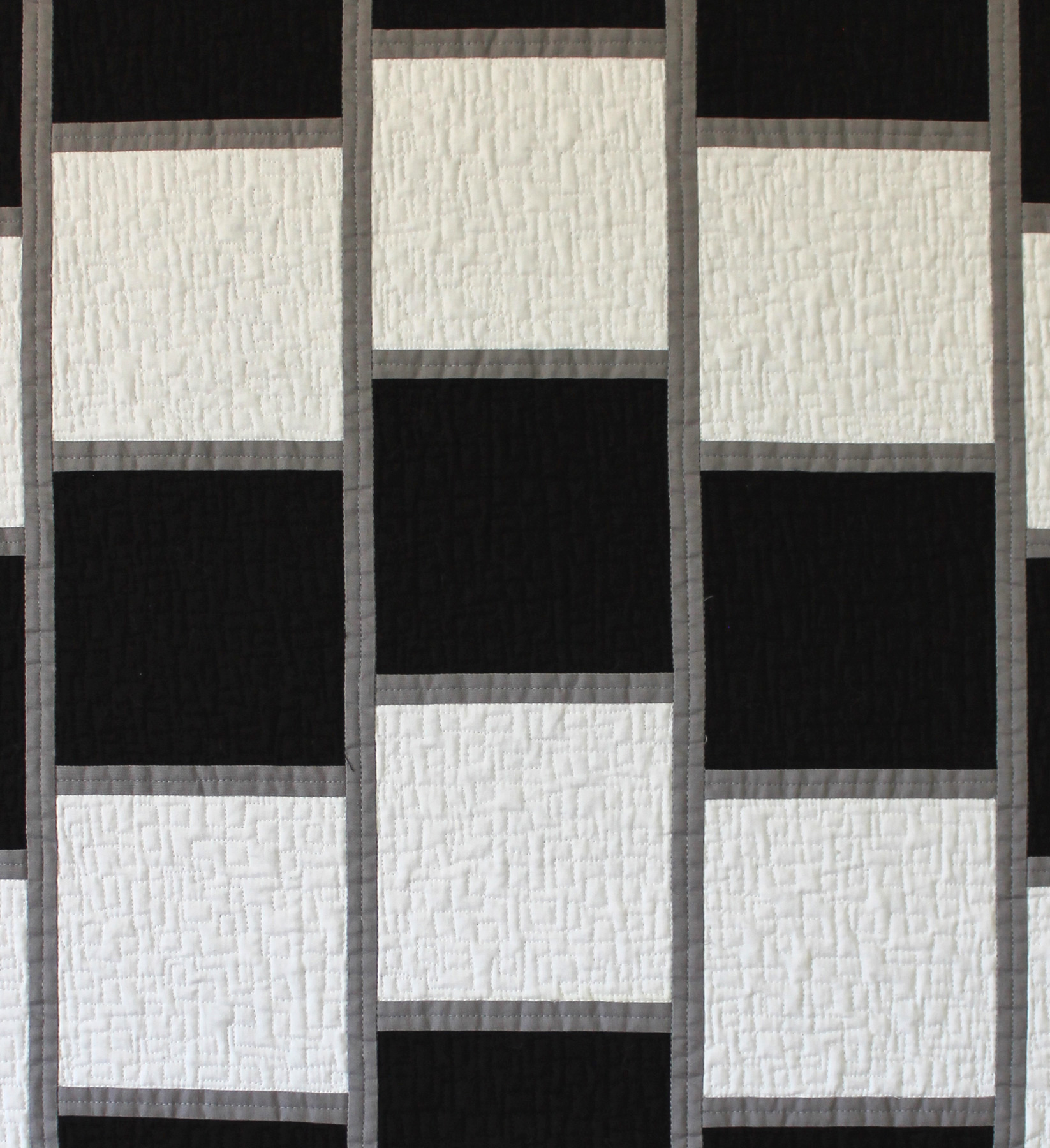
Optical Illusion is the second of the three quilts I entered for judging at QuiltCon. I actually made this quilt specifically for QuiltCon, so I was very pleased when it got in. I’ve been crushing on simple geometric designs in a limited color palette, so this quilt really allowed me to explore that desire. I definitely think more black and white quilts are in my future.

And yes, it moves when you scroll it! 🙂
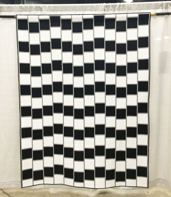
optical_illusion_quiltconOptical Illusion 67″ x 88″ by Christa Watson.

Most people were surprised at how big it was in person.

Optical Illusion was placed into the piecing category which includes this description, “quilts that are machine pieced and reflect a particularly strong or innovative use of piecing.” I guess you could say this quilt was pieced innovatively, although I was secretly hoping for it to be in the minimalist category. I’m still learning exactly what minimalism means. 🙂

Here are the positive judges’ comments, along with my commentary:

  • Quilting motif supports the design. I’m glad – since that’s what I was going for – geometric simplicity that doesn’t overpower the quilt.
  • Binding is well proportioned and applied. Double yay since the binding on this quilt is what stressed me out the most!
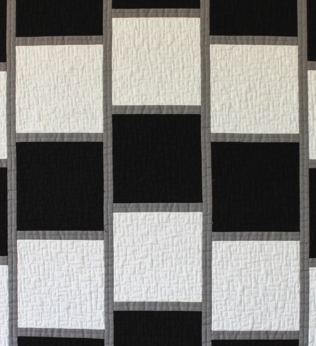
cwatson_opticalillusion_detDetail of quilting on optical Illusion – free-motion boxes.

Here are the areas for suggested improvement, along with my thoughts:

Design direction lacks focus. I was afraid of this – the judges viewed the quilt so close up that I’m afraid they missed the point of the quilt. I don’t think they read the artist’s statement either, so to them it probably just looked like a bunch of black and white squares, and they didn’t get to see the effect of the optical illusion.

I had one slight disappointment in that whoever printed off the paperwork for the show got the name wrong. I had entered it as “Optical Illusion” (I went back and double checked all my acceptance emails to make sure it wasn’t my error), but the title was listed as “48”. I can only imagine that was some kind of typo or mail merge glitch. However, much to the credit of the MQG, they did fix it immediately, once I notified them. Unfortunately, it was too late to know whether or not the incorrect title had any impact on the judging. But you know what? Rather than get all upset about it, I’ve learned through experience sometimes these things just happen. Inadvertent mistakes can be made by volunteers who are doing their best, so there’s no need to beat them up about it. 🙂

The best part about sharing this quilt was seeing the reaction it generated. I’m sure I’ll enter it into more shows in the future.

Quilt should be cleaned before entering into competition – lint. I knew I’d get knocked down on this. The quilt wasn’t linty or dirty, but the batting bearded (shed) like crazy through the black fabric on both front and back. When using dark solid fabrics, I need to stick to a black batting or one that doesn’t beard, like 100% cotton. I used Quilter’s Dream Orient which I’ve used before in print quilts with no problems. The batting is a mix of bamboo, silk, tencel and cotton. I’m not sure which fiber caused the problem, but that just means it’s time to experiment and make more quilts!

I share these critiques with you so that we can learn together what makes a successful quilt.

OpticalIllusion_quiltcon_meStanding next to Optical Illusion for scale. Though I’m pretty short so that may not help much.

I have had quite a number of people asking me for a pattern for this quilt. I am in the process of writing one now, so stay tuned!
QuiltCon 2015 Judging Results #1 – Spiraling Out of Control

I recently received all 4 of my quilts back from QuiltCon. Three of those were judged so I thought it would be fun to share the results with you along with my commentary. I’m a big advocate of sharing your work in local and national quilt shows and being open minded when it comes to the judges’ critiques. Because I really want to delve into this subject, I’ve decided to write about each of the three quilts in three separate blog posts over three days.

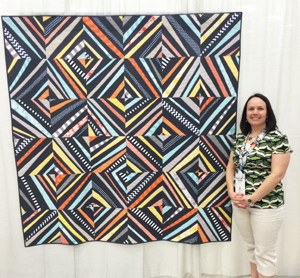
spiraling-at-QuiltConSpiraling Out of Control by Christa Watson, 70″ x 70″

The obligatory picture of me next to the quilt for scale. I’m still figuring out how to not make my quilts wavy when they hang, but the majority of show quilts do this, so I don’t feel so bad.

Spiraling Out of Control. It was placed into the improv category by the show organizers (entrants did not select their own categories this year). That category had the largest number of entries, so it was fun to be one of them. I’m still on the fence as to whether I like the idea of not having to pick a category, or if I’d rather have more say in the process. The great thing about QuiltCon is that it answers the question of “What is a modern quilt?” Just look to any QuiltCon quilt in any category as an example of at least one element of modern quilting.

Many of you may remember Spiraling from the MQG quilt challenge sponsored by Riley Blake last year. The great thing about that contest was that it challenged me to be creative while working within a limited palette.

Here are the judges’ comments for this quilt:

  • Well quilted
  • Good design choices in the quilting
  • Would have liked to see more variety and exploration within the blocks

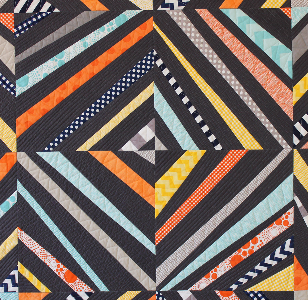
spiraling_detailClosup of the quilting using lots of straight lines for texture.

I’m really pleased that the judges thought my workmanship was well done. I was a little stressed about the quilting not being perfect because I actually free-motion quilted all of the straight lines so I wouldn’t have to turn the quilt! Getting good feedback on my workmanship makes me feel better about my efforts.

The last point is definitely valid, but this is where it’s tricky for the judge to know the full story behind the quilt. As a design challenge, my variety of colors was limited so I couldn’t explore too much there. Also, I wanted all of the blocks to give the same diagonal effect so I really didn’t want to change the overall look or feel of the block structure. So maybe this quilt would have fared better in the modern traditional category since it also looks like a modernized version of a traditional string pieced block, although the techniques I used are vastly different.

spiraling_cool_photo

Photo credit goes to planetdorth on instagram. I love the juxtaposition of the guys’ striped tee next to this quilt. It was fun to watch people stare and get lost in this quilt!

All in all though, I’m very pleased that it was part of the show and for sure I will try to go out on a limb more with future designs. One of the best things about having this quilt in the show is that it definitely raised my profile as a quilter and several people came up to talk to me about it. It’s already been featured in a couple of different magazines and has been seen in several shows, so the time I took to make it has been well worth it. Suffice it to say that a pattern is definitely coming, but it will be a few months down the road….


The Pillow Collective – Amy Ellis’ Think Big Edition

Amy Ellis has just released her 4th (yes 4th!) book with Martingale. 🙂 It’s called Think Big and to celebrate she’s hosting the Pillow Collective – Think Big Edition.

Check out last year’s Pillow Collective here.

Think Big logoFor the blog hop, 15 different bloggers (including me) got a chance to read the book and make a pillow from one of the designs. Let me tell you right now, I have not made a quilted pillow since the early ’90s (I resist 3-D sewing) but boy did I have fun with this one.

I chose Amy’s  Downtown block and tweaked it a little by using solids for all of the rectangle pieces to create an interesting abstract design. I really like the look of it and definitely need to work more modern design into my decor!

finished_pillow2

For the quilting design, I went to town stitching a whole bunch of random straight lines, using painter’s tape to help establish a straight angle. I quilted on either side of the tape, then used the edge of my presser foot as a guide to add additional random parallel lines.

quilting_lines

The best tip I picked up from Amy’s book was how to finish the pillow. There are excellent step-by-step instructions on how to assemble the pillow front and back together, creating an opening in which to stuff a pillow form.

pillow_bindingFrom the book I also learned that you can bind a pillow the same way you would for a regular quilt. I love the pop of color it adds! Now I’m not scared of pillows anymore and may just make another!

finished_pillow

The pillow is currently sitting pretty in a corner of my very yellow dining room! If I get bored of using it as a pillow, it also makes a cute mini. 🙂

abstract_mini

Think Big includes a beautiful assortment of ten 18″ finished blocks, each with projects in five different sizes! I love how graphic and modern they are, and I’m sure you will, too!

think big cover

Because Amy is so sweet as well as extremely generous, she’s also hosting a giveaway of several fabric bundles and a quilt featuring her Modern Neutrals fabric line!! To enter, simply pin a pillow to pinterest (say that 5 times fast) using the hashtags #ThinkBigBook and  #PillowCollective. Click here for Amy’s Pillow Collective Pin Board.

giveaway2

Today is the last day of the blog hop, so be sure to check out all of the previous stops to see all of the other beautiful pillows. I’ve linked to each blogger’s pillow post below:

Now, who’s in the mood to make a pillow?

My Quilt Finishes 2012 – 2014

I recently organized my finished quilts page, showcasing the quilts I’ve made from 2012-2014. The year 2012 was a turning point for me because that’s when I discovered modern quilting and decided I wanted to be a “quilt professional.” Although my quilts aren’t all strictly modern, it’s fun to see them all on one page. I finished 7 quilts each in 2012 and 2013 and then really ramped things up with 19 finishes in 2014!!

I just tell myself that I’m making up for lost time during that period in my life where “Christa didn’t quilt!” 🙂 You can click on each of the pictures for more detailed information about that quilt. Most of them include pattern information, tutorials, or inspirational in-process pics. Enjoy the show!

2014 Finishes

cwatson_Optical_Illusion_1800

Optical Illusion

Abacus-Finished-for-Blog

Abacus

Mini Churn Dash

Mini Churn Dash

Modern Logs

Modern Logs

Herringbone

Herringbone

Modern Quilt

Spiraling out of Control

Modern X

Modern X

12 quilts for my book in 2015!

12 quilts for my book in 2015!


2013 Finishes

Modern Trees

Modern Trees

Colorful Chevrons

Colorful Chevrons

String of Pearls

String of Pearls


Roses for Katelyn

Roses for Katelyn

Hugs 'n Kisses

Hugs ‘n Kisses

Sea of Squares

Sea of Squares

Love by Christa

Love Table Runner


2012 Finishes (The Year I Discovered Modern Quilting)

Charming Chevrons

Charming Chevrons

Girl Baby Bricks

Baby Bricks in Pink

Blue Baby Bricks

Baby Bricks in Blue

Finished Quilt

Busy Hands

Jolly Jelly Roll Quilt

Jolly Jelly Roll Quilt

Hearts and Feathers Wholecloth

Hearts and Feathers Wholecloth

Log Cabin Wreath, Pieced and Quilted by Christa Wason 18" x 18"

Log Cabin Mini Wreath

Make a Modern Mini Quilt with My Mini Churn Dash Pattern

I’ve jumped on the mini quilt bandwagon with one of my latest finishes, Mini Churn Dash. I actually made it over the summer, but I’m able to share it with you now that it’s been published in the latest issue of The Quilting Quarterly by the National Quilting Association.

Mini-QADI was actually able to use this mini for two features in the magazine – the pattern on how to make the mini quilt, and my regular recurring column, Quilt As Desired.

Mini_patternI used a few fabrics from Bonnie & Camille’s Miss Kate line, generously provided to me by Moda Fabrics. I had so much fun making this mini!

I wanted to keep both the quilting and the binding in scale so I reduced my quilting stitch length and I finished it with 1/8″ binding rather than the standard 1/4″. It really wasn’t that hard to do. I used single-fold binding strips that were only 1 1/4″ wide and sewed with 1/8″ seams.

mini_bindingI love using Wonder Clips for binding my quilts. The more clips, the better!

In case you missed the magazine issue, you can purchase the individual pattern here.

I’ve been enjoying seeing quilts made with churn dash blocks and am so glad I was able to combine two trending ideas, mini’s and churn dashes into one quilt. If you are inspired to make your own Mini Churn Dash, I’d love to see it! You can share a picture with my via email, on my flickr page, or on Instagram with the hashtag “minichurndash.”

Optical Illusion – The Finish

I was able to finish Optical Illusion just in time to submit it to QuiltCon (the all-modern quilt show and conference). Then I got the exciting news that it was selected for judging along with two of my other entries, Abacus and Spiraling Out of Control. There were over 1300 entries submitted this year which totally blew away the amount of entries received the first time around. What an awesome show it’s going to be!

cwatson_Optical_Illusion_1800Optical Illusion, designed, pieced and quilted by Christa Watson

Here’s a detail shot where you can see the quilting a little better:

cwatson_opticalillusion_detI had a lot of fun sharing this one on Instagram, because when my followers scrolled the reduced sized picture up and down, they could get the lines to move. What a fun trick! See if you can get it to move when you scroll this blog post up and down – it’s an interactive quilt!

Another “optical illusion” for this quilt was totally unintentional but added a fun surprise: when you hold it up to the light, you can see the geometric backing fabric shining through the white squares, creating a “stained-glass” effect. Cool huh?

stained-glassThis quilt is as fun to play with as it was to make! Since I finished ahead of schedule, I took a little time to make a not-so-fancy but utilitarian label for it, using the embroidery stitches on my machine. (It’s a Bernina 710 – since I know you are going to ask!)

labelI know several of you have asked for a pattern for it, so that’s in the works. I probably won’t release it though until after QuiltCon, to give me plenty of time to get it ready (and to see how it does during the judging process, LOL!!)

Now, it’s onto the next quilt….

Sneak Fabric Peek of Some New Projects

I’m excited to get a jump start on some quilts I’m hoping to finish next year. I wanted to play around with precuts and scraps and I can’t tell you how refreshing it is to sew with so many colorful pieces of fabric!

Pat SloanTriangle TipsI’m currently making a quilt using Pat Sloan‘s latest fabric line The Sweet Life which will be in shops (including ours) around February of next year. These are some leftover triangle trimmings from the quilt blocks. I decided they are so fun and colorful that I think I’ll make a bonus project from all of the leftovers. Got any suggestions?

Scrappy Charms_1I also started cracking open some mini charm packs and regular charm packs that I have accumulated over the last couple of months (and this is after attending quilt market and giving most of it away already!!)

Not quite sure what I wanted to do with them, I first sorted them into piles of lights and darks because I knew I wanted high contrast. I was able to flip over quite a few of the medium prints and they turned into pretty low-volume pieces on the back. I just love versatile fabric, don’t you?

scrappy_charms_2I just love the contrast between bright prints and more muted low-volume designs!

I’ve now got the perfect idea in mind – it’s based on a traditional quilt I made years and years ago that I’m going to tweak into a more modern design. I’ve been having a blast sewing together all of these little squares and playing with all these luscious colors and prints!

Work in Progress – Optical Illusion Quilting Update

I’m plowing my way through the quilting on Optical Illusion this week. I hope to get it finished in time to enter it into QuiltCon. No pressure, right? (One of the things I love about entering quilt shows is that they light a fire under me to actually get things done.)

quilting_overviewDon’t you always match your clothing to your quilts when you sew?

I first created a small practice piece so that I could try out a couple of quilting variations with the same fabric, thread and batting as in the real quilt. I’d rather trouble shoot issues now, and know what I’m in for before starting the big quilt.

practice_pieceSmaller practice piece, sewn to scale using the same materials as the big quilt.

One tweak that I made to my spray basting method was to omit dragging my big tables downstairs and outside. I realized I could just lay a large sheet out on the patio and spray the layers of my quilt on the sheet, then take them back indoors for final assembly.

bastingI prefer to spray baste the top and backing separately, rather than the batting.

I tried out several different stitch textures before opting to go with Boxes, the squarish stipple design on the upper left hand of the picture below. After some practice, I realized that the design is really the star of this quilt, so I didn’t want to over-do it on the quilting.

texture_practiceThese textures were quilted on my practice piece so I could see how they looked “in the cloth” before picking a final design.

I realized that I prefer to add texture to my quilts with the quilting, so that I can enhance the piecing rather than overwhelm it. I quilted all of the black areas first in a matching thread, starting and stopping the quilting in each black box.  It was a lot of tying off, to bury my thread tails. But it really didn’t take that long, since I did a few rows each night while watching TV.

black_boxesI really like the texture of the boxes. I’m quilting the same motif right now in the white squares and I really like the effect. I chose Quilter’s Dream Orient batting which is super soft and I like the feel of it. However, the batting beards which means there is a lot of white fuzz showing through on the black fabric, so I’m constantly cleaning it off with a lint roller. (I’m still figuring out which battings I like best.)

I should have it all quilted soon and I plan to enjoy the holiday weekend hand stitching the binding on while visiting with the extended family.

Here’s wishing you a Happy Turkey Day!

Work in Progress – Optical Illusion Quilt

I’m making really good progress on my Optical Illusion quilt I designed several months back. It’s based on the optical illusion called “Cafe Walls” but with a vertical setting rather than a horizontal setting.

fabricI’m using Riley Blake solids in black, white and grey and decided to cut all of the long skinny strips parallel to the selvedge so they would stretch as little as possible.

RowsI used my railing in my sewing area to keep all of the rows lined up in order. That’s probably the trickiest part!

topI like the illusion it creates when you stare at it for too long! Now I have to decide if I want to make it any wider, and how I’m going to quilt it. That’s half the fun!